Contrast & Repetition: Setting Elements Apart
You've probably already mastered certain aspects of using contrast and repetition (or similarity) in how you design web pages, without even realizing that's what you've been doing. You've probably grouped certain elements together on a page because they're visually or aesthetically similar. In the same breath you also include other elements to provide contrast for everything else on the page to stop your design looking "bland". These are the basic design principles, you've probably learned already or use intuitively, but I'm sure it's always good to go back to basics to improve your work. So let's look closer into contrast and repetition in design.
What Is Contrast?
In as much as humans are capable of thinking with a "higher" brain we tend to rely more on our "lizard" brain, which focuses on recognizing a change in circumstances or our surroundings. In fact it's this "lizard" brain which ensured our survival whereas many of our "ancestors" simply died out.
We recognize changes in patterns or shapes very quickly, and then react to them. Using contrast in your designs will help draw attention to specific areas or elements of a site, or at least it will when used properly. A very simple example of this is making a text element bold, instantly contrasting it to every other word on the page. In fact technical writers do this quite a bit because it allows readers to scan documents quickly to learn what steps are required to complete a given process.

The key to ensuring that your use of contrast is very effective is to use it where appropriate, and only where appropriate. Less is definitely more when it comes to contrast.
In web design contrast can be used in color, size, and alignment. Most people would think of color when they hear the word contrast, but the principle of contrast is by far not limited by color. In fact, contrast is indispensable when it comes to helping the user distinguish one page element from another.
Here's an example - most of the web pages have a header, a footer and a content area, these areas are different and need to be visually separated. By using contrasting background color you will achieve just that.

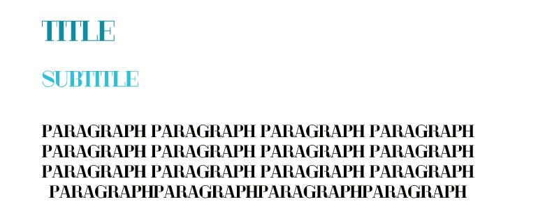
You can use contrast in text in a few ways. You can give titles, subtitles and paragraph text different colors, thus separating them from one another. Or you can give them different sizes, thus creating hierarchy. You may have noticed I use this approach in every article I publish here. Or you can use both approaches together.

Using contrast in size, or making some things bigger than the others, is a good way to create hierarchy where you can not rely on color that much. For example, if your design has minimalistic color scheme and the main content is in the middle of a popular 3-column layout, you can make the middle column much bigger than the other two, thus letting the visitor know he should pay more attention to it.
And what about contrast in alignment? I would say this approach has to be used very carefully. Alignment can make or break a design, you simply can not trifle with this. But I can not say that a properly used contrast in alignment is an ineffective way to go. An example? Well, you can use centered titles with left aligned paragraphs, this is how I would do it. And while we are at it - never-ever center large paragraphs, it makes text very hard to read.

I've summed up everything I know about contrast in design. If you want to know more (and I strongly suggest you learn more) Lynda has a good course on the principles of design, here is a link to the lesson on contrast, be aware - to view this lesson you need to be subscribed.
What Is Repetition?
Our innate ability to spot changes in shapes, patterns and behavior around us is also matched by our ability to see uniformity in shapes, colors and patterns - the similarity of one group of objects to another. It's our ability to understand patterns, while appreciating contrast, which allows us to learn more quickly, and to adapt more quickly as well.
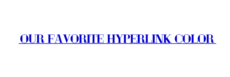
When you use repetition in design you're illustrating how certain elements are alike, and that you can rely on those elements remaining alike throughout your design and across all similar design elements. In the earlier example I mentioned how bolding text will provide a direct contrast to the rest of that horizontal line of text. If we look at how repetition can have an impact on user behavior we need only look at hyperlink formatting.

Why? Well, hyperlinks have always been underlined in blue (#0000cc), and even after years of dynamic designs, CSS and huge advances in web typography web users still expect a hyperlink to at least be underlined, but ideally in the same color they've grown accustomed to.
The "repetition" in your web design here would be to simply format your hyperlinks in the same way on every single page, so users know what to expect when they click on a link. Suddenly changing the color or decoration of hyperlinks on a page for no apparent reason will "break the pattern" for the user. The end result of this can be that they simply ignore the hyperlinks from that point onwards - their pattern recognition is now broken and it's entirely the designers fault. And this is only one example of how much impact repetition in design has.
Repetition in websites can usually be seen as similar visual elements appearing throughout the pages. What element are the most effective to repeat? Colors, fonts, shapes, textures, graphics, videos, images, headers, footers, line thickness, spatial relationships, navigation, sidebars, on and on goes the list. If repeated consistently these elements create continuity.
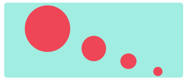
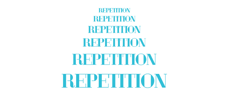
You can repeat the elements in a gradation or progression state, meaning the elements either get smaller or larger as they are repeated. This will help to avoid the design becoming boring.

Here's where you can learn more on repetition (you need to be subscribed to Lynda to view this as well).
Using Both in Your Design
It would prove to be very, very difficult to design a site without elements which are similar and elements which provide contrast and context to those "similar" elements. Your focus is on creating a design which engages the visitor on a number of levels, and to do that you need to design pages with a holistic approach. Basically just enough similarity to make people feel at home, and just enough contrast that they don't die of boredom within the first few seconds of finding your site. This is what we call harmony.
Just remember that web designers are visual communicators first and foremost. If you remember that much then you're already safely on the path to mastering contrast and repetition to best serve your customers' needs.
So, care to show me how you use contrast and repetition in your designs?
Oh, and I'd appreciate it if you shared this post via your social networks, the social buttons are just below this post, thx!About the author
Copyright © . All Rights Reserved
