Blending Options
- Adobe Photoshop CS6 Classroom in a Book
- Photoshop CS6: Visual QuickStart Guide
- Photoshop CS6 For Dummies
- Adobe Photoshop CS6 Digital Classroom
- Photoshop CS6: The Missing Manual
- The Adobe Photoshop CS6 Book for Digital Photographers
- Adobe Master Class: Photoshop Inspiring artwork and tutorials by established and emerging artists
So, first off, I will explain the blending options simply by using some basic text.
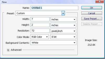
Create a new document, 7 by 2 inches, a banner-type size, and for that sake of making the images in this tutorial a bit smaller.
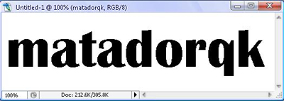
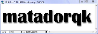
So try to fill up as much of the area with any text you wish, like this:
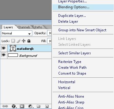
Now, we will play with the blending options, and you will see how some blending options might make your text look a lot better, so in the Layers, right click on the Text layer, and choose blending options.
Then, you will open up the blending options menu, lets start with the first blending option, drop shadow.
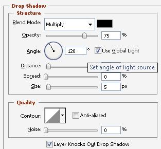
These are the pre-set settings for a drop shadow, and simply leaving them like that will give you a decent shadow. Nevertheless, you can always adjust anything you wish, such as:
Blend Mode: Try them, there are many blending options which will do different things to the image.
Opacity: This will adjust the darkness of your shadow.
Angle: This will adjust the angle at wish the "sun" is hitting the image to cause a shadow in the opposite direction.
Distance: The distance the shadow is from the actual object.
Spread: The thickness of the shadow.
Size: Well, obviously the size of the shadow.
Then, next in the list is the inner shadow, which we will switch the settings to make it visible. Put your settings like this:
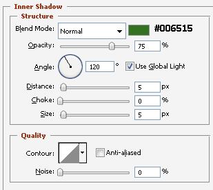
I wrote down which color in the image just incase you wanted to use it. So, we changed the color because the pre-set is black, and if our image is black, you wont see the shadow inside it. Now, when placed in green, it is visible.
Again, you can modify anything you wish, the only thing you may not understand is the choke, which is the quantity of inner shadow you want in your image.
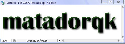
The next blending option is the outer-glow, which can also be pretty useful. If you wish to give an image a purposeful shine, or give a person an angelic glow, this is the tool you want to use.
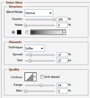
These are the settings I used, now the image may look extremely dark, which gives your text a spooky look with the green.
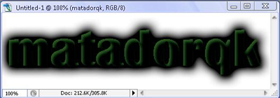
Then we will give the image a soft inner glow to make it more legible.
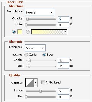
Play around with these features if you'd like until you get something satisfactory.
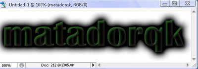
As we can see it is a bit clearer now, but now we will make it slightly 3-dimensional, or so this feature looks. Use a simple Bevel and Emboss with the pre-set features.
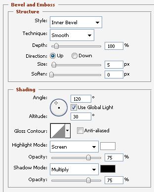
As we can see, it looks significantly decent, so also check the contour, which will not change much, but will improve its look.
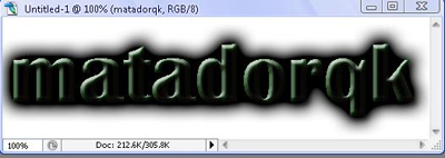
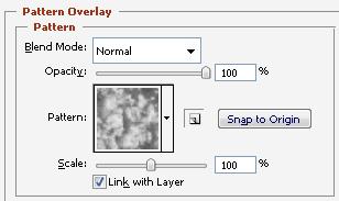
Now, as a finishing touch we will use the pattern overlay, with the pattern I used below, to achieve a decent look.
So the final result:
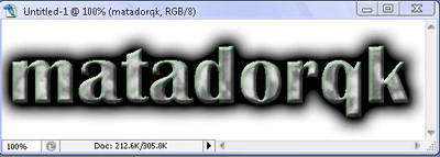
Again, it is not to make a really fancy logo, but to teach you about the blending options, which are truly useful.
So, last but not least, I would like you to start a new document to teach you the stroke blending option. It is by far one of the most useful blending options I have used, personally.
So, after making a new document (same sized as the first one) you will write your name again, except this time, you will write it in white. You will obviously not see anything. After writing it, go to blending options, and use the stroke with whichever settings you please, mine only changed the color to black.

It will create an outline around the text, so when you have a background that makes your text illegible, put on a stroke, it should really help :)
Until next time
How To Use Blending Options in Photoshop CS6
About the author
Copyright © . All Rights Reserved
