


To begin, here's my image set up:
Create a new image
9 inches wide
5 inches high
200 dpi
RGB
White Background
Select 2 opposing colors. For my example I'm using red and green. Create a new layer, and select the Reflected Gradient tool set to difference mode. Start filling the new layer several times, beginning from different points each pass. You may even throw a few radial gradients in for good measure.
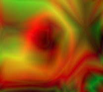
This is a small section of my image as it stands after about 12 passes of the gradient. Just a note: using the difference mode gradient is one of the single best ways to create sharp, contrasting designs. I use this effect often, and have always been pleased with the result.
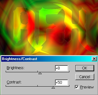
Enter some large type with the type mask tool. Once selected, go to Layer>New>Layer via Cut. This takes your type selection and removes it from the gradient layer, allowing use to apply filters and styles to the type shaped selection. Duplicate the new layer... I'm going to show you a pretty cool tip in a few minutes.
Before we get to that, let's work on the duplicate, which should be at the top of the layer stack. Tweak the brightness/contrast just a bit to bring out the color from the background.
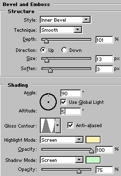
I'm now going to apply my bevel to the layer to further bring it out from the background.
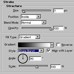
Let's add just a dash of a gradient stroke:
By now your type should look something like this:
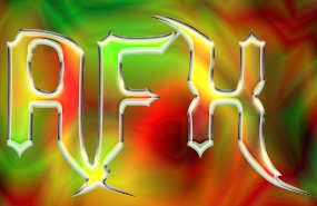
Don't you just love this stuff?
Ok, time to apply the cool factor. Remember the trick I mentioned? Here it is. In order to create my borders around embedded looking type, I used to reselect the type and expand the selection. This worked ok, but the corners were rounded off gradually as I increased the selection size. I don't want to do that here, as I want the points of the font to remain sharp. The font I'm using is called Nightwarrior, and can be found on numerous free font websites. As we have a layer unaffected by the bevel in the shape of our type. We can transform it to increase the size, thereby maintaining the sharp edges for our border.
Select the bottom most type layer. Go to Edit>Transform>Scale, and increase the size to taste. I want to make a distinctive metal border, so I'm expanding the layer so the effects on the border can be clearly seen. Though the fonts fill not directly match as they would using the expand selection option, this is still a fun way to render things.
Command/Control>Click the expanded type layer to generate your selection. Hit D, X, and select the radial gradient, this time changing the mode to normal. Select a point in the upper left of the selection and fill the selection to the lower right.
We are going to try a variation of an effect we covered a few months ago. Select a brown or red for the foreground color. Duplicate the layer. Command/Control>Click to make the selection again. Fill the layer with gray and apply the Spatter Filter a couple times. Then select the gray and delete it from the duplicate layer. Apply a pillow emboss set to 40%, and apply the ring contour.
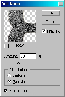
Reselect the bottom type layer and add noise.
Now just apply a bevel to taste. I've also merged the top layer with an empty on and applied a pillow emboss. After replacing the white background with black and creating a cool globe in the background, here's my image:
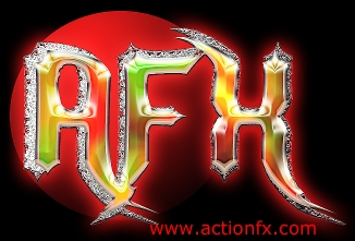
 Al Ward, a certified Photoshop Addict and Webmaster of Action FX Photoshop Resources (