

Web2.0 style icons are very popular and can be found on many website. This tutorial teaches you the basics of designing these icons.
The common features of these type of icons are :
- Smooth Edges
- Not too much blending of colors. One color is dominant on a particular shape.
- Light shadow behind the icons &
- Simple yet eye catching look.
Keeping those 4 points in mind, lets start creating a simple help icon : Start by selecting Rounded Rectangle tool
![]() Set the radius to 2 px
Set the radius to 2 px
![]()
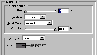
and draw the shape. Set the foreground color to #EFEFEF while drawing the shape. Add stroke in it as shown :

Draw 1 pixel wide white color lines inside the shape :

Add few #B0B0B0 colored, 2 pixel wide lines in the shape to give a paper look :

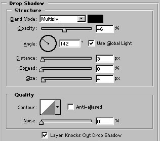
Group and merge all three ( lines, base & white color border) shapes. Add drop shadow in the shape as shown :

Now, type '?' with VAG Round font setting the font size to 50 points.

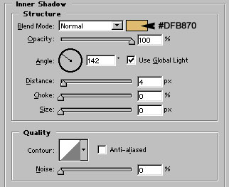
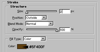
Add these layer styles in it :
Your new help icon is ready. I hope you have learned something from this simple tutorial :)
