Step 1
Start a new document that is 770 x 600 and fill the background with: #FCFCFC
Step 2
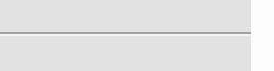
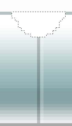
Create a new layer, and make a selection like so approximately 120 pixels down from the top of the canvas using the rectangular marquee tool:
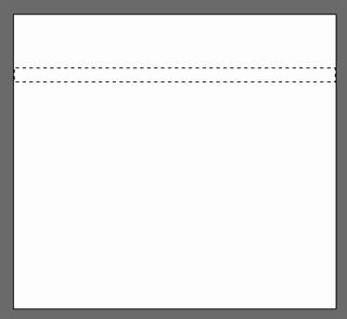
Fill this selection with white (#FFFFFF).
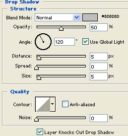
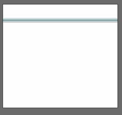
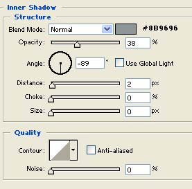
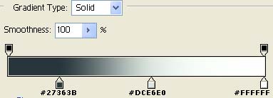
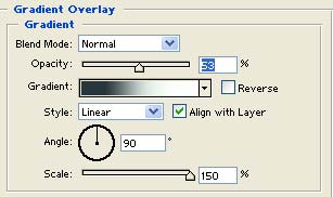
Step 3
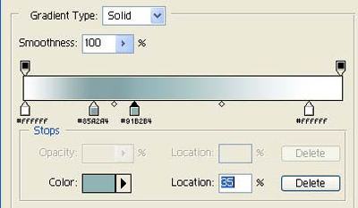
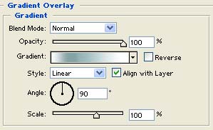
Double click this layer, and apply the following blending options:
Gradient Overlay:
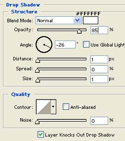
Drop Shadow:
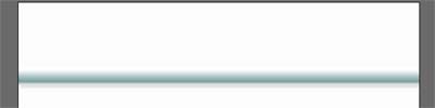
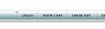
You should have something that looks similar to this:
Step 4
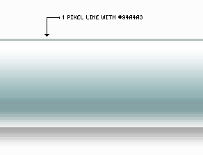
Create a new layer. Now set your foreground color to: ##94a4a3 Get out the pencil tool (
![]() ) and apply these settings:
) and apply these settings:
![]()
Now draw a 1 pixel line all the way across the top of this navigation bar we have just created like so:
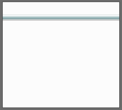
Here's how your canvas should now look:
Save your work
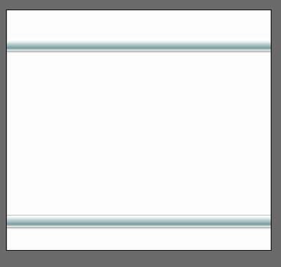
Step 5
Next duplicate these two layers, and position them near the bottom of the canvas (about 75 pixels from the bottom) for the footer:
Shortcut: Pressing Ctrl + J on your keyboard will duplicate your currently active layer.
Results:
Step 6
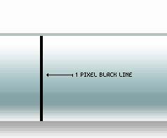
Next we will add some dividers between our top navigation bar. Create a new layer on top of everything else, set your foreground color to black (#000000) and set your pencil tool up like so:
![]()
Next zoom in closely and draw a 1 pixel vertical line on top of our navigation bar like so:
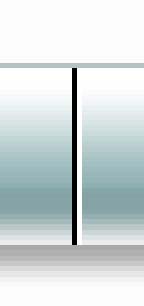
Press Ctrl + J on your keyboard to duplicate this layer.
Press Ctrl + I on your keyboard to 'invert' the color to white.
Press 'V' on your keyboard to get out the "move tool" and tap the right arrow (->) on your keyboard once to nudge this white line to the right 1 pixel.
Here's what you should have:
Now press Ctrl + E on your keyboard to merge these two layers together.
Next drop the opacity of this layer down to 20 percent:
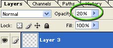
Name this layer "nav divider" as we'll refer back to it in a moment.
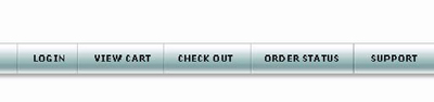
Result:

Step 7
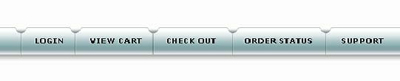
Next we will add some text to our navigation bar. Set your foreground color to: #1A1A1A, get out the text tool and apply your text to the navigation bar as I've done here.
The font I used here was 10pt bold Verdana.
Next double click your text layer and apply the following blending options:
Drop Shadow:
This will give the text a little more depth.
Step 8
Next we'll use a technique to separate the buttons a little more to make them stand out a bit more.
Create a new layer.
Set your foreground color to white (#FFFFFF), get out the pencil too set to 1 pixel in diameter, and draw a small triangle similar to what I have done here over top one of the nav bar "dividers".
Note: I've selected the triangle to make it easier for your to see:
Double click this layer, and apply the following blending options:
Drop Shadow:
Note: You may need to slightly adjust these settings to fit your needs, depending on the size of the triangle you had made.
Result:
Step 9
Now duplicate this small triangle layer we have just created by pressing Ctrl + J and and position it over top of each of our dividers as I've done here:
Step 10
Next we'll begin to build the content area(s) of our layout. To start go ahead and create a new layer. Now using the rectangular marquee tool make a selection similar to what I have done here to create an area for our news/special features sidebar:
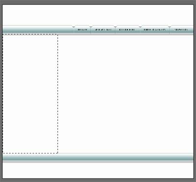
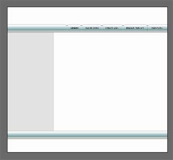
Fill this selection with #E2E2E2. Here's what you should have:
Step 11
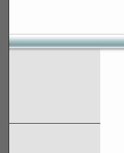
Next we'll create a divider for this area, using the same technique we did with the navigation bar. Set your foreground color to black (#000000) and draw a 1 pixel line across our sidebar area like so:
Press Ctrl + J on your keyboard to duplicate this layer.
Press Ctrl + I on your keyboard to invert the color to white.
Press 'V' on your keyboard to get out the "move tool".
Tap the Down Arrow on your keyboard once, to nudge the white line down 1 pixel.
Press Ctrl + E on your keyboard to merge these two layers together, and drop the opacity of this layer down to 35 percent.
Here's how it should look: