

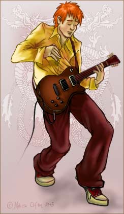
Introduction
The tutorial that follows shows MY way of colouring using Photoshop. I do not claim to be a Photoshop expert by any means, this is just the technique I use. It's a really good way of colouring/shading your pictures if you are indecisive about the colour palette, as you can easily change the colours at any stage! Please note this tutorial is written for PC users (because that's what I use) and for mouse users (because that's all I had at the time of writing this tutorial. Now I'm a very proud owner of a wacom tablet and couldn't live without it).
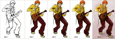
There are five steps to this tutorial...
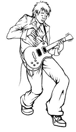
Step 1: Separating the Line Art
Separating the line art is really only necessary if you intend to colour it. Personally I think a lot of pictures benefit from coloured line art, just have a look at the work produced from Disney.
The whole of step 1 is actually a really short Photoshop process, so let's begin....
a) Scanning Image
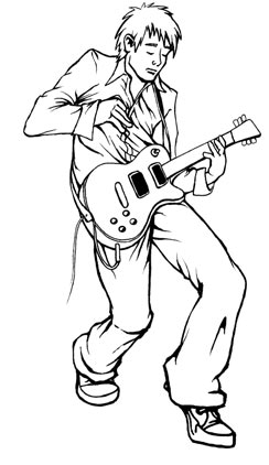
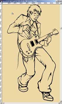
I like to clean up and ink in my pictures the old fashion way, with a pen, before I scan it into Photoshop. (There are plenty of great tutorials on how to clean up your rough sketches using Photoshop, however I tend to find these techniques very time consuming).
When scanning in your line art remember... bigger is better! I like to work at 300dpi (dots per inch).
I tend to scan in my original picture in RBG (if the picture is only for the computer screen) and then change to CMYK (if the picture is intended for print).
Image>>Mode>>RGB
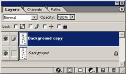
b) Create New Layer
Now duplicate the layer. Just click the layer called "Background" and drag it to this icon
 at the bottom of the layer window to duplicate the layer.
You can delete the original layer called "Background". Click and drag it to the trashcan icon (next to the icon shown previously).
c) Refining the Black Line Art
What we want to achieve with our line art is solid black lines, so we need to remove any grey marks that may have come in with the scan. It's like a laundry detergent commercial... "make the whites whiter and get rid of any dirty marks". There are several techniques for doing this but I find adjusting the curves works really well.
Adjusting Curves
First make sure your image doesn't have any colour...
Image>>Adjust>>Desaturate...
Then...
Image>>Adjust>>Curves...
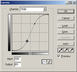
The line in the "Curves" dialogue box will appear as a diagonal. Click on this diagonal line twice and drag these two markers until your line forms an "S" shape (as shown above). The lower marker will increase the black values as you pull it down. The upper marker will decrease the grey values as you pull it up. The exact shape of your "S" curve will depend on your picture, so watch your image as you move these markers until you achieve the desired result.
d) Making a New Layer with Black Line Art and Transparent Backing
This stage is easy. First...
Switch to your "Channels" palette (see image above).
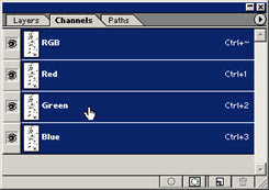
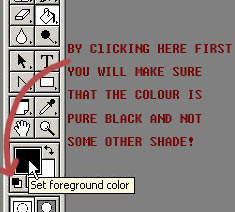
Hold down Ctrl and click on one of the channels. You will see that you have now selected the white areas of your picture.
Invert the selection, Shift+Ctrl+I. Now all the line art is selected.
Go back to your "Layers" palette and create a new layer (
).
Get your Paint Bucket Tool (
 ) and fill the selection black (see image above). Now you have black line art on a transparent backing.
Deselect, Ctrl+D.
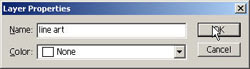
Right click on the new layer created, "Layer 1", and select Layer Properties... Rename this layer to something meaningful, i.e. "line art".
*Note: It is extremely important to appropriately name all your layers as you go. At the end of this tutorial you will have soooo many layers, it will become a nightmare to navigate through them if you don't know what they are.
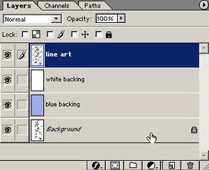
Finally, create two new layers. Fill one with white and fill one with a light shade of blue. Rename both these layers, like "white backing" and "blue backing". Drag both these layers under your "line art" layer.
You're almost there!
e) Finishing Touches
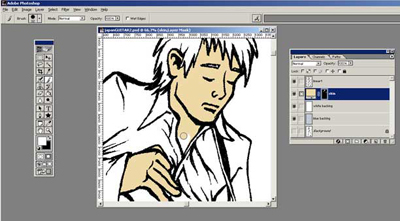
Working on your "line art" layer, use your Eraser Tool (
 ) to get rid of any unnecessary lines or marks. Using "Ctrl +" and "Ctrl -" zoom in and out to make the adjustments. I like to use the easer tool to also taper off some lines. See image below.
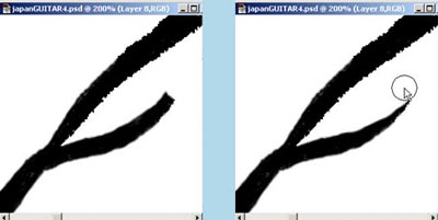
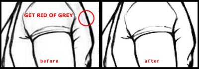
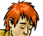
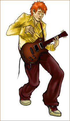
If you compare my original scan, at the top of the page, with my finished Photoshop line art image, you will see that I removed a lot of crease lines on the shirt and totally re-drew the nose (the original was munted).
Step 2: Adding Colour
Now that your have separated your line art in step 1, it's time to colour with Photoshop...
I love colouring in Photoshop. I used to experience extreme anxiety colouring my line art when I used pens or paint...every colour choice could be a mistake that would ruin my picture, and I may have to start over again from the beginning.
Using fill layers is the best way to colour if you are indecisive about your colour palette. So let's begin this tutorial and see how it works...
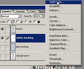
a) Creating a Fill Layer
Click on this icon
 at the bottom of your "Layer" window and select Solid Colour...
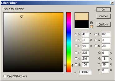
Select a colour in the Colour Picker dialogue box. Click OK.
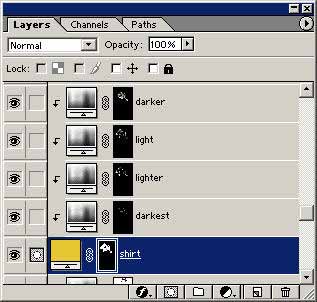
The new fill layer created will appear in your layer window.
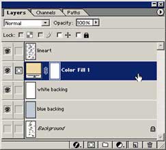
Rename this layer to the item that you intend to colour. For example, I will name this layer "skin".The picture is now totally coloured with the colour of my fill layer "skin".
Working on this new layer, take your Paint Bucket Tool (
) and fill the layer black. The colour disappears...this is because the colour will only show up where there is white on this layer.
Now change the active colour to white. Get your Paint Brush Tool (
 ) and start painting where you want to the colour to appear.
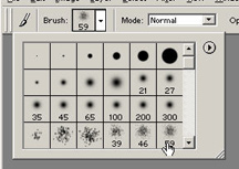
Use a hard brush with the opacity set to 100%. Make sure that you zoom in when colouring, so that it is nice and tidy!
*Note: To make colouring faster, click on your "line art" layer, and use the Magic Wand Tool (
 ) to select the area that you wish to colour. Then click on the new fill layer, grab the Paint Bucket Tool and fill white...fast!
b) Creating more Fill Layers
Repeat the above step creating a new fill layer for each colour/item in your picture.
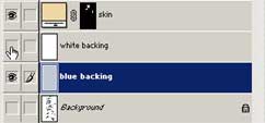
Turn off the visibility of the "white backing" layer (click the eye icon) when you are shading a layer with a colour close to white. See above image. Now you know what the "blue backing" layer is for.
Make sure all your new fill layers are positioned below your "line art" layer and that you name each layer appropriately.
If you have multiple layers for a single item, you can organise them into a folder (known as a set). To create a new set, simply click this icon (
 ) at the bottom of the layers window. Place layers into a set by click dragging them onto the set. To rename a set is the same process as renaming a layer.
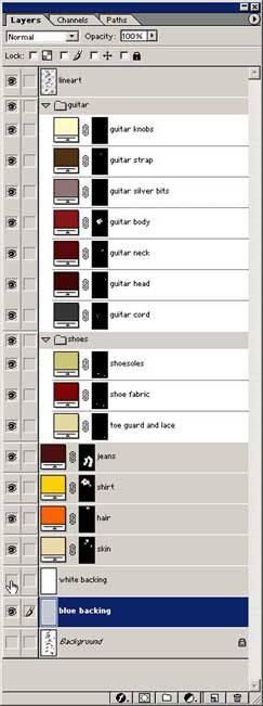
The image above shows all the fill layers I used and how I organised them. It may take a while to create all your fill layers, so remember to Save regularly!
c) Versatility of the Fill Layer
This is my favourite part...
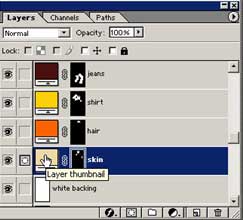
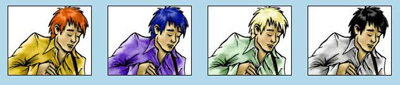
At any time if you are unhappy with a colour that you have chosen, simply double click on the Layer Thumbnail (as shown above) and re-select a colour. Now you have the ability to change the colour of his hair for example, to a whole new colour in a second flat!! Indecisive picture colourers of the world unite and cheer!!!
If you are working commercially, this technique is great for your client too. Imagine how impressed they will be when you can deliver all the colour changes that they require in seconds!
Step 3: Adding Depth and Highlights
Now that you have put in your base colours in step 2, it's time to add the shading and highlights. This is the most time consuming stage of the tutorial, but also the most rewarding. Shading, when done well, will transform the picture!
The shading technique that I will show you here is the similar to the colouring technique. We will use Photoshop's Adjustment Layers to create the shadows and highlights. The main reason behind this technique is to maintain the ability to change the colour of any item in the image and still have the shading look correct.
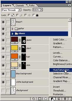
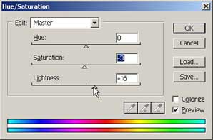
a) Creating a Hue/Saturation Adjustment Layers
Click on this icon
at the bottom of your layer window and select Hue/Saturation...
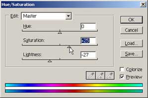
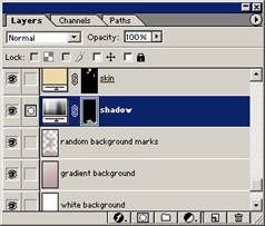
First we are going to make a depth layer (always create your shadows first and highlights second), so drag the Saturation slider to the right, increasing the saturation and drag the Lightness slider to the left, decreasing the lightness. See image below. Click Ok.
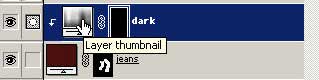
You can see that the new adjustment layer looks very similar to a fill layer. Drag the new layer to be above the jeans layer. Rename the layer to something appropriate like "dark".
Working on this new layer, take your Paint Bucket Tool (
) and fill the layer black. The darkness disappears...just the same as a colour fill layer. Also note that you can adjust the hue/saturation layer by double clicking on the "layer thumbnail".
b) Creating a Clipping Group
Hold down the ALT key and move the mouse between the two layers, and click when the cursor turns into a "double bubble". See below.
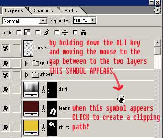
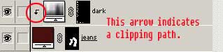
The depth layer will slide to the right with an arrow pointing to the colour layer below it. See image below.You have now created a Clipping Group. This means that the shadows we create will only exist on the coloured area of the jeans...no need to worry about going over the lines.
*Note: Use Clipping Groups to add detail to items i.e. freckles to the skin, texture to the jean fabric etc.
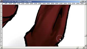
c) Painting in the Shadow Regions
Now change the active colour to white. Get your Paint Brush Tool (
) and start painting where you want to the shadows to appear.
Use a soft brush with the opacity set to 20% and slowly build up the shadow areas. Try applying a slight blur to your depth layers to get smoother shading.
Filter>>Blur>>Gaussian Blur...
After you have finished shading an area, switch your active colour to black, use a soft brush and remove shadows from the outer edges of items...this simulates the effect of back light and will give your pic a more realistic look. See below.
Continue creating new depth layers for all your colour layers. Some areas that have a lot of shade values may require 2 or more adjustment layers...just stack 'em up!
d) Painting in the Highlights
As you may have guessed, this is the same process as creating the shadow regions. This time however when you create the adjustment layer, slide the saturation slider left, decreasing the saturation, and drag the lightness slider right, increasing the lightness. See below.
Obviously that exact values you use will depend on your image!
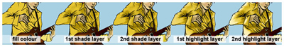
The images below show the layers I created for the shirt, and the order in which I created them.
e) A Tip for Adding Depth/Highlights to Shiny Objects
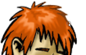
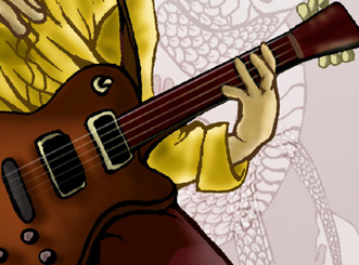
For items that are shiny, the shadow/highlights are more crisp and defined (rather than blended). A good example of such an area is the hair. See image below...
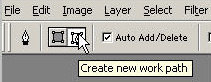
To create these areas use the Pen Tool. With the pen tool we will to create a path and then make it into selection to fill our highlight/depth layers.
![]()
Make sure the pen tool is set to create a Work Path.
Now to some-up how to use Photoshop's pen tool in a few sentences isn't easy...
If the shape of the shade/highlight area that you are going to draw is made up of straight lines it's easy. Simply click on the extreme points of the desired shape. An anchor point is created with each click. See image below.
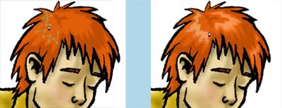
The path we create must be closed (like a circle) in order to make it into a selection. Once you have created your last anchor point simply click once more on the starting point (you will see a small circle indicating that the path will close).
Once you have created a path, right click on it and click make selection>>ok
Make sure you are on the appropriate depth/highlight layer and fill the selection white.
You may like a add a little faint blur to this layer to soften it, Filter>>Blur>>Gaussian Blur...
All the time consuming work is now done! Don't forget to Save!
Step 4: Colouring the Line Art
Right, so you have just completed step 3, and your picture will be looking real good now.
Now is a good time to experiment with the colour of items in your picture. (Double click on the layer thumbnail of the item whose colour you wish to change, and select a new colour).
Let's make the picture even better by colouring the line art.This step of the tutorial is so fast, try not to blink.
a) The One and Only step
Create a new layer (
) above your line art.
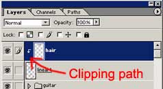
Create a clipping group. (Hold down the Alt key and move mouse between the new layer and the line art layer).
Rename your new layer. I've renamed my new layer "hair", as that the line art I'm going to colour this first.
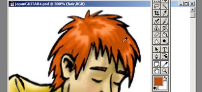
Take your Eyedropper Tool (
 ) and click on the hair.
Click on the new Foreground Colour to bring up the Colour Picker Window.
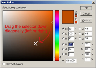
Drag the selector down diagonally to select a darker version of the original colour. Click OK.
Get your Paint Brush Tool and paint over the line art for the hair. Use a hard brush and make sure you reset the opacity to 100%.
Once you have completed colouring the lines around the hair, repeat this process for each item...remember to create a new layer for each new item.
Fine tune the shades of your line art using Image>>Adjust>>Hue/Saturation...
Don't forget to Save!
Step 5: Finishing Touches
OK, you have pretty much completed the picture in step 4, let's just add a few little finishing touches.
a) Background
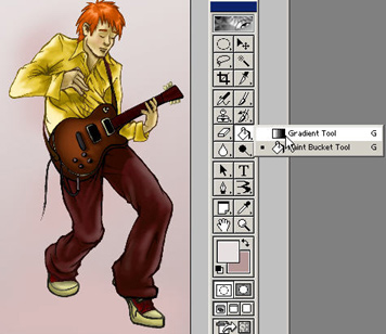
If there is no background image, I like to do a simple gradient fill on the background. First create a new layer, it should be above your "white background" layer. Right click on the Paint Bucket Tool to reveal Photoshop's Gradient Tool. See Image below.
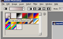
Select your a foreground and a background (a darker shade of the foreground colour is preferable) in the tool palette. I chose a linear gradient for this picture. All the options are in the top left of your Photoshop window. See image below.
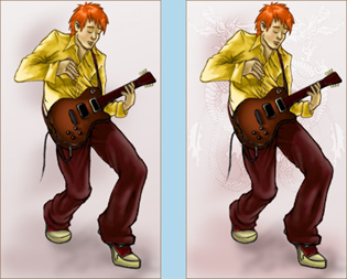
This was too even for my liking so I grabbed a large brush and did some random darker marks on another layer. Then blurred the hell out of it.
Next create a shadow for your character so that he/she/it isn't floating in mid-air. Make the shadow using a hue/saturation adjustment layer (see step 3).
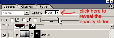
Finally I found the gradient a little too much so I lowered the opacity of the "gradient background" layer.
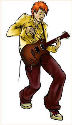
I had a picture of dragon that I'd drawn earlier so I added that to the image. I set the "dragon" layer mode to Soft Light so that its barely there. (The mode of the layer is next to the opacity slider on your Layers Window). The dragons might be a little tacky but I'll leave them there for now.
b) Details
I added a little length to the guitar cord. It looked like the guy had a Mickey Mouse tail. See the above image.
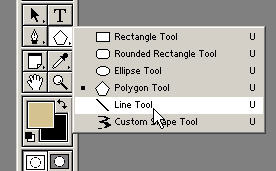
Using the Line Tool (see below image) I created the guitar strings.
I also add a little rough detail to the guitar head. Note that the lines that create the guitar strings are actually really faint.
c) Secondary Colour
This is a new Photoshop trick that I learnt recently. It's the icing on the cake!! The colour will really help to tie all the layers together.
Create a new layer (this is the very last layer that you need to create). Drag the new layer to the top of the Layer Window so that it sits above all other layers. Rename the layer appropriately. Mine's called "red light".
Select the colour you wish to use as a secondary colour...mine's red, you may have guessed from the layer name. This secondary colour is actually refracted light for the most part SO if your background is green for example don't use red, use green tones. The colour should match the surrounding objects.
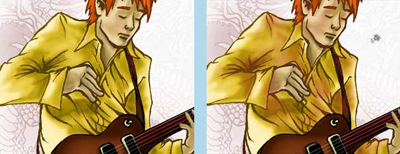
Select a spatter brush with a low opacity and paint on secondary light. Apply a little blur to the layer and try lowering the opacity of the entire layer until it looks right. See image below.
Finally, don't forget to Save!
So that's it! That's how I colour my pictures.