


Step 1: Creating the Workspace:
Start by creating a 450 x 80 px document in photoshop and make the background colour as #333333
Step 2: Create the Base layer:
Make a new layer and grab your Rectangular Marquee tool and on the top bar change where it says Style to Fixed Size and input the following width and height dimensions:
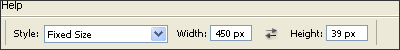
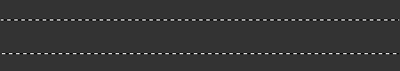
After doing this you should get a rectangular selection like this:
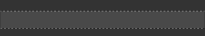
Just by chance my selection is in the middle you may need to move your selection so it is in the middle like mine. After you have centered your selection right click within it (Still have the rectangular marquee tool selected) and click fill. Fill in the selection with the colour #494949. Once you have done that your selection should look like this:
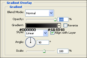
Deselect the selection by clicking anywhere that's not in the selection area, make sure style back from Fixed Size to Normal and right click on the layer that is the square bar in your layers panel and click Blending Options. Tick the Gradient Overlay box and apply these settings:
Click OK and your selection should look like this now:

Right click on the layer again and again select Blending Options. This time tick the stroke box and apply these settings:
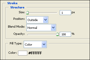
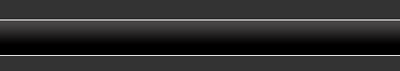
After you have applied these settings click OK and your selection should look like this:
Step 3: Add the gloss
One last thing we need to do to this base layer which will be the navigation background is make it glossy. So make a new layer and grab the Rectangular Marquee tool and change the style to Fixed Size like we did at the beginning of this tutorial and make the dimensions 450 x 20. You should now have a second selection similar to the navigation base. Position the selection like so:
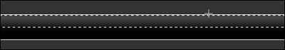
Right click within the selection and select fill. Fill in the selection with #FFFFFF and click okay. Change the style back to Normal instead of Fixed Size and deselect the selection. The selection should now be like this:

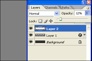
Finally on this layer lower the opacity to about 12% like this:
The selection should now look like this:

Step 4: Create some Nav bar Links
Okay so we've got the background of the Navigation bar sorted now it's time to add in some navigation links and seperator's.
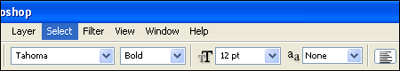
Grab your text tool and change the font settings to Font: Tahoma. Size: 12px. Style: Bold. Anti alliasing Method: None:
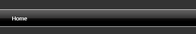
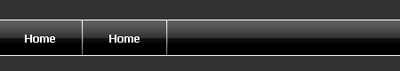
Make sure that the colour of your text is white. (#FFFFFF), then add your first to your nav bar like so:
Step 5: Add in the Separators
Next we need to add in a separator to make it clear which link is which. So grab your line tool and set the weight to 1 px and colour as #FFFFFF then make a line going down like this:
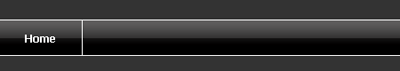
Now the separator looks good right? But I think it could look a little more better. Grab your line tool again keep the weight set at 1px but this time change the colour to #6E6E6E. Once you've set the new colour to that drag another line just next to the previous line you drew. After doing this I got this effect:

Notice that the separator has a slight chrome grayish colour to it now.
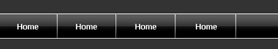
Step 6: Duplicate your Nav Link
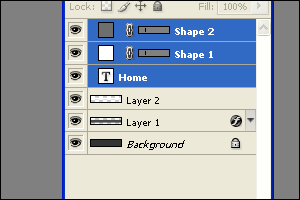
Now we need to duplicate this process so the navigation bar has it's links! Go to your layers panel and highlight the text layer and two line layers you have created like this:
Right click and duplicate the layers and moved them across the navigation bar like this:
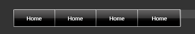
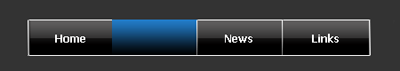
Repeat this process until you reach the end of the navigation bar making sure that each link is equally spaced! Until you get to something like this:
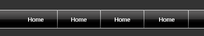
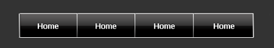
Finally I'm going to center the links. To do this simply highlight all the link text and separator layers all at once and press the right arrow key on your keyboard:
Step 7: Getting rid of the unneeded parts
When you center it you will have a missing separator because we we're using the document has the beginning point for the navigation links. Simply adding a separator and make it equal proportion to the others:
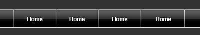
Finally we're going to cut off the end bits on each side because they are not being used and it makes the navigation bar look silly. Get your rubber tool and make sure it's set on a normal eraser not blur. And start erasing the end bits starting with the navigation bar background (The main layer) You will then have to move onto the second selection layer to rub out the glossy part layer. Here's a screenshot of my process of rubbing out the end bits:
Notice that you have to do it layer by layer as the two selection parts we're made on separate layers. Here what I got after all the rubbing out:
Step 8: Customize your Links
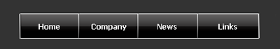
Now you can go ahead and change the link names if you want like this:
Step 9: Colour change
For a final touch I made two of the links a different colour and used a bit of a different gradient than the rest of links if you want to do this then here's how!
I'm going to change the colour of the links Company and Links so first off I'm going to create a new layer above the company text layer and then I'm going to make a neat selection with my rectangular marquee tool over the link area. The style doesn't have to be a Fixed size you can make the measurements yourself.
Make the selection:

Right click within the selection and select fill, fill it in with #FFFFFF and you should end up with this:

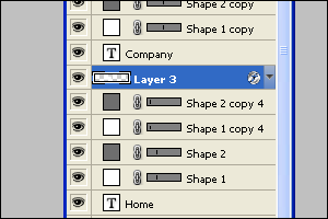
Deselect the selection and right click on the layer which should you created which should also be above the company text layer like this:
Right click on the layer and choose Blending Options. Tick the Gradient Overlay box and apply these settings:
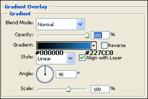
Click OK and your nav bar should look like this:
Now it doesn't quite fit in yet you can't see the text! so move the layer with new colour on down one so it is below the text company text layer
Once you do this your nav bar should look like this:
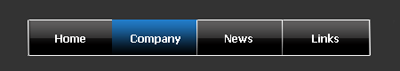
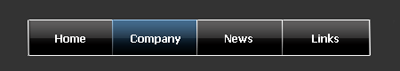
Finally on the colour change layer lower the opacity to 46% and you should get something like this:
Repeat this on the fourth link tab and our final result should be like this!:
The Final Result:
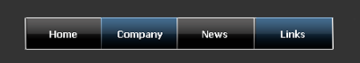
I'm quite a fan of blue you could use your own gradients if you wish!