


 Let's pretend. Let's pretend you asked me to design a Web site for you. Then we also need to pretend, of course, that I said yes, which I would almost never do because freelance clients are usually nuttier than an Almond Joy and about as smart as a bag of hair. I'm speaking generally, of course.
Now pretend I said, "I quit. You can design this site by yourself." Which I'd most likely do, because in this scenario you're the client, and I've already expressed my views about the client.
"Don't worry, though. I'll talk you through it," I say. "Why? Because that's the kind of guy I am."
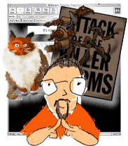
The first thing you need to do is ask yourself a few questions. What is the point of the site? What are your goals? Do you want to show the world pictures of your cat? Are you trying to sell worms through the mail? Are you promoting your new major motion picture? The answer will help you begin to focus your page. As you edit your material, you will quickly see that the picture of your cat has no business on the homepage of your new blockbuster.
 Next question: Who are you, and who's your audience? Are you a 12-year-old girl trying to communicate with other 12-year-old girls? The president of a start-up company trying to get some cash from an investment bank? Hint: Purple and unicorns will work really well for one of these situations.
 Then you've got to answer technology questions. You might have to guess on this one, but you still need to think about it. How will your audience view your page? Will your content appeal to a business crowd accessing the Net on a T1, or is it for the folks at home with 14.4 modems? While considering speed, you should also think about browsers and plug-ins as well. What makes more sense for the purpose of your page? You don't need Shockwave, RealAudio, or Java if you only want to post a picture of your cat. On the other hand, they might be necessary if you want to impress people with fancy-shmancy smoke and mirrors. Remember, Manhattan was purchased for US$24 and some beads.
Now that you've figured out what your site is about, who the viewers are, and what kind of technologies you want to use, it's time to think about hierarchies. Not everyone has a huge monitor, so your most important elements need to be at the top of the page, where viewers will see it immediately. The smallest monitor out there is 640 by 480 pixels, so your design should work on a basic level within those parameters. If one of your goals is to get people to call your 800 number, you better make sure they can see it without scrolling. (Advertisers don't want their banners placed three clicks down for a reason.) Think of that first screen as the front page of a newspaper. Really important stuff goes on the front page, and the most important stuff goes on the top or "above the fold," as newspaper folks say.
Another thing to remember is that people read left to right and top to bottom. They almost always look at the upper-left corner first, which is a good place to put something really important. None of this holds true, of course, if you're Japanese and read top to bottom, right to left, but the point is that it's good to be aware of how your audience's eyes will travel across the page.
When deciding which colors (your palette) you'll use on the site, you need to ask (again with the questions):
- Do the colors you pick work well with the goals of your site?
- Do the colors exist on the 216 universal-color palette?
- In an old browser, will you be able to read black type on the background color you picked?
 Colors are to Web pages what fonts were to desktop publishing in the '80s. People think that just because they have 216 colors, they should use them all. Use a limited palette: A few colors can go a really long way. Be smart about the colors you pick. Don't think in terms of your favorite or least favorite colors. Just make sure they support your message and tell your story.
The other big question with color is readability. The type should sit comfortably on the background color. It's more than an issue of high contrast. White type on a black background is readable, but if you try light grey type on black, the end result is more comfortable to the eye. If you go for a lot of contrast and then back off a bit, you'll probably end up with something subtle that's a little more complex and interesting. Of course, you can never go wrong with black type on a white background. It might not be the flashiest way to go, but it's bulletproof.
 Readability part two: The bigger the type, the easier it is to read; the longer the line length, the more difficult it is to read. As a basic rule of thumb, use the <blockquote> tag or a table to shorten your line length. I'd also think twice about setting body copy in anything smaller than <font size=+1>. After all, you want people to read your writing. Also avoid making entire sentences links. It's cleaner and simpler to link off one word or a short phrase.
Why I love blockquotes, part two: White space is your friend. White space doesn't necessarily need to be white - it can be any color you want, but it should be blank. Eye relief is the concept here. Don't be afraid to leave some space around a GIF. Fat margins around body copy work nicely as well. White space helps the reader's eyes rest on what's important - whether that's an image or words. It helps unclutter your design and focus your concept.
 I'll close with another idea that isn't new or mine. My former boss once said to me, "Keep it simple, stupid." (Hopefully, this wasn't directed at me.) Focus your ideas. Make sure everything on your page has a really good reason for being there. Make sure you spend as much time picking out your images and colors as you spend on your copy. Make sure the level of technology you decide to use works with the overall goals of your page. Keep it simple. Keep it smart.