


Color is the most instantaneous and wonderful means for delivering and communicating messages and meanings to the intended audience. Much of the reaction to color is subtle, triggered by tiny nerve ending and chemicals in the brain, that either excite, sadden, overwhelm or inspire the viewer, when coming in contact with various colors.
Different hues and
saturation levels can convey elegance, creativity and seriousness,
while others convey experience, excitement, vitality and dependability.
Below, you will find some general guidelines on how to go about
conveying your message to the masses, while using something as simple
as color.
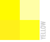 Yellow
is perceived as cheerful and energetic, yet mellow and soft. Just
like the mid summer sunshine, it portrays hope, happy times and used as
a way to grab one's attention.
Yellow
is perceived as cheerful and energetic, yet mellow and soft. Just
like the mid summer sunshine, it portrays hope, happy times and used as
a way to grab one's attention.
Examples:
NY City Taxi Cabs, Arm & Hammer Baking Soda, Kodak Films,
Dummies Books, Nestle Quick Chocolate Milk, and McDonalds.
In nature yellow can be seen on bees, fish, sunflowers and of
course, the sun.
 Orange
is a friendly, vital, inviting, energetic and playful color. Orange is
perhaps the hottest of all colors, which is why almost everyone can
relate to it in some way or another, especially children.
Orange
is a friendly, vital, inviting, energetic and playful color. Orange is
perhaps the hottest of all colors, which is why almost everyone can
relate to it in some way or another, especially children.
Examples:
Sunkist (fruit and soda), KIX cereal, Cingular Wireless,
Nickelodeon, Tide detergent, Jamba Juice and Southwest Airlines.
Other naturally occurring orange colors are goldfish, flowers and
tangerines!
 Red
excites, stimulates and creates arousal. People often think of the
color as daring, dynamic, bold and sexy. In print, red is an aggressive
color, whereas it commands attention and demands action.
Red
excites, stimulates and creates arousal. People often think of the
color as daring, dynamic, bold and sexy. In print, red is an aggressive
color, whereas it commands attention and demands action.
Examples:
Coca-Cola, Staples, Red Cross, Budweiser, CNN and the Chicago Bulls.
Other everyday examples are red sports cars, red dresses, red
lipsticks, red ties as well as red STOP signs.
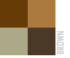 Brown
is the ultimate traditional earth color, associated with substance,
durability and security. It's earthly tones lend perfectly to food and
food related items, even used in restaurants and coffee houses.
Brown
is the ultimate traditional earth color, associated with substance,
durability and security. It's earthly tones lend perfectly to food and
food related items, even used in restaurants and coffee houses.
Examples:
UPS (United Parcel Service), Hersheys Chocolate, Godiva, Baltimore
Orioles, aged and rich beers, coffees, cigars and chocolates. Other
examples are brown leather chairs, furniture and portfolios covers.
 Green
is the color of nature, and everything that goes with it. It has been
described as refreshing, healing, soothing and prestigious (when
associated with money and banks).
Green
is the color of nature, and everything that goes with it. It has been
described as refreshing, healing, soothing and prestigious (when
associated with money and banks).
Examples:
7-Up, Sprite, First Union Bank, Apple Jacks cereal, DoubleMint
gum, Scope mouth wash and GreenPeace. Other examples of soothing green
can be found everywhere in nature, from vegetables to meadows and
forests.
 Blue
is a very stable and dependable color. As with the ocean and sky
that are always constant, blue inspires confidence, commitment and a
sense of serenity and peace.
Blue
is a very stable and dependable color. As with the ocean and sky
that are always constant, blue inspires confidence, commitment and a
sense of serenity and peace.
Examples:
HP, IBM, BMW and Volks Wagon. Many financial institutions, mortgage
brokers and large corporations that are conservative in nature, tend to
use blue. Water bottling companies also use blue to portray freshness.
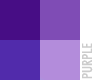 Purple
reflects elegance, sensuality, spirituality and creativity. Purple is
perhaps the most complicated and rare color, hence referred to as a
majestic and royal, fit for kings.
Purple
reflects elegance, sensuality, spirituality and creativity. Purple is
perhaps the most complicated and rare color, hence referred to as a
majestic and royal, fit for kings.
Examples:
This color is representative of rare and sensual products or services,
such as lingerie shops, flower shops, etc. Most businesses are
hesitant to use purple because of its sensual properties.
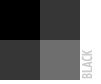 Black
is strong, classic, mysterious and powerful. The most sophisticated
shade of the spectrum, people associated it with style, elegance, and
expensive taste.
Black
is strong, classic, mysterious and powerful. The most sophisticated
shade of the spectrum, people associated it with style, elegance, and
expensive taste.
Examples:
Many designer logos are comprised of simple black lettering or logos.
They include DKNY, Calvin Klein, Rolex, Rolls Royce, Kenneth Cole
and YSL.
Whether you are designing a self promotion piece, or one for a client,
always keep in mind that color can make or break an advertisement
piece, packaging or product or service, if used incorrectly.