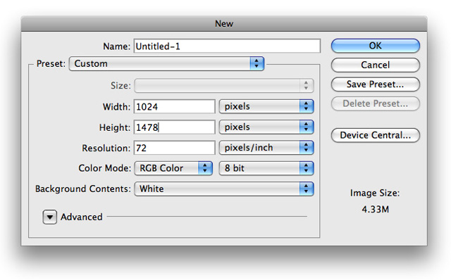
1. The first step we want to make is to create a new document with the dimensions of 1024x 1478 for the purpose of this tutorial.
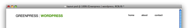
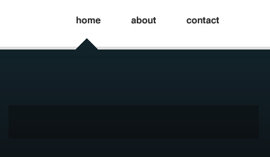
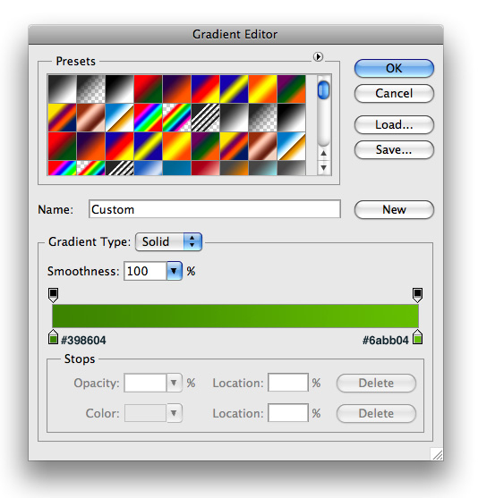
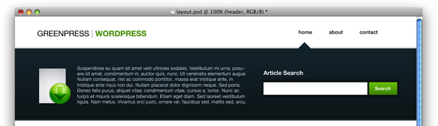
2. Now we want to go ahead and set up our logo and links in the top right. For the logo I used Helvetica with the color #000000 set to Regular, and Anti-Alias set to Crisp. The second half of the logo I used the color #6B9913, with it set to Bold and the Anti-Alias to Crisp. For the links I used the color #323232
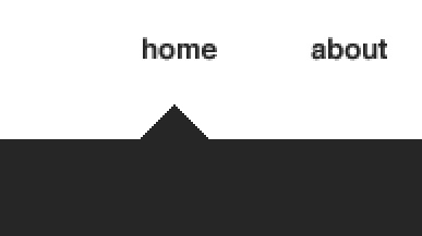
3. Next use your Rectangle Tool with any color to make a rectangle similar to the following
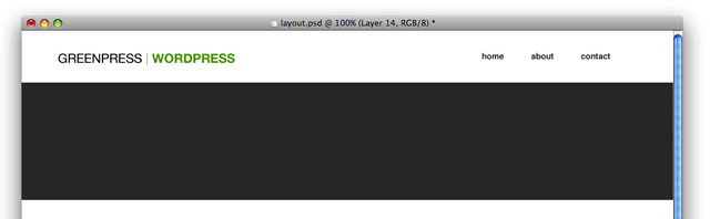
4. Using your Polygonal Lasso Tool make a 'triangular' shape under your home link and fill it with the same color as your rectangle layer, on your rectangle layer.
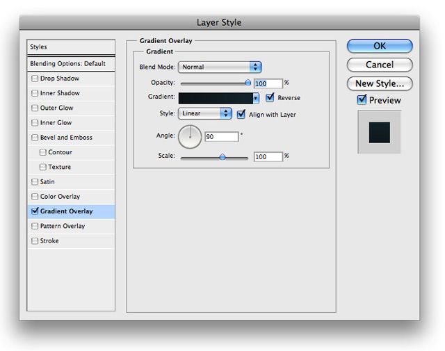
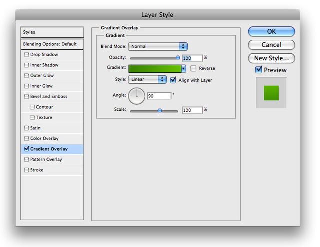
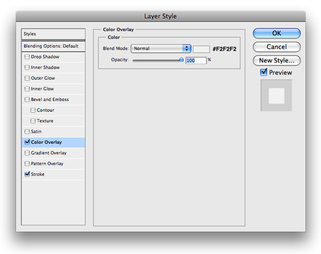
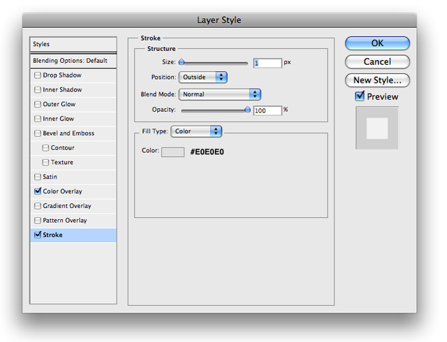
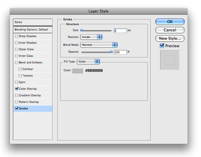
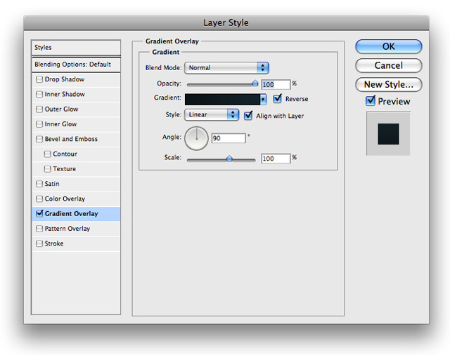
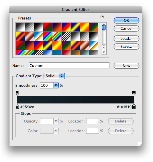
5. Now go ahead and right click your layer and choose blending options from the drop down menu and insert the following

6. On a layer under your newly created rectangle, make a selection similar to the following with your Rectangle Marquee Tool and fill it with #000000
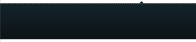
7. Now lower the opacity to 10% and you'll have something that looks very similar to the following
8. At the bottom of your rectangle make a selection similar to the following and fill it with #FFFFFF. Make sure its nudged up a pixel from the bottom

9. Then just go ahead and set its blend mode to Soft Light.
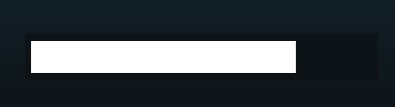
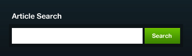
10. Now for a search box. Go ahead and create a new layer and fill it with black in a similar shape to the following and lower the opacity to 28%. This will serve as the housing for our search field.
11. Next go ahead and place a white rectangle inside of it to serve as the search input field. Make sure its own its own layer and fill it with #FFFFFF
12. Then we want to go ahead and make a search button. Using your rectangle marquee tool make a selection similar to the following and fill it with #FFFFFF.
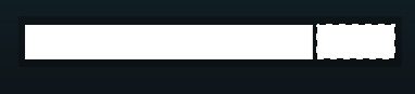
13. Now insert the following blending options onto its layer
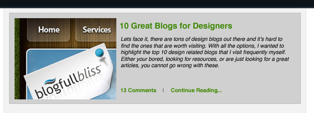
14. Go ahead and add some text similar to the following and you should have something that looks like this
15. To fill up the rest of the banner we can add a summary for what our website does and add a nice icon. You can use the icon that I used by downloading the source files at the end of the tutorial.
16. That's it for the header, so lets go ahead and show how our posts will be displayed. Go ahead and make a rectangle in similar width going down your entire document and fill it with any color (we will be overriding it).
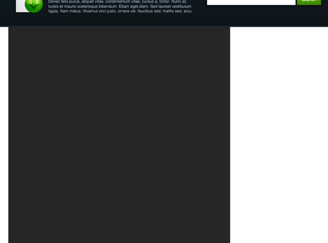
17. Now right click this layer and choose blending options from the drop down menu and insert the following
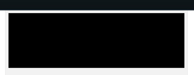
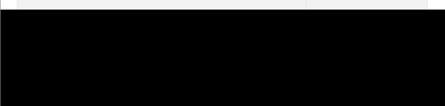
18. Next we want to make a background for each separate post. to do so use your rectangle marquee tool and fill it with #000000 similar to the following
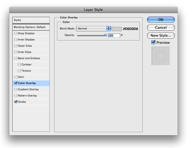
19. Now go ahead and insert the following blending options onto its layer
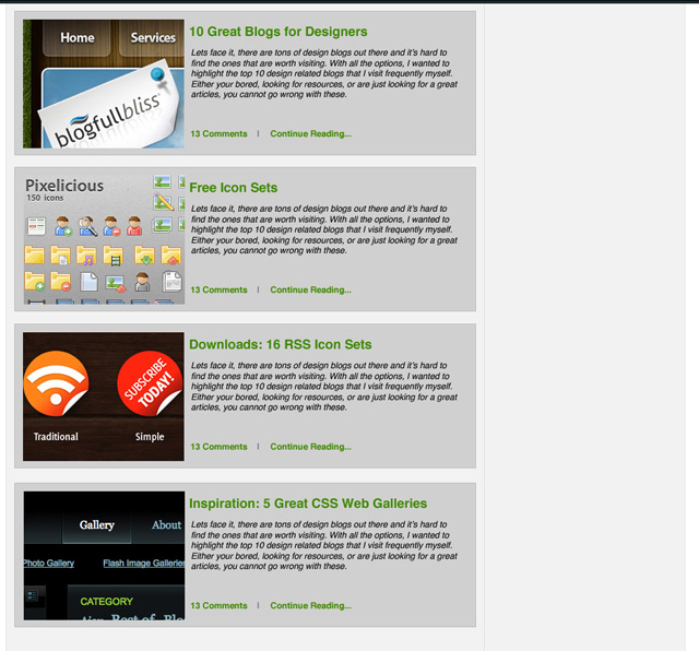
20. Next all you need to do is add some fake content and it will look something like this
And then you can just repeat that for the left side.
21. Now lets move onto our sidebar. We will be doing the same thing as in Step 17, and you'll have something that looks like this for the sidebars background
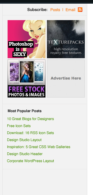
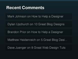
22. Then just add in some fake content like so and you have a sidebar!
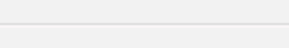
23. For the dividers between content I used #FFFFFF on the bottom, and #E7E7E7 on the top
24. Now its time for the footer. Go ahead and make a selection at the bottom similar to this and fill it with any solid color
25. Now insert the following blending options onto its layer
26. Like the header, we wan to make a selection at the top of the footer and fill it with #FFFFFF. Make sure its own its own layer
27. Then set its layers blend mode to Overlay.
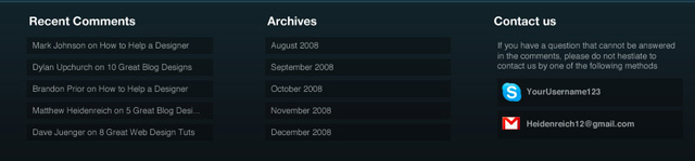
28. Now we want to make sure our footer is pretty simple. For the rectangles, All i did was create a rectangle and lower the opacity to 29%. For the text in the rectangles I used #FFFFFF font and lowered the opacity to 65%. Arrange it like so
29. Now just do something similar for Archives and a little contact area and you should come up with something like the following
30. When it all comes together you should have an end result like this