

If you're fairly new to Photoshop, but know enough and want to start making your images look a little more interesting, then I think this tutorial is for you. I'll be teaching you how to take a rather boring image, and turning it into something much more with just a few simple steps (by adding some basic texture(s) to it).
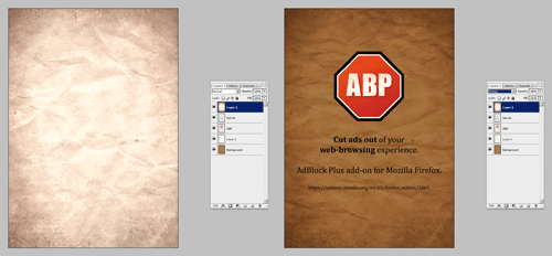
So, we're going to take this simple Illustrator document:

And turn it into something more like this:

Step 1
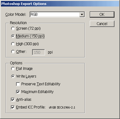
If you have Illustrator, you can go ahead and download the Illustrator source file here and then export it as a PSD file (File > Export). 150 ppi may be best to start off with.
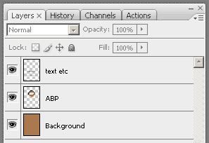
Open up the PSD and make any changes you may want before getting started.
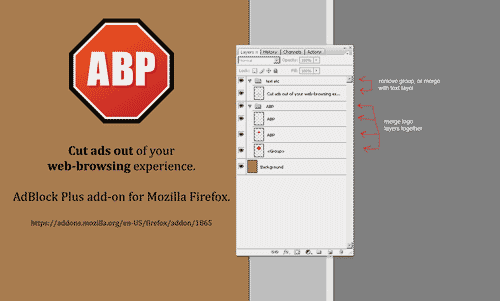
I recommend merging the logo layers together and having the text on a single layer (not inside of a group).
Step 2
Once you're all set with your document that you want to add texture to, you need to find some textures to work with.
For this, we'll be using a very simple paper texture that I scanned in, and some textures from Bittbox.
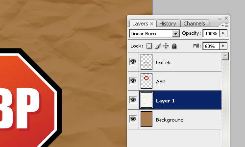
Step 3
Drag the wrinkled paper texture into your document, preferably underneath the text and logo to start with. Now it's time to change the layer mode. Multiply or Linear Burn will probably yield the best result. You may also want to lower the Fill after changing the layer mode.
Step 4
Now you may want to repeat this with a different texture, maybe something with grungy edges.
If the texture you're using is showing more than you want to after changing the layer mode, consider using Levels adjustments (image > adjustments > levels) to lighten or darken it.
Step 5
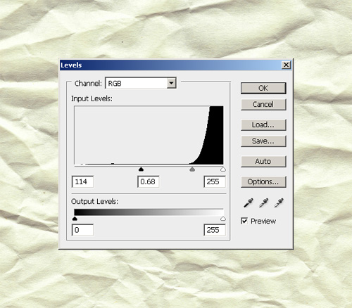
Duplicate your first paper texture, clear the layer effects from it and place it on top of your layers. Bring up the Levels (image > adjustments > levels) and drag the sliders so as to bring out the dark ripples of your texture:
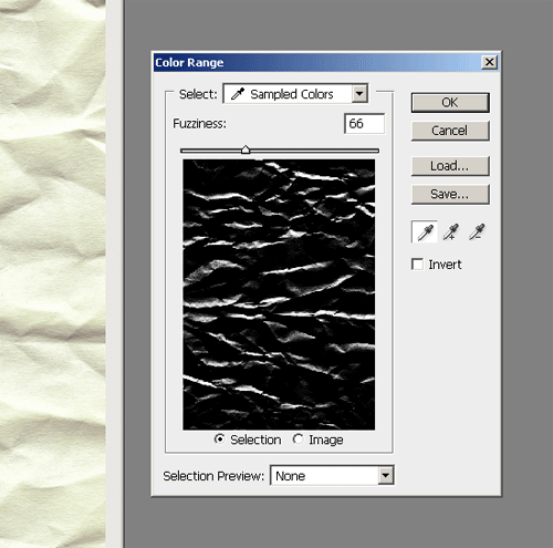
In your Photoshop menus go to Select > Color Range and select the black area of your image. With your selection active, you can either select your logo layer and click the layer mask button at the bottom of the layer's palette, or you can go to Layer > Layer Mask > Reveal Selection. If your layer mask hasn't worked correctly, simply selected the layer mask in your layer's palette and press Ctrl+I on your keyboard. This will have inverted the layer mask.
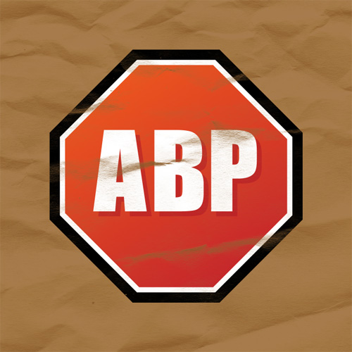
As you can see in the above image, some of the logo has disappeared because of the wrinkled paper. Well, that's what it's supposed to look like! :P
Change the layer mode for your logo layer to Multiply and lower Fill if necessary.
![]()
If you like you can repeat this with the text layer.
Step 6
We are basically finished (as we have given much more character to our very flat poster. If you want to continue adding more and experimenting with different layer modes, then by all means please do! I can also recommend using a levels adjustment layer to tone down the contrast just a little bit.
I hope my short explanation was sufficient!