


Let's start out by creating a new image. I'm setting mine up as follows:
Width: 8 in
Height: 4 in
Resolution: 150
Mode: RGB
Background: White
Since we are basically doubling the 72 dpi, you can view this at 50% and still have a fair rendering of what the full-blown image looks like.
Now that we have our foundation, set the foreground color to Black and the background to a light orange... almost yellow. For this example my background is set to #FF9900.
Type in your text in a new layer and Rasterize the type. Command/Control>Click the layer name to turn your type into a selection. Add Noise at about 30% Gaussian, and apply difference clouds 3 times. Here's my example:

Before we get too gung-ho, duplicate this layer and let's work on a copy.
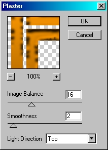
Apply the Photocopy filter (Filter>Sketch>Photocopy) and set the detail to 7 and darkness to 8. Apply the Plaster Filter (Filter>Sketch>Plaster), adjusting the Image Balance to taste. My settings are shown below:
Once satisfied, click OK.
Go to Filter>Render>Lighting Effects. I'm just using the default settings, but you can certainly change the brightness as you see fit.
It's starting to shape up nicely, isn't it? I'm not done yet though. The one problem I have is the depth issue... as it stands it appears someone poured our gold on a piece of plain white paper, and that just won't do. We want these letters to jump off the page, not lay there like a dead trout destined for the frying pan... Oops, guess my mind was wandering again. Did someone say 'Trout'?
Let's go back to the original type layer. Go to Layer Styles, and apply the following Stroke:
Size: 10
Position: Outside:
Blend Mode: Normal
Opacity: 100%
Fill Type: Gradient
Gradient: Black to White
Style: Shape Burst
Create a new layer beneath this one, reselect this layer and merge down. Now go back to layer styles and apply this bevel:
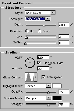
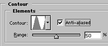
...and this Bevel Contour:
You should have something resembling this:

We're getting there now. I still want a bit more depth; so create a new layer beneath this one. Select this layer and merge down (Command/Control+E), then duplicate the layer.
No select the bottom most type layer, click the selection tool, and with the arrow keys move the type Left+2 clicks and Up+1 click. Duplicate again, select the bottom most type layer, and move it again. Repeat this process until you are happy with the thickness of the lettering.

The edges look pretty dull, so let's spice them up a bit. We are working with metal after all, and we want this puppy to shine!
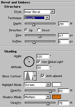
Starting with the first layer we moved, begin merging down until you have 3 layers and the background layer. To the bottom type layer... this should be the one with all the merged layers... apply the bevel/emboss in the Layer Styles with these settings:
Now just dress it up with some sparkles using the paintbrush or what ever. You may also want to place a shadow behind it to really dress it up. Here's my finished product:

 Al Ward, a certified Photoshop Addict and Webmaster of Action FX Photoshop Resources (