


What you see is not always what you get at least with the standard screen sizes. Many new web designers will assume that if they are designing for an 800x600 screen that their web page tables should be 800 pixels wide. If you tried it, and you have to horizontally scroll to read your page content, I'm sure you were pretty frustrated. Don't worry, it has happened to all of us.
A good rule to follow is to subtract 30 pixels from the width of your table to accommodate the screen size.
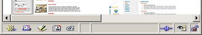
Horizontal bar example
Example:
800x600 Screen = Table Width 7701024x768 Screen = Table Width 994
Note: If all four margins (top, left, right, and bottom) are set to 0, substract 25 from the width and 150 from the height of your table . So, the max width and page fold would be:
- 800x600: 775px; Page fold: 450px
- 1024x768: 999px; Page fold: 618px
Above, I showed only two resolutions because you should never design your website for resolutions higher then 1024x768. The majority of users today use either 1024x768 or 800x600 resolutions. If you design for resolutions higher then this, you can guarantee that almost all of your users will have to deal with ugly horizontal scroll bars.
Learn how to design for all screen resolutions.
That's it!