

The Character palette can be shown and hidden through the Window menu or a button in the Options Bar when a type tool is active. The palette replicates many of the fields and options available in the Options Bar for type tools. Unlike the type-related fields in the Options Bar, the Character palette is also available when a non-type tool is active.
Remember that while you're in the process of adding type, you can show and hide the Character and paragraph palettes by pressing Command-T (Mac) or Control-T (Windows).
The Character palette can be used in several ways:
• It can be used without any type in the image to establish presets for the type tools. This will affect all type that will later be entered until such time as additional changes are made in the Character palette or the Options Bar.
• With a type layer active in the Layers palette but no type selected in the image, changes can be made to the entire layer. These changes affect all type on the layer, but only type on that layer. The changes remain in effect in the Character palette and Options Bar.
• When some type on a type layer is selected with a type tool, changes can be made to that portion of the type without affecting the rest of the type layer. Such changes affect only the selected type, and remain in effect.
• If a type tool is active and in use, the Character palette can be used to set the characteristics of type that has not yet been entered. All type entered from that point on has the new characteristics, but previously entered type is unaffected.
There are 12 fields and eight style buttons in the Character palette. (The eight buttons are duplicated by commands in the palette's menu.) You can navigate among the fields in the Character palette with the Tab key. Tab will advance to the next field, Shift-Tab returns to the previous. Note that this works even with the Font Family (name) and Font Style fields. In these fields, you can type the first letter of an entry in the pop-up list to jump to it. (In the Style field, you can only jump to styles available for that font. If you type I for italic and the current font doesn't offer italic, you'll hear an error tone.)
From the top, left to right, the Character palette fields and buttons are:
• Font Family: This pop-up menu includes a list of all fonts available to Photoshop on your system. Font families include Helvetica, Times New Roman, Arial, and so on. All properly-installed TrueType, Type 1, and OpenType fonts should appear. This menu selects only the font family.
• Font Style: This pop-up menu will show the font styles and weights built into the font itself. The options may include Regular or Roman, Bold, Italic, Semibold, Condensed, Expanded, and combinations of those options, such as Semibold Italic. Some fonts are designed at a single weight and style, in which case the menu's arrow will be grayed out. Such fonts include Stencil and Techno.
• Font size: The font size field determines how large the font will appear in the image. In addition to the preset values in the pop-up menu, you can type any size between one-tenth of a point and 1296 points. By default, Photoshop uses points as the unit of measure for font size. One point is equal to 1/72 inch. You can change the unit in Photoshop's Preferences. In addition, you can type any unit of measure directly into the field. For example, typing 28 px makes the font size 28 pixels. The other available abbreviations are in (inches), cm (centimeters), pica (picas), and pt (points). Fractional values can be entered as decimals.
TIP: For really large projects, you can work around Photoshop's font size limitation. Enter the text at 1296 points. Use Edit, Transform, Scale. Make the type larger than you need. You can now return to the Font Size field and enter any point size up to the scaled size.
• Leading: Pronounced like the metal rather than the verb "to lead," this measurement determines the distance between lines of type. Like size, it is normally set in points but you can enter values in any unit of measure. The pop-up menu defaults to Auto, which sets the leading at 120% of the font size (although this can be changed in the Justification dialog box opened through the Paragraph palette's menu). You'll find that the values in the pop-up menu mirror those of the Font Size pop-up menu. Remember that leading is based on the tallest character in a line.
• Kerning: Kerning is the space between a pair of characters. It affects only those two adjoining characters. Each font is designed with specific kerning for various pairs of characters, applied with the default setting of Metrics, but you can fine-tune the appearance of type with judicious use of kerning. Kerning is especially valuable when letters of different font size adjoin.
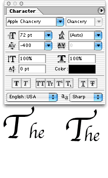
To adjust kerning, select a Type tool and click between the letters that need adjustment. Use the pop-up menu or enter a numeric value in the Kerning field. Return or Enter will commit the change. If you change you mind while still in the numeric field, you can use Command-Z (Mac) or Control-Z (Windows) to undo or simply hit Escape to cancel. Kerning is measured in 1/1000 em, a unit of measured based on the particular font's size. One em in a 24-point font is equal to 24 points.
• Tracking: While kerning sets the distance between two letters, tracking adjusts the spacing among a group of selected letters. Tracking is measured like kerning. It can also be applied to an entire type layer by selecting the layer in the layers palette and then making the change. When tracking is adjusted for a group of letters in a selection, the first letter doesn't move. All selected letters beyond it (by default, to the right) will shift to meet the adjustment. Consider tracking to be the addition or reduction of space to the right of selected characters.
TIP: Reducing the tracking can be an excellent way of squeezing type into a space that's just a little too small. Whether paragraph or point type, tightening the tracking can be far preferable to scaling or resizing the type.
• Vertical Scale: Because Photoshop's type is vector based, you can scale it without loss of quality. The Character palette allows you to adjust the height of selected characters from 0% (invisible) to 1000%. The font's default appearance is always 100%. You can apply vertical scaling to selected type or to an entire type layer. Keep in mind that this scaling is independent of the menu command Edit, Transform, Scale. The Character palette will still show 100% after a scale transformation.
• Horizontal Scale: Useful for simulating expanded or compressed font styles, horizontal scaling can be adjusted from 0% to 1000%. When used proportionally with vertical scaling, the effect is comparable to changing the font size.
• Baseline Shift: The baseline is the imaginary line upon which most letters in a font rest. (Some letters, of course, extend well below the baseline, such as g, j, p, q, and y; others may extend slightly below the baseline, such as e and o in some fonts.) Shifting a letter above the baseline creates superscript, shifting below the baseline produces subscript. True superscript and subscript are typically smaller than the other characters in the text. (You can use the Superscript and Subscript style buttons).
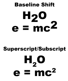
Shifting the baseline changes the position of the character(s) without changing the size. Baseline shift can be adjusted using Option-Shift (Mac) or Alt-Shift (Windows) with the up and down arrow keys. Adding the Command (Mac) or Control (Windows) key changes the increment from 2 points to 10 points.
• Text Color: The swatch in the Character palette indicates the current type color. Click it to open the Color Picker. Remember that Photoshop allows multiple colors in a single type layer. Each letter can be a different color, if so desired. Use a type to select text to change, or select an type layer in the layers palette to apply the change to the entire layer.
• Style Buttons: From the left, the buttons are Faux Bold, Faux Italic, All Caps, Small Caps, Superscript, Subscript, Underline, and Strikethrough. When the selected font offers a bold weight or an italic style, it's definitely preferable to choose it from the Font Style pop-up menu that to apply the faux style. On the flip side, using Photoshop's Superscript and Subscript buttons is usually easier than working with Baseline Shift and then scaling the character. Remember, too, that Photoshop will not allow you to warp type to which faux bold has been applied.
• Language: This pop-up menu selects the dictionary to use for spell checking and for hyphenation (paragraph type only). All available dictionaries will be listed. Photoshop allows you to mix languages on a type layer. Select a words or words with a type tool and select a language from the pop-up menu.
• Anti-Aliasing: You have the option of applying
one of four types of anti-aliasing to selected type or a type
layer, or having no anti-aliasing applied.
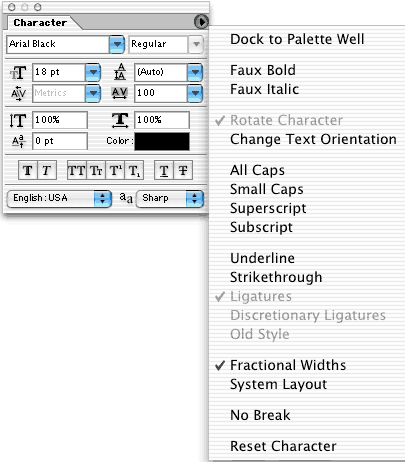
The Character palette menu offers a few additional options. Ligatures,
which are certain letter combinations combined into a single character,
and "old style" numbers must be built into a font to
be available.
 Pete
Bauer is the Help Desk Director for NAPP, as well
as a Contributing Writer for Photoshop User and Mac Design
magazines. His books include "Special Edition Using
Adobe Photoshop 7" (with Jeff Foster), "Special
Edition Using Adobe Illustrator 10," "Sams Teach
Yourself Adobe Illustrator 10 in 24 Hours" (with Mordy
Golding), and "Special Edition Using Adobe Illustrator
9." Pete writes documentation for a variety of computer
graphics related products, as well as testing software
for a number of companies. As a computer graphics efficiency
consultant, Pete specializes in customized training programs.
He is based in Columbus, Ohio, and can be contacted via
Pete
Bauer is the Help Desk Director for NAPP, as well
as a Contributing Writer for Photoshop User and Mac Design
magazines. His books include "Special Edition Using
Adobe Photoshop 7" (with Jeff Foster), "Special
Edition Using Adobe Illustrator 10," "Sams Teach
Yourself Adobe Illustrator 10 in 24 Hours" (with Mordy
Golding), and "Special Edition Using Adobe Illustrator
9." Pete writes documentation for a variety of computer
graphics related products, as well as testing software
for a number of companies. As a computer graphics efficiency
consultant, Pete specializes in customized training programs.
He is based in Columbus, Ohio, and can be contacted via