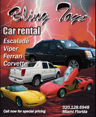
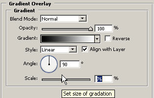
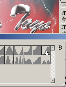
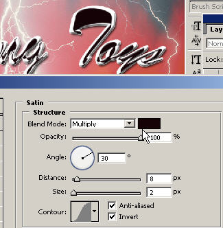
Since I was recording this tutorial from scratch and on the fly, I'm just exercising my options here to come up with a nice, glossy text effect; something that looks like a logo on top of a fancy car.
Add some more typography. You'll want to have at least two different fonts going on. This is to balance out the design.
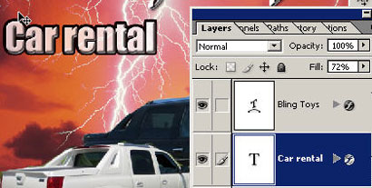
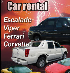
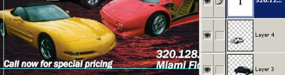
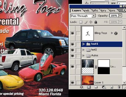
The logo has its own special thing (er bling) going on so we want to leave that alone and create something a little more legible that says the contact information and states the purpose of the ad/design. 'Car Rental' states the purpose of the ad (in case they just thought it was cars flying above the ocean).
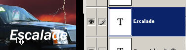
Create another legible text layer. You can use a smaller version of the same font of use another one but you don't want to go over 3 different fonts in a single page ad...just make sure you're using them all so they work together.
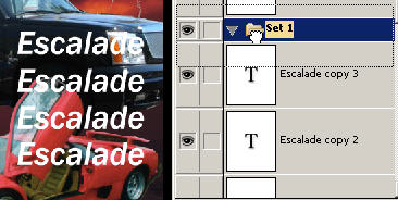
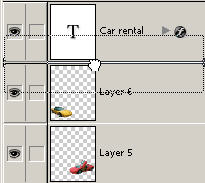
Create duplicate layers by dragging the layer to the new layer icon in the layers palette and create a layer set and drag these layers in for organization. You can now move the layer set around where you want to.
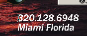
Add some contact information in a text layer. This will always appear smaller and usually at the bottom of the ad. You want to make sure you convey the important information that you or your client requests.
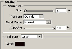
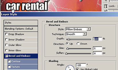
Remember that with each layer or text layer you can add its own independent layer effects.
If needed you can change the order of the layers, in this case I'm doing it because the text layer was partially hidden beneath the corvette so now I'm putting the layer on top of the corvette in the L palette.
If you want, feel free to View: Rulers and drag in some guidelines to line up your text.
That's about it. Close the folders so you have a clean layers palette. With the moVe tool you can now nudge layer sets up which I did in this case because they were too close tot he bottom. Remember you can move any of these layers and layer sets to where you want in the document.
This design works for several reasons: You've got
lots of expensive automobiles, lightning to create excitement and
electricity, some glossy logo text, complementary typography that
states the purpose. and the nice sunset that lets potential
customers and viewers think like they're in Miami at the end of a
day with a sunburn and entering the nightlife.
But now you should be able to expand your skillz into new areas with
what you have learned in this tutorial. There's a lot of
fundamentals going on here but so is a lot of graphic design. Going
through this, you should understand the bigger picture of how
different tools and techniques relate and the possibilities of how
you can piece them together for a specific purpose in a genre of
design or your intended vision. If you'd like a masterful
level of design training and tons of other
advertising design
secrets then go
here.