


This is a button tutorial on how to make a cool clan Website style line of buttons, like the ones that you see on professional counter-strike clan website, or other such gaming sites. this tutorial was made in Photoshop CS2 but will also work with other versions.

Now to start it off, go to file->new and create a new image with the size, 80 pixels x 35 pixels. you can use a different size if you want, but this is the size I will be using. After creating it, use the paint bucket tool (G) and fill the layer with the color black. Your button should now look like this:

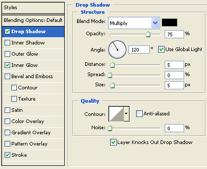
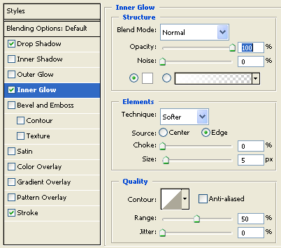
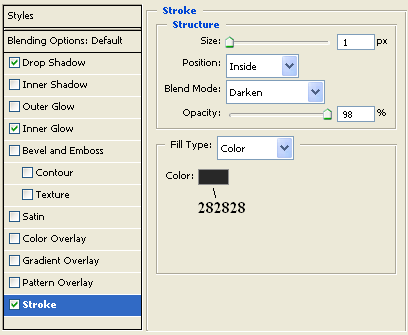
Next were going to be adding some effects to our background layer. Right click on your layer and go to “Blending Options” and make them the same as the settings below
now after those settings we should have a button background like below, with a nice shadow background:

the next step is adding a nice shine to our button. Adding a shine is fairly simple.
First: Create a new transparent layer and place it above your background layer. Then use the “Rectangular marquee tool (M)”, and select a nice 3/4ish of the upper part of our rectangle, like so:

second: use your “Paint Bucket Tool (G)” and fill the selected area with white. so now you should have something that looks like the following:

now you can deselect the white area by clicking “CTRL+D”.
Third: Now in order to make the shine complete were going to change the opacity on the white area above the background of the button. To add a nice passive shine i used an opacity setting of “15%” (*note* You may want to adjust this based on the size and color of your background). After changing the opacity setting, you should have something like this:

Now that all the somewhat hard stuff is done, were almost done. The main thing left is adding some text to our button. Since my button is fairly small, I decided to use the font, “BankGothic Md BT” (a default font, nothing special), with size set to “18 PT” and the anti-aliasing method set to “Crisp”. So now we should have some basic looking text like this:

That is basically it for the button part, i decided to give it some depth by add a Drop Shadow (Blending Option) to it with the default settings, although it doesn't change it much, it adds a very slight difference if you look closely.
Now if you are making more than 1 button, i will show you a neat way of putting them together that makes a nice line in-between them.
Okay, basically take 2 or more buttons that you made (ill show how to do it with 2, for simplicity purposes) and put them side by side, but NOT overlapping.
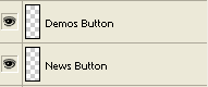
Now although this looks fairly good on its own (without altering), a neat trick is to click on the layer of the button on the right and to move its layer so that its above the button that is on the left, like below:
The next step is fairly simple. Just use your keyboard and click the <- arrow twice, to move the “demos” button 2 pixels over the news button.
Next I will show you how to make a really simple Rollover version of your button, its pretty similar to adding a shine to the button.
Create a new layer over all the other layers of your button (Basically have this layer at the top) and then using the “Paint Bucket Tool (G)” fill this layer with the color, (or shade i guess heh) white. After this your button should have gone completely white if this layer was properly at the top.
The final step is to change this layers opacity setting to about 20%. This should give your button what looks like a grey film over it, obviously letting the user know that their curser is over this button, as compared to the others.
My button in rollover form came out like this:
Compared to: