Step 1 Most of the people reading this tutorial will never run a business where a real logo is required. Not because we can't, but because we are technilogically inclined; in other words our businesses will be on-line because we see the potential. With a totally on-line business, the guidelines for logos are less strict. However there will come a point in your career that you need to create a real logo for a real company.
Step 2 Let's look at some real-world business logos. Although these companies may have strong internet presences, they are primarily run in the real world, selling real products (with the exception of Yahoo). It's always a good idea to look at successful business strategies when modeling your own business strategy, and the logo is no exception. Take a look.
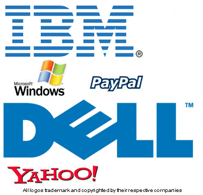
Step 3 What do you notice about all these logos? First of all most of them use only 1 or 2 colors! This is severely limiting, but there is a reason. Why you ask? Because in order to trademark a logo, the logo has to be easily recognizable in black and white, and easily distinguished on printed letterhead. For this reason, the most successful logos consist of only 1 or 2 colors, and are usually just transformations of text, or even just a specific font and word. Very simple.
Step 4 You can see what I'm talking about looking at the real world logos above. IBM's logo is only the letters IBM in bold blue with semi scan lines. PayPal is simply the outline of the word PayPal in a specific font, in a specific color blue. Dell is just the word Dell with the E tilted. Pay attention to big name logos and you will quickly find that the most successful logos are not fancy; they are simple, and easy to recognize. This brings us to the next point.
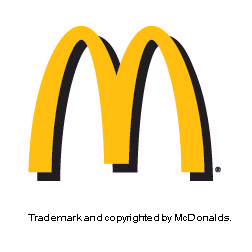
Step 5 Logos must make a customer think of your company at only a glance. Therefore it must be simple enough to take in the entire logo with only a fraction of a second of looking at it. Think of McDonalds, every time you see the 'golden arches' (a big yellow M right? how hard is that?) you know that it's McDonalds. The primary purpose of a logo is to have something that is first of all unique (you'll never confuse McDonalds logo with Burger King's for instance) and second of all easily recognizable. Lastly a logo has to be distinguishable on black and white, and in paper print. These are the main points to consider when designing a logo.
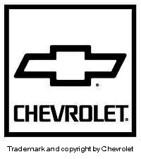
Step 6 If you look around you'll notice that most sucessful logos are simple text with maybe a twist or two. But that's not always the case. You'll often times find a symbol and/or text. However the symbols also follow the same rules. 1 or 2 colors, easy to distinguish, and very simple. Think of Chevy Trucks, it's a funky long sided cross. Even though in a lot of commercials you'll see the logo dressed up, (maybe looking like chrome, or coming out of a rock) if you look on their letterhead that same cross would be only 1 color and very simple.
Step 7 I realize this was a winded discussion, but from looking at some of the logos I think it needed to be said. If you ever get confused at whether your logo is good, or if it's too much, just compare it with industry standards. Is it comparable to other logos in the same industry? Is it easily recognized? Can it be printed in black and white and still be recognizable? If the answer is yes to all these, then you're on the right track. Here is the one I came up with for kromefx.com: