


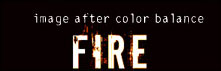
First, begin with any text you want on a black background. I chose the font "downcome" with the size of 60pt.

![]()
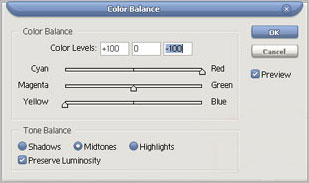
The color balance settings are:
Midtones: 100 red and 100 yellow
Highlights: 50 red and 30 yellow
Shadow: 25 red and 10 yellow
Now we need to make some flames coming from the text. So, create a new layer under your color balance layer and grab the pen tool. Make sure your pen tool settings (at the top) are as followed.
![]()
First click on the top of your letters to create an anchor point with pen. Then click a little above to the side and hold and drag until you have a basic curve. After, holt Alt on your keyboard and click on the newly developed point so you can create a new, fresh point with case.

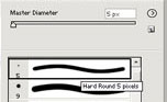
Now, click one more time to create another point and hold and drag until you have a curve that fits nicely with the previous one as well as looks correct. After that is done, click on your brush tool and go to the basic brushes and select a normal brush that is about the same width as the letter you plan to add a flame to. I chose a 5 pixel brush.
Once you have your brush size, go back to the pen tool and right click on the path and go to stroke path. You will see the curve on your image now.
Now, position you curved line so it looks like it is realistically coming off of the letter. (If it is top big, scale it so it fits better).
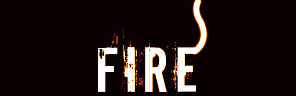
As you can see, I have positioned my curve so it looks as though it is part of the "E". But that doesn't look like fire to me, so now we need to add a neat effect to bring out the color.
To start out, we need to create a layer mask. Click on the little box with a white circle in it to create one on your curved line layer.
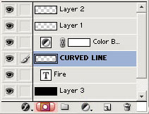
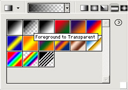
After, select your gradient tool and set the mode to foreground to transparent with a black foreground.
Now carefully make a few gradients at the edge of your curved line on the layer mask. You will see the edge begin to fade out and look a lot more realistic. If you make a mistake with the gradient, undo and try again. Just make sure you have the layer mask on your curved line and that you are working on your curved line.
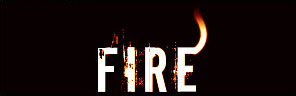
As you can see, it looks like the fire is coming off of the text.
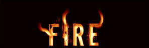
Now, all you need to do is add a few more flames to your other letters or branch some more off of the same letter to give it even a more firely feel. If the colors do not look very accurate to fire, try to create another color balance layer to fix the colors, if not, delete the old one and create a whole new one. Also, just have fun and play around. Maybe a blue or green color balance layer would make a neat blue fire look. Well, after a few experiments, layer styles etc I came up with this fire text. It's not the best obviously but I bet you guys could come up with something cool as well.
I hope you enjoyed reading this tutorial and I also hope you learned not only about making a nifty fire effect on text, but about things such as the pen tool and a layer mask. Thank you.