The Color palette (Window menu > Color) is the color mixing palette of Adobe InDesign. It allows you to create colors using color sliders or by clicking in a color spectrum. Once you create a new color, the Color palette's job is done. If you don't save the color, it may disappear as soon as you select another object, never to be seen again.
So, it's an excellent idea to save your colors for future use. That's where the Swatches palette comes in. It's your color storage palette. In the following tutorial, I will discuss some of the many ways you can bring 'lotsa Swatche' into your Swatches palette.
STEP 1 There's More than One Way to Swatch a Color from the Color Palette.
There seems to be a solid correlation between the importance of a particular InDesign feature and the number of ways that you are given to implement it. With this in mind, saving your newly mixed colors from the Color palette as Swatches must be extremely important.
I found five simple ways to add Colors from the Color palette to the Swatches palette (Window > Swatches), as follows:
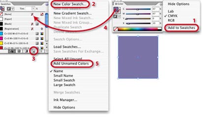
1. Under the Options menu of the Color palette, choose “Add to Swatches.”
2. Select “New Swatch” under the Options menu of the Swatches palette.
3. Click the “New Swatch” button at the bottom of the Swatches palette. Option-Click (Alt-Click on PC) to name the Swatch in a dialog window.
4. The “Illustrator” way – Click and Drag your new Color from the Color palette to the Swatches palette (releasing the mouse when a hand icon with a “+” appears).
5. And in case you forget to make Swatches, you can add all Colors that you’ve been using by going to the Swatches palette Options menu and selecting “Add Unnamed Colors.”
STEP 2 Can You Spot the Spot Colors?
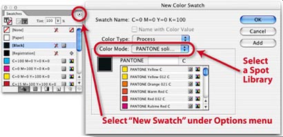
If you ask people who use Illustrator and are new to InDesign how to add Spot PMS Colors to the Swatches palette, they’ll probably look in the Options “fly out” menu for “Open Swatch Libraries > Pantone Solid Coated.” A lot of features in InDesign are very much like Illustrator, but not this one.
To find the hidden Spot Colors, go to the Options menu of the Swatches palette and select “New Color Swatch.” Then, in the window that opens, locate the Spot Color Library that you’d like to use, select the Color that you’d like to open and press OK. If you’d like to add more than one Spot Color, press “Add” after selecting each one, and OK when you’re done.
STEP 3 Creating and Adding Gradients.
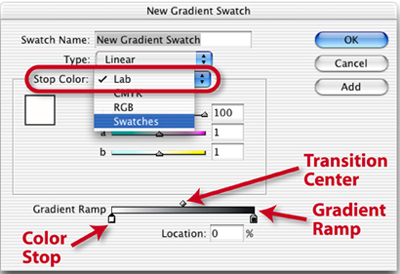
Once you’ve seen the choices under the Options menu of the Swatches palette, you begin to realize that every kind of Swatch you would like to add to your palette can be accessed here. (You can even “Load Swatches” from an existing layout.) If you choose “New Gradient Swatch” from the Options menu a dialog window opens:
Click to select a Color Stop at the bottom of the Gradient Ramp, and choose a Color for that Stop from existing Swatches, RGB, CMYK, or Lab colors. You can add more Color Stops simply by clicking anywhere under the Gradient Ramp. Adjust the center point of the color transition between two Stops by moving the diamond Transition Center to the left or right along the Gradient Ramp. Choose the kind of Gradient under “Type” – either Linear or Radial. To finish, name the Gradient Swatch and click OK. Or click “Add” if you’d like to create and add more Gradients.
STEP 4 Creating Gradients the Good Old Illustrator Way.
If you’re a big Adobe Illustrator fan, you probably would like to create Gradient Swatches the same way you’re accustomed to doing it in Illustrator. No problem!
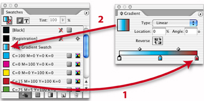
Start by opening the Gradient palette (Window menu > Gradient) and under its Options menu, choose Show Options. Then select any object and click on the Gradient Fill square in the upper left part of the palette. This will fill your object with the Default White to Black Gradient. Then, like in Illustrator, you can click and drag Swatches (1) to the Color Stops below the Gradient Ramp to change the Colors of the various Stops. Or you can also drag Swatches to an empty section below the Gradient Ramp to create new Color Stops. When you’re happy with your new Gradient, you can click, drag and drop the Gradient Fill square from the Gradient palette to the Swatches palette (2) and the Gradient will be added as a Swatch. To name the Swatch, just double click on its Swatch listing and type in the name in the window that opens and click OK.
STEP 5 A Swatch of Another Tint.
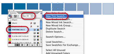
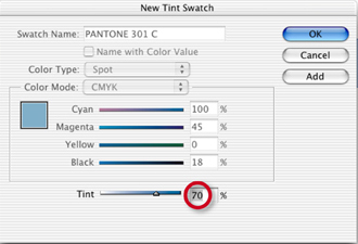
If you’re using Tints of a Swatch Color, why waste time applying the Swatch and then tinting it in the Tint section of the Swatches palette? Make a Tint Swatch instead.
Simply select a Swatch, choose a Tint percentage and go to the palette’s Option menu and choose New Tint Swatch. When the window opens, click OK and the Tint Swatch is added to the palette. You could also select a Swatch without tinting it, go to the palette’s Option menu, choose New Tint Swatch, select your Tint Percentage in the window that opens and click Add to create a number of Tint Swatches at once.
STEP 6 Making the Most of Two Colors.
There’s nothing harder to do well in print than an exciting two-color job. Many times, even an exceptional design just seems to be lacking something – like a greater variety of color.
Mixed Ink Swatches to the rescue! Mixed Ink Swatches and Mixed Ink Groups allow to create Swatches that contain different percentages of one or more Process Colors (Cyan, Magenta, Yellow, Black) and one or more Spot colors.
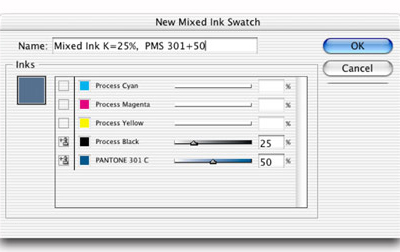
Let’s start with a Mixed Ink Swatch. To keep this simple, I’m going to use Pantone 301 C and Black. After adding PMS 301 to the Swatches palette, go to the Swatches Option menu and choose “New Mixed Ink Swatch” to open an options window. Then click on the boxes to the left of Process Black and Pantone 301 C to select them, choose a percentage for each, Name the Swatch, and click OK. That was easy!
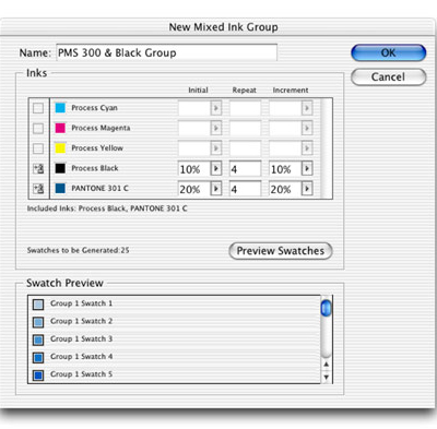
Mixed Ink Groups do exactly the same thing but on a bigger scale, creating lots of new Swatches at one time. To create a Mixed Ink Group, go the Options menu of the Swatches palette and select Mixed Ink Group. In the Window that opens, we are going to set up 25 Swatches each containing PMS 301 C and Black in different percentages.
To start, select Process Black and PMS 301 C.
Next, choose an Initial Percentage for each Color. In my Initial Swatch, Process Black = 10% and PMS 301 = 20%.
Then figure out how many total Swatches you’d like to create. I chose 25 – a total of five percentages of each color. The Initial percent plus four Repeats of each Color.
Because I’d like to create Swatches that are more towards a brighter blue rather than darker grays, I chose an incremental increase of only 10% for Black but 20% for PMS 301.
If you click the Preview Swatches button, you can take a look at all 25 Swatches, to see if your satisfied before clicking OK.
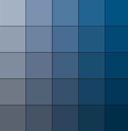
These are the 25 Swatches that were created as part of our Mixed Ink Group – an amazing variety of rich color Swatches that will bring a lot more visual excitement to a two color job.
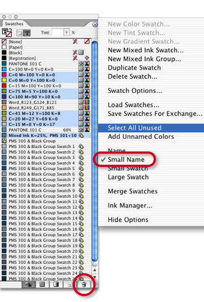
STEP 7 Now That We Have Lots Swatches It’s Time to Tidy Up.
In the beginning of a project, when you’re trying to decide on a color scheme, it’s great having a large variety of Swatches from which to choose. But as you progress and you’ve decided exactly which colors you will be using, having so many Swatches can be just too much of a good thing.
You could select “Small Name” from the Swatches palette’s Option menu, which can bring a large number of Swatches down to size. But if you still find yourself scrolling endlessly through unused Swatches, it’s time to tidy up a bit by getting rid of all those extra Swatches that you know you’ll never use.
Go to the palette’s Option menu and choose “Select All Unused” and all Swatches not currently in use will be selected. If there are some Swatches selected that you’re just not ready to part with, deselect them by Command clicking on them (Control-click on PC). Now you’re ready to clean house. Just click the Trash button at the bottom of the palette and you’re done. Taking out the trash has never been easier!