


1. First, create a new document (700x600), fill it with dark grey:

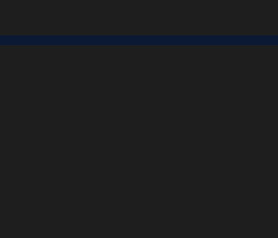
2. Create a new layer, make a selection like shown below, and fill it with a dark blue:
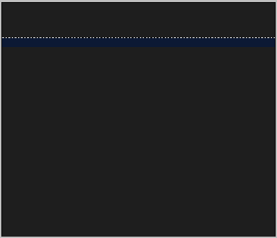
3. Create a selection over your blue bar so it covers the top part of it only:
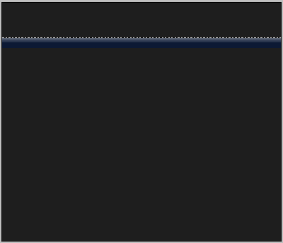
4. Using the gradient tool, select the foreground to transparent preset, and select white as your foreground. Now fill in your selection with the gradient tool on a new layer:

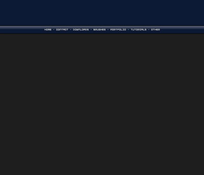
5. This gives our blue bar kind of a glossy effect. This will be our horizontal navigation menu. Using the magic wand tool, select everything above the bar:
6. Create a new layer. Fill the selection with your dark blue color.

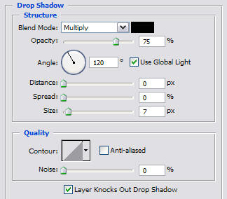
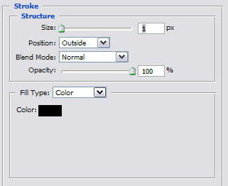
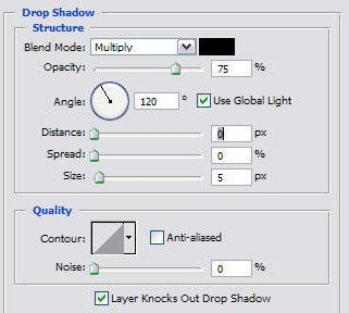
7. In the blending options of your navigation bar, add a drop shadow with these settings:
and a stroke with these settings:
8. Using a pixel font, write out your links.
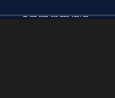
9. Center these inside of your navigation bar. Add a 1px black stroke around them, as well as a dropshadow:
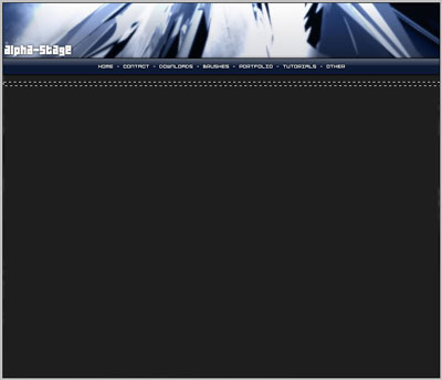
10. We need to work a bit more on that banner. Its up to you what yours looks like. I am going to use a render I have already made and add onto it:

11. Create a rectangle selection like this:
12. And fill it in with a grey slightly lighter than the dark grey background. Next apply a shadow with these settings:
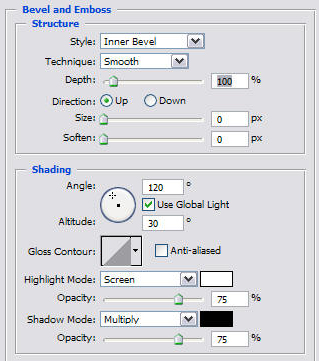
and a bevel like this:
13. Duplicate this layer, and move it down about this far:
14. Create a new layer beneath these two bars, fill the space in between the bars with a light to dark grey gradient:

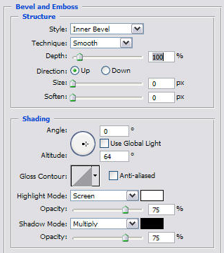
15. Set up a bevel like this in this layer:
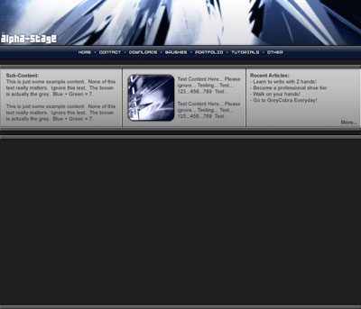
16. Select your single column marquee tool from your tool bar, and make a selection somewhere along your mid layer to give it a good amount of space to the left for a content box. Click Ctrl + X to cut it out. Repeat this so that your layer is cut into thirds:
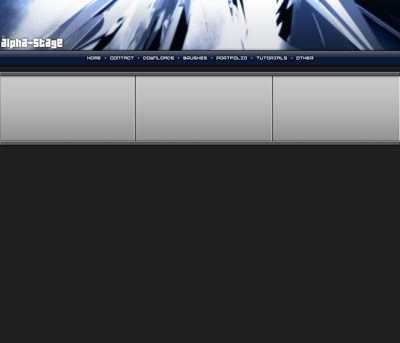
17. I am going to fill these with some test content so I can get a feel of what the final result will look like:

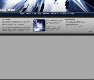
18. Not bad at all! However, this is just a section for sub-content, now we need to make our main content section. Duplicate the layer containing the smaller bars once more, and place them like this:
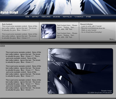
19. Fill in the inside with a plain grey color:
20. Add some content:
And there you have it! Many of these techniques are used when creating sites for hosting services because there are many sub-content boxes up top. Having sub-content boxes placed at the top of your webpage can attract a visitor to content you want them to visit before they get sucked in on the details. By placing something like attractive products at low prices here, can immediately grab hold of the user before they get a chance to close the window, or read something else! Often, designers will use contrasting colors to catch the attention of visitors as well, such as orange and blue. Good Luck!