

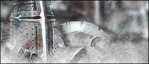
Final Result:
Index:
Part One - Getting Started
Part Two - Render Placement
Part Three - Brushing
Part Four - Blending
Part Five - Colouring In
Part Six - Adding In Things
Part Seven - Text
Part Eight - Border
1. Start off by opening up a new transparent document. Choose your size to suit your style. (I use 300x130)
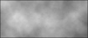
2. Now reset your Colours (Ctrl+D) and go to Filter > Render > Clouds.
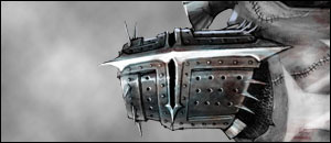
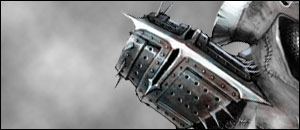
Now before we do anything else, it's time to pick your render (If you know what render you are using than even better) and decide what brushes you are going to choose (some Brushes look better with certain Renders).
Sometimes you can (and most probably will) get a really good grunge feel by using multiple brushes.
There's lots of things you can do with renders other than just placing them splat on the canvas. Experiment with the placement of the render. Maybe even duplicate the render and make it fade away in the background. Who Knows. EXPERIMENT!
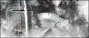
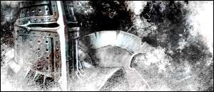
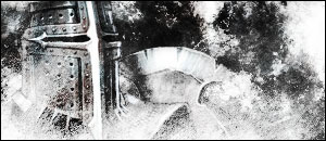
1. Grab your selected render and resize if needs be. Now as I had stated above, experiment with the placing of the render. I'm just going to use a splact on the canvas placement and nudged toward the left side of the canvas.
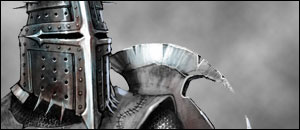
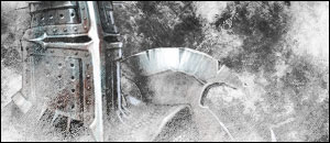
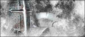
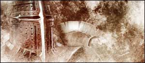
But I will show you experimentation (and weirdness) on placing renders.
It might not be mind buldgingly exciting, but it can make a big difference on the final product.
This Part of making a sig is bad for those who have no good imagination and too much perfect symmetry in their mind.
Good brushing, believe it or not, can just be random dabs on the canvas. Other times you can achieve a good brush over with thinking about it. Well, I'm going to tell you now that brushing can depend alot on both of those techniques, and alot on the render you chose.
But let's start with teaching you how to brush.
1. Grab your best grunge set. Actually, make that your four best grunge sets since we are going to make this pretty grungey.
2. Make a new layer just above the clouded layer. Choose the softest grunge brush and just dab anywhere at random (mind not to drag your brush, or it will look horrible.) Constantly be changing between black and white and making new layers every now and then (also, don't forget to keep the black and white brushes separate).

3. Now choose some slightly harder Grunge Brushes and Apply like you did with the soft ones.
4. Now do the same again, only choosing your two hardest brushes and mix them together.

5. Now that was just mindless dabbing. Now if you want you can add some after brushing. With this type of brushing its probably better to keep to a softer brush again.
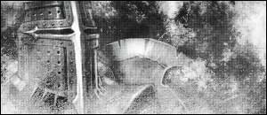
This after brushing can be an effect of mist over a render or surrounding dark effect. Here's what I did with mine.
To get this, I just made a few layers over my render layer and did some brushing and blending option changes.
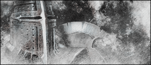
Now, there's loads of different types of ways to blend in renders. I'm going to show one way of doing it, and the most simplest too.
1. Grab the Polygonal Tool and carefully trace around your render about 2 pixels in. Once you've done that, Right click in the middle of the selection and click 'Feather'. Now type in 10 and click OK. Then just press Ctrl+Shift+I and hit Delete.
2. Then just put your render behind about 1 or 2 more brush layers. Now still on the render layer, Duplicate it twice (press Ctrl+J twice) and there you have it, a simple blended in render.
There's definitely more than one way of colouring in, but I will show you two ways.
One Way Of Colouring
1. Select your very top layer. Go to: Layer > New Adjustment Layer > Colour Balance.
2. Try and choose the colours that fit with your render. You don't have to, but it will look alot better if you do. Try and play around with the Shadows, Midtones and Highlights and make the colour stand out a bit more.
3. After you have chosen your colour(s), go to Filter > Render > Clouds.
4. Then make another Colour Balance, but this time use slightly different colours. Now goto Filter > Render > Clouds.
5. Do that with about 5 different colour balances along with the extra Rendered Clouds.
Another Way of Colouring
This way is easy, and will probably get you closer to the colours of the render.
1. Duplicate your render layer and place it just underneath your other render. Now go to Filter > Blur > Gaussian Blur and set it to about 4.0 Radius.
2. Duplicate your newly blurred layer and shift it around. Keep duplicating and moving around the blurred layers until you have filled up the canvas (and are satisfied with the look of it) Then Merge the Blurred layers into each other, nothing else, just the blurred layer. (Also make sure that they are under the original render)
3. Now on the totally merged layer you just made, set the blending option to Overlay. Duplicate the layer if you have to.
And that's all there is to colouring. Try combining both of those ways to achieve something even better if you can.
Add in anything you like whether it be scanlines, boxes, magnification, etc.
Its all about what the sig looks like in the first place from now.
I'll Show you a way with Scan Lines and Boxes.
Adding Scanlines
To add scanlines to your signature, either make your own (Tutorial not included in this one) or use this already made one:
![]()
1. Save the above scanline Template and open it up in Photoshop.
2. Then go to Edit > Define Pattern. Name it 'Scanlines' and click OK.
3. Grab the Paint Bucket Tool and at the top, change 'Foreground' to 'Pattern'.
4. Now just Splash it on a new layer (above all the rest) and set its blending mode to Soft Light or 30% Opacity.
That's how to do Scanlines.
Adding Boxes
To add boxes, do exactly the same as the scanlines with this Pattern:
![]()
Another Thing to do, is add more contrast to the Sig. Which makes it sharper and makes it stand out more.
Adding Contrast
1. Select the Top Layer and go to Layer > New Adjustment Layer > Brightness and Contrast.
2. Take up the Brightness to about -11 and the Contrast to +33.
3. Click OK.
Another good thing to make it more grungy is to do these little Steps. (This will look weird if you have too much contrast and will not work with ALL sigs.)
Making the Grunge Feel
1. Select your Top layer and press Ctrl+A, then go to Edit > Copy Merged.
2. Paste your copied selection. You notice it doesn't look much different? well, this next step is the most important.
3. Now set your blending mode on this new layer to Overlay.
4. Select your Background Colour and Renders and Press Ctrl+U. Those Images have now been desaturated.
As I said above, this Method doesn't work very well with all Sigs. Works ALOT better if the Sig has alot of colour on it. (Unlike mine.)
That's all I'm going to tell you about adding extras. Look around the rest of the website for more tutorials on what you could possibly add to your Sig. The possibilities are endless.