Robby Leonardi
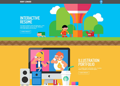
Interactive portfolio of Robby Leonardi, a multidisciplinary designer based in New York City who does illustration, graphic design, animation, and front-end development.
Loading...
Interactive portfolio of Robby Leonardi, a multidisciplinary designer based in New York City who does illustration, graphic design, animation, and front-end development.
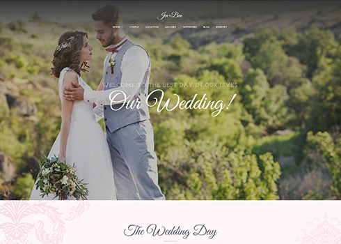
This One Page Wedding WordPress Theme has everything you need to launch a wedding website in a few simple steps. Creating a stylish online celebration of the most important day of your life has nevr been easier.
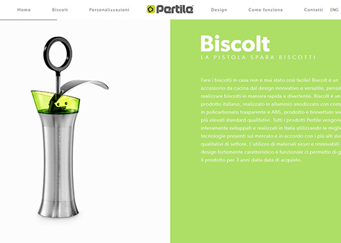
Cookie machine Product website dedicated to the final customer. Dynamic, animated, responsive and game oriented
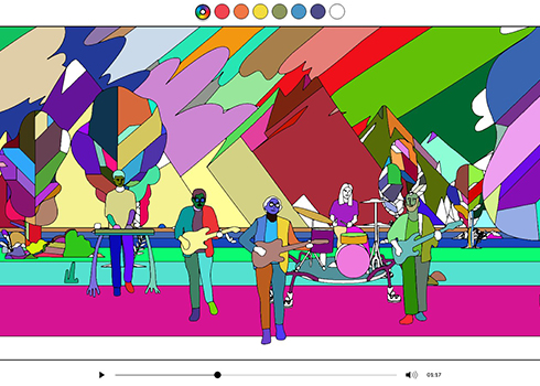
Create your own Stained Glass music video in this interactive experience by Real Estate that lets fans colour in the animations as the video is playing.
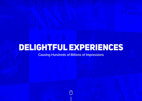
Digital Brand Innovation Agency
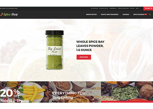
Seasonings and Herbs Store Responsive Magento Theme with awesome features, product badges and useful tools.
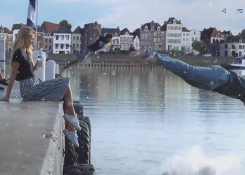
A premium product portfolio that lives and breathes Sourcy's Dutch heritage.
Discover PracticalVR's website to enjoy and learn more about tomorrow's mixed reality tools
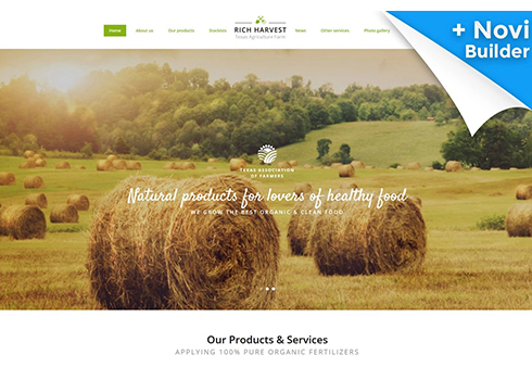
Agriculture Farm Responsive Multipage Website Template. This fully responsive HTML template comes with a rich UI kit and over 30 ready-made pages. The template features Novi builder, which makes the customization a piece of cake.
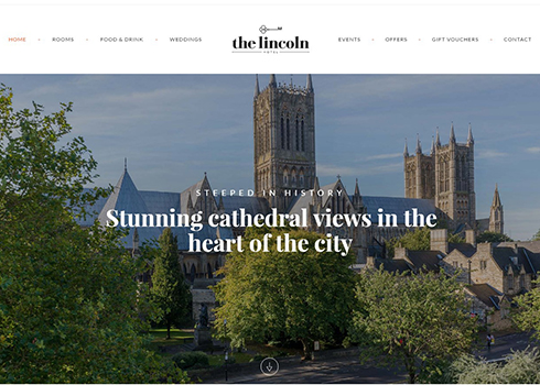
A Responsive website for a marvellous hotel in the heart of Lincoln. Focus on clean design, beautiful typography, custom code, and stunning photography.
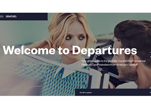
Your global guide to luxe travel, style and more. Curated for international Platinum Card,members from American Express
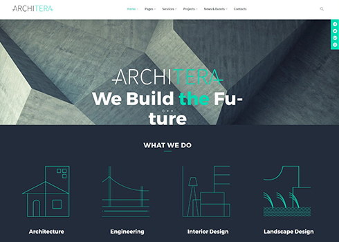
Architecture Firm Responsive WordPress Theme with live customizer, parallax animation and so much other amazing features.
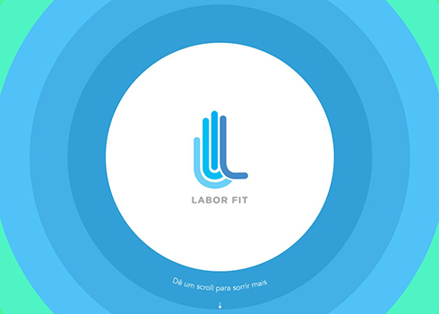
Movement to have a healthier life and a website with enough colors and animations to inspire people in their day to day.
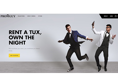
An online tuxedo rental service with a complete suit customization tool.
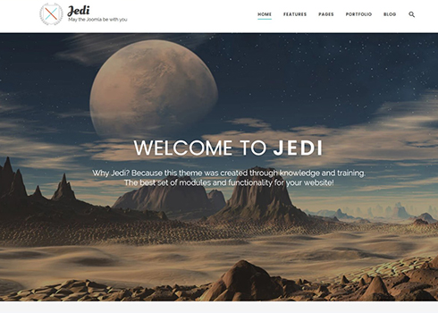
Multifunctional Joomla Template offers so much functionality in one pack, you'll be mind-blown!
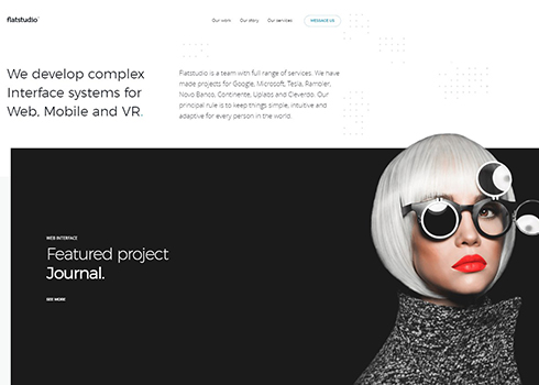
Flatstudio develop complex Interface systems for Web, Mobile and VR.
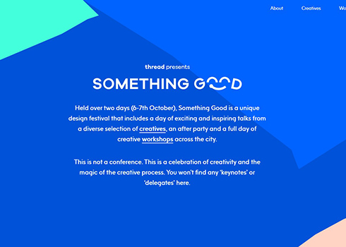
Something Good is a unique two-day design festival that includes a day of exciting and inspiring talks from a diverse selection of creatives and a full day of creative workshops.
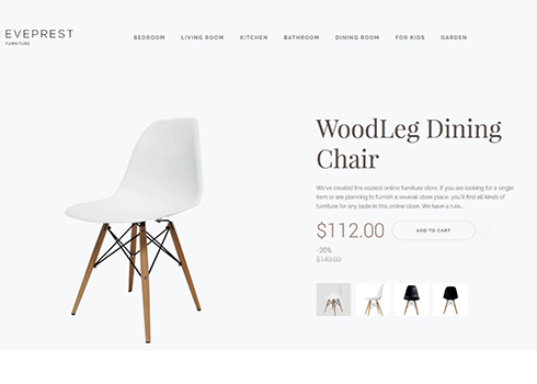
4 ready-made layouts, 10+ premium modules, product slider, MegaMenu. Basically, this PrestaShop theme has everything you need to start an online store in a couple of easy steps.
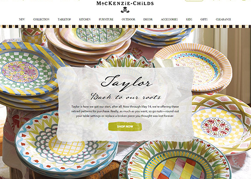
The spirited and inspiring MacKenzie-Childs online shopping experience provides beautiful, original designs that add joy and grace to homes throughout the world.
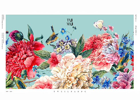
Website for Taji Maji, a new flower & crepe store in Daikanyama, Japan.
Copyright © . All Rights Reserved