The Worst Web Design Errors to Avoid at All Costs
No web designer ever starts out with the intention to create a website that's burdened by mistake after mistake. However, good intentions never ensure success, which is why many websites all over the Internet are plagued by web design errors that simply repulse site visitors from ever coming back...and with good reason!
You know you've encountered these annoying websites when you surfed the Internet because they always suffer from the same problems. They're full of slow-loading web pages, extremely small or extremely large text, the ugliest color combinations you've ever seen, external links failing to open in new browser windows and pop-up windows galore.
As a web designer - assuming you're a web designer who wants to build your reputation and credibility - your number one goal is to enhance the user experience of any site visitor. A person should feel so comfortable on your site that he wants to keep coming back for more...and more...and more...
Try to contain your temper as we list the worst web design errors to avoid at all costs.
The Curse of the Slow-Loading Web pages
When visitors come to your site, they want an efficient user experience that's characterized by fast-loading web pages. No one wants to wait several seconds for a webpage to finish loading all of its graphics! That just makes for a frustrating user experience. Besides, patience isn't a strong suit of a site visitor - nor should it be.

Here's an example of a torturously slow-loading site that will make you want to scream: Scobleizer. Even though it's by a guy who worked as a technology evangelist for Microsoft, Robert Scoble, that didn't help the site avoid the curse of slow-loading web pages!
If your web pages load in a slow and irritating manner, check to see if you're causing one of two huge errors:
Graphic files that are excessively large
Excessive overuse of graphics in general
What you should do is keep the amount of graphics on your webpages to a minimum...unless, of course, you know how to include lots of graphics without sacrificing efficient load times.
Really Small or Really Large Text
One of the most common and aggravating design errors is the inclusion of too small text on webpages. Sure, small text lets you fit together lots of information, yet that's negated by the fact that it's extremely difficult to read. This is particularly true when you look at small text on a high-resolution monitor.
On the flipside, there are sites whose web pages have really large text. There's no silver lining here: Large text just looks absolutely unattractive and amateurish, too. Large text becomes a real nuisance if you're looking at it on a system that features low resolution such as 800 by 600 pixels.
How do you avoid falling into this trap? Just compare the text you use on your website to other sites, and be sure to ask various people of different ages if they're able to comfortably read the text on your site from just a few feet away from the monitor. If they can't, you've got to correct the issue.
Here's an example of a site with hard-to-read small text: Y Combinator's Hacker News. Here's an example of a site with excessively large text: Kk Designs.
Horribly Ugly Color Combinations
A big part of an enjoyable user experience is looking at a site with a harmonious and inviting color scheme. That's why ugly color combinations are hard to forgive.
Check out this example of horrid color combinations on a website. It's the UK's Reading Borough Council's website. Note how boring and drab the color scheme is, mainly because its color combination is based on just one color.

Sometimes, simplest is really best: Color combinations that use, for example, black text on a white background are easy on the eyes and nice to look at due to minimalist effectiveness. In addition, standard link colors appear easily. To do a little more, you can always utilize a graphical bar on a webpage and even include one or two interesting graphics on a webpage, so that they possess a colorful appearance without giving up each webpage's readability.
Links Fail to Open in New Tabs or Browser Windows
Some websites let links to other sites open in the same tab or browser window while other websites allow their links to other sites actually open in a new tab or window. This may just be a matter of personal preference for some, but to many more, external links that fail to open in new tabs or windows are just annoying. They're also confusing because you can't see at a glance where you've just been.
If your site's external links open in a new tab or window, a site visitor will feel more in control of his user experience. He'll be able to quickly reference where the new tab or window opened up to without losing track of what webpage sent him there! Such a browsing experience provides superior organization to a person and, thus, more comfort.
The Scourge of Pop-Up Windows
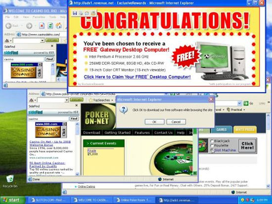
If there's anything as irritating as a plethora of graphics on a site that slows its load time to a crawl, it's the presence of pop-up windows that have the user frustratingly clicking away to close them as soon as they appear. Still one of the classic thorns in the sides of site visitors, pop-up windows are, at best, a distraction, particularly if they're just for ads!

Think of it this way: As a web designer, you want your site visitors to focus on your content and be impressed by it. You do this by providing extremely valuable content. However, pop-up windows impair the ability of users to concentrate on your content, and they may also drive them away. Further, pop-up windows infect your site with a low-quality appearance. If you want more site visitors, you definitely don't want to make them associate your site with spamming, which pop-up windows tend to be viewed as.
Here's an example of a website with intrusive pop-up windows, even though it's popular: 1-800 flowers.com. Click on various menu tabs and categories of flowers on the site, and be prepared to encounter the aggravating "See all gifts in your recipient's location" pop-up window! If you're really lucky, you get to see the pop-up window prompting you to chat with a customer representative.
You're Better Than These Web Design Errors!
Avoid these worst web design errors at all costs! Your reputation as a web designer is on the line, after all. If any of your web design projects include some of these mistakes, then your credibility can take a hit, which is not what you want. You want to project yourself as a highly competent web designer who knows what he's doing.

In addition, your commitment to your principles as a web designer should absolutely forbid you from committing any of these design errors. Your number one job is to make sure a site visitor has the best possible user experience when he comes on a site designed by you. He won't get that user experience he deserves if any of these errors are present on your site. So take inspiration and design a site with user experience first and foremost in your mind!
About the author
Copyright © . All Rights Reserved
