10 Ugliest Web Design Trends of All Times
Web designs are like fashion trends: Some of them are classics while others are best left forgotten. However, they're still good for a laugh and as a reminder of what happens when you try to get too creative with your design skills. When hiring a web designer, it's best to go with a pro who has a proven portfolio spanning more than a few months. Everyone has a few bellbottoms in the back of their closet, but if you learn from your mistakes, you'll avoid similar ones in the future.
Here are some of the ugliest web design trends of all times. Revisiting history ensures that you won't repeat these mistakes. It's shocking to think there was a time when these were considered cutting edge. Thankfully, they're nothing but a distant memory now.
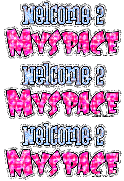
Sparkle, sparkle, flash, flash
Literal sparkle and flash combined with the web tactic of flash made for a glitzy, unprofessional site that loaded at a snail's pace. It kind of looked like a unicorn threw up after eating too many cupcakes.Yes, technically it caught everyone's eye and it was a staple of MySpace pages. However, everybody grew up and left the glitter and flash for the kids.
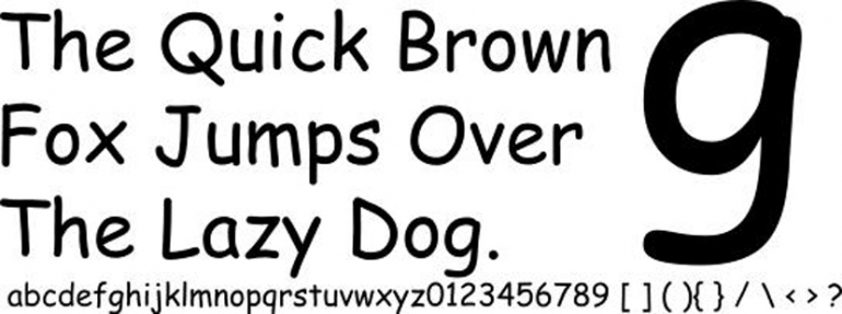
Comic-sans and the like
There are many goofy font choices, but Comic-sans remains the most well-known. Anything with "comic" in the title doesn't belong on a professional website. Instead, choose sans-serif fonts that are classics like Arial or Calibri. Even serif-fonts like the staple Times New Roman can look dated. Less is more, so let your fonts be as clean as they can be.
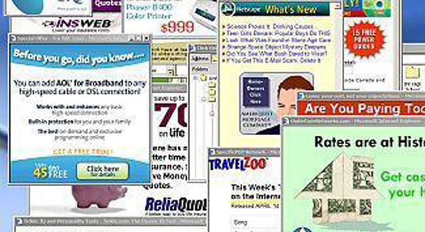
Pop-ups galore
Remember when pop-ups were so new they weren't annoying? That only lasted for a few months as people quickly realized they were being assaulted. Pop-ups will definitely get you some attention, but it will probably result in the user back clicking like mad. There are very few times when this tactic is acceptable, and nowadays users demand a website they can control.
Garish colors
Just like choosing interior colors for your home, neutral is always safe. A pop of color here and there can be charming, but if you blast your users with bright colors, they'll get a headache and move on. Neutral tones suggest expertise and have staying power, which is crucial if you're also trying to build a brand and up your reputation.
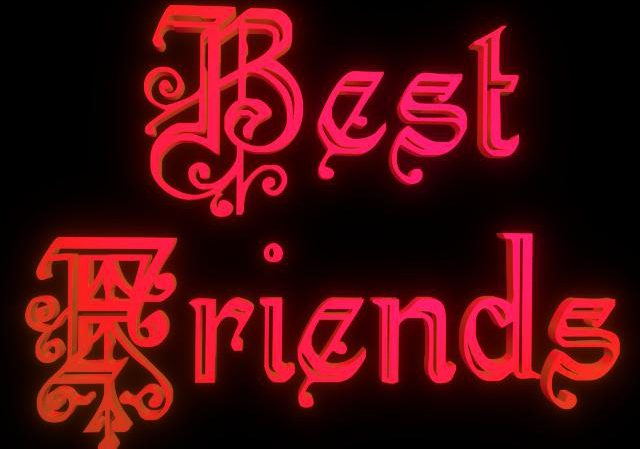
Font/background combinations that were tough to read
Here's a good rule of thumb: A light, neutral background with black font is perfect for every single type of website. Using a black background with neon font isn't just unprofessional, it's also literally hard to read. While your website shouldn't have a lot of text anyway (again, less is more), the text it does have should mimic reading a book.
Hidden nav bars
Unless it's a website that doubles as a treasure hunting game, your goal is to make navigation as user-friendly as possible. Most people don't want to play a guessing game and if the information they want isn't instantly accessible, they'll find someone else who provides it. This was fun for awhile and some websites still feature it by using icons instead of clearly spelled out links. Make it easy for your users and they'll repay you with loyalty.
Homepages that aren't homepages
If you type in a homepage URL, you should be able to access the basics: information about the company, links to About Us, Products, Services, Contact and other nav bar basics. However, if you get to a page that's nothing but a video or a gallery and you have to click somewhere else to access the "real" homepage, it's annoying. It's not classy, it's making your users take an extra step.
Clipart galore
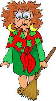
Yes, Clipart is free and there are many options but it screams unprofessional. Sometimes you really do get what you pay for, and that's never been truer than with these goofy options. Instead, commission your own stock art or purchase quality images. It helps to build your brand and you won't look back on old website renditions and cringe.
Keyword stuffing
In the early days of search engine optimization (SEO), black hat tricks worked and one of the easiest was keyword stuffing. This often resulted in blocks of text that didn't make sense and eventually led to a Google penalty. Today, some SEO "professionals" still use it to make a quick buck off their client, but it's much easier for Google algorithms to catch.
Would you like to know more?
Getting more information on a web page is an evolving art, but there was a time when you had to physically click on "more" when predictive scrolling was a better option. This one's a toughie, and you need to know your audience to make the right call.
These are just the tip of the iceberg. What trends do you remember that are better off dead?
About the author
Copyright © . All Rights Reserved
