Awesome Showcase of Logo Design Tutorials and Templates
Logo design is one of many services that a good graphic designer can provide to a professional company that is looking to make an impression on the marketplace. With the absence of a memorable, eye catching and meaningful logo design, a business - no matter how small or large - will fight an uphill battle when it comes to name and brand recognition. With great logo design, a company's name will resonate clearly with all of their customers.
- Logo Design Workbook: A Hands-On Guide to Creating Logos
- The Logo Design Toolbox: Time-Saving Templates for Graphic Design
- LOGO Design, Vol.
- Designing Brand Identity: An Essential Guide for the Whole Branding Team
- Design a Logo - 7 Step Process
Hope that this set of logos and logo design tutorials will be useful. As always we can find many interesting ideas of logo on the TemplateMonster.com. They offer a wide range of logosets designed to meet requirements of various projects: business, sports, entertainment, etc. These logosets come in various styles.
Green, Leafy, Eco, Enviro, logo design



The history of well known logo designs.
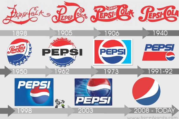
Pepsi Logo Evolution
In the early 1890's a pharmacist from New Bern Caleb Bradhaml has created "Brad's drink". In 1898, Bradham renamed his drink into "Pepsi-Cola". In 1898, Bradham used a scribbled logo script as the first Pepsi logo to brand the product. When his business got established and people started enjoying his drink, Bradham decided to modify the Pepsi logo into a more customized version of the previous logo script. Thus, in 1905, a modified script logo was introduced, followed by a second change in Pepsi logo in 1906 with the inclusion of the slogan, "The Original Pure Food Drink", in it. By 1943, the Pepsi logo adopted a "bottle cap" look that included the slogan, "Bigger Drink, Better Taste". Later, in 1962, the Pepsi logo was replaced with two bulls-eye marks encircling "Pepsi", and then again in 1973, into a boxed Pepsi logo with minor typeface changes. In 1991, Pepsi commemorated the evolution of its scripted Pepsi logo by featuring a logo design with an italic capital typeface. Later at the company's 100 years celebration in 1998, Pepsi-Cola unveiled a new logo that symbolized the brand's innovation and global recognition.
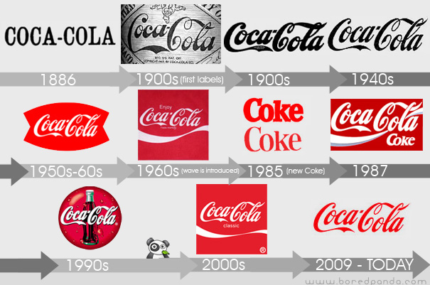
Coca-Cola Logo Evolution
Coca-Cola was first served in 1886 and even then, the first official logo of Coca-Cola was not the script logo. It first appeared in the Atlanta Journal Constitution in 1886 as both a slab serif and chunky sans serif - it wasn't until mid-1887 that Frank Robinson, Coca-Cola's bookkeeper, drew the first traces of the Spencerian script logo that we all know. For the first ten to twenty years you could probably find a dozen different executions of the Coca - Cola script as the logo was probably drawn over and over for different applications. It isn't until the 1930s and 1940s that a clear interpretation of the logo appears and is used consistently. During the late 1950s and early 1960s the script logo is placed within a shape, referred to as the "fishtail" logo, which is as off - brand as anything that Coca-Cola has ever done. In 1960's the wave was introduced, a ubiquitous visual today, when Lippincott Mercer was in charge of making the Coca - Cola identity more consistent. "New Coke" introduced in 1985 had a new formula marketing and its own set of logos - that completely ignored the script logo - that left a bad taste in their consumers' mouths. Around the same time, in 1986, Landor began rolling out an even more developed brand identity that modified the wave among other subtle changes. Today's Coca-Cola logo is amazingly similar to what it was 124 years ago
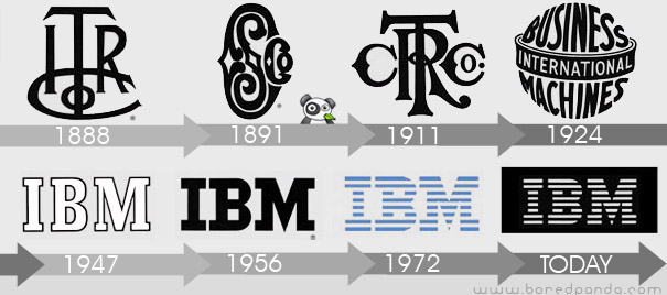
IBM logo
The company which became IBM was founded in 1896 as the Tabulating Machine Company by Herman Hollerith, in Broome County, New York (Endicott, New York, where it still maintains very limited operations). It was incorporated as Computing Tabulating Recording Corporation (CTR) on June 16, 1911, and was listed on the New York Stock Exchange in 1916. IBM adopted its current name in 1924, when it became an international manufacturing company. The logo that was used from 1924 to 1946. The logo is in a form intended to suggest a globe, girdled by the word "International". The logo that was used from 1947 to 1956. The familiar "globe" was replaced with the simple letters "IBM" in a typeface called "Beton Bold." The logo that was used from 1956 to 1972. The letters "IBM" took on a more solid, grounded and balanced appearance. In 1972, the horizontal stripes now replaced the solid letters to suggest "speed and dynamism." This logo (in two versions, 8-bar and 13-bar), as well as the previous one, was designed by graphic designer Paul Rand
Playboy logo
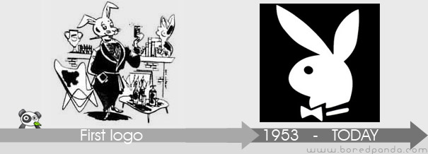
Art Paul was working as a freelance designer when he in 1953 was contacted by playboy founder Hugh Hefner who needed a logo for his new magazine. He created the now famous rabbit wearing a tuxedo bow tie. Paul went on to design the whole first edition of the magazine and was hired by Hefner as Playboy's first art director in 1954, a position he held for 30 years. Playboy magazine claims it once received a letter at its Chicago, Illinois offices with its distinctive "bunny" logo as the only identifying mark, appearing where the mailing address normally appears.
Apple Inc. logo
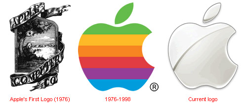
Based on its company name, they selected an apple as its main form of branding. Initially, the logo depicted a small apple shape sitting under a tree with Apple Computer Co set into the frame of the picture. The first logo design was perceived to be a bit too complex and hard to view, so Regis McKenna worked on the logo some years later and added a "bite mark" to symbolize the concept of seduction of the customers and the marketplace in general. Next, the monochrome version was replaced with the rainbow-colored logo as a reference to the Biblical story of Adam and Eve in which the apple represents the fruit of the Tree of Knowledge. It brings to mind that people must pursue their dreams...
Nokia logo
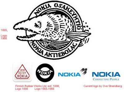
In 1865, Engineer Fredrik Idestam established a wood pulp mill on the banks of the TammerKoski rapids in the town of Tampere, in southern Finland. Later in 1868, he built second mill by the Nokianvirta River, which gave the Nokia its name. In 1871, Idestam and his friend Leo Mechelin, renamed and transformed the firm into a share company, thereby founding the Nokia Company. The first logo of Nokia was created in 1966 showing the image of a fish. This image should be inspired by the salmon fish of Nokianvirta River. In 1898, Eduard Polon founded the Finnish Rubber Works, which later became Nokia's rubber business. The new company tried producing many products like papers, bicycle, car tires, footwear, communication cables, electricity generation machineries, televisions, aluminum, capacitors, and lot more. In 1967, three companies, which were jointly owned since 1922 by Nokia, officially merged and created Nokia Corporation. After the merger, Nokia Corporation adopted the logo which was all black rounded shape emblem, in which "Nokia" was written in white. At the start of its telecommunication equipment manufacturing, Nokia adopted the logo which was quite similar to the current one, but with the light blue color and the arrow like shape pointing upward. Arrow in the logo represents the Nokia's progress and advancement in telecommunication industry.
Google logo
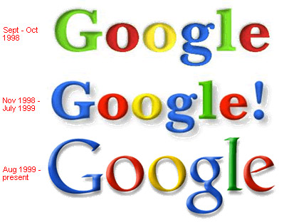
In 1998 Sergey Brin created a computerized version of the Google letters using the free graphics program GIMP. The exclamation mark was added, mimicking the Yahoo! logo. In 2010, the Google logo received its first major and permanent overhaul since 1999. The new logo was first tested in November 2009, and was officially launched on May 6, 2010. It utilises an identical typeface to the previous logo, but features a distinctly orange-colored "o" in place of the previous yellowish "o", as well as more subtle shadow rendered in a different shading style.
Microsoft logo
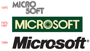
In 1987, Microsoft adopted its current logo, the so-called "Pacman Logo". The logo was designed by Scott Baker. According to the March 1987 Computer Reseller News Magazine, "The new logo, in Helvetica italic typeface, has a slash between the o and s to emphasize the "soft" part of the name and convey motion and speed." The original logo was a "groovy logo" and reflective of the 70's and 80's. I can see this logo with glowing Disco lights.The old logo, which was green, in all uppercase, and featured a fanciful letter O, nicknamed the blibbet, but it was discarded. Microsoft "blibbet" logo, used until 1987. Microsoft logo with the 1994-2002 slogan "Where do you want to go today?". Microsoft logo as of 2006, with the slogan "Your potential. Our passion"
Intel logo
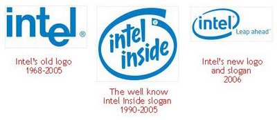
One of the most famous current company was formed in 1968. Initially the company wanted to call "Moore Noyce". However, this decision had to be abandoned by the original reason: this name was in tune with the words "more noise" (Eng. - "a lot of noise"). One year later, a new name "Integral Electronics", which decided to reduce to a more harmonious "Intel".
Check some logo design tutorials!!!
3D Euroleague Logo
In ths tutorial you will learn how to give 3D effect to the 2D logo.

Creating an Environmentally Friendly Green Type Treatment

Creating a crazy cool logo
Design a Print-Ready Beer Label in Adobe Illustrator

Design a Grungy Circular Logo
In this tutorial you will learn how to create text along a path in an interesting way and apply it to a common application.
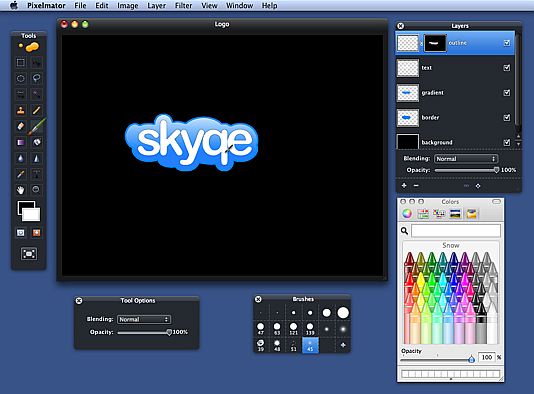
How to Create a Logo in Pixelmator
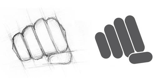
Logo Design Process Tutorial
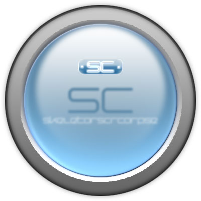
Glass Orb with Logo
This tutorial with guide you through how to make a glass orb with a logo
Designing a Logo

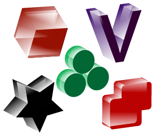
3D Logo
Learn how to create 3D logo easily using Illustrator CS.
Design Logo
This project will show you how to create a web logo for your site using Y as an example.
Related Posts:
About the author
Copyright © . All Rights Reserved
