Where the Web Typography Trend Is Going in 2016
Creating excellent web typography design calls for a balance between what is trending and basic design skills. You must have an eye for what looks good and also consider whether or not the typography is clear enough for the site visitor to easily read. Even the most beautiful design isn't of much use if the website visitor can't understand what the type is trying to convey. It is important to understand the trends but not be so tied to them that you sacrifice the overall aesthetic of the design.
Consider these trends:
Trend # 1: Large CTAs vs. Small Info Text
One trend that has become more common is large call-to-action text versus smaller surrounding text. This tends to draw the eye to the CTA and encourage the site visitor to convert into a customer or subscriber. The larger CTA text is often encapsulated to further draw the eye. Typically, the larger text and smaller text are in the same font, but should at a minimum be in complementary typefaces.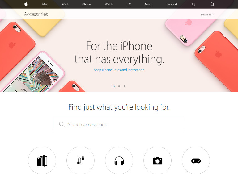
Trend # 2: Simplified Typefaces
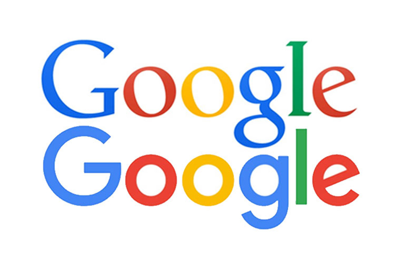
In the fall of 2015, Google unveiled a new logo design and started an interesting trend in typography for 2016. Google's new logo is made up of a pretty simple and easy-to-read font. However, it is bright with multiple colors and also animated. By choosing a simpler typeface, you can add additional elements that might not work as well with a more complicated typeface, such as the animation or some trendy graphics.
You've probably noticed that Google often adds some background graphics to its logo for specific holidays or to celebrate special occasions. This is easier to do if the overall typeface is simple.
Trend # 3: Watered-Down Fonts
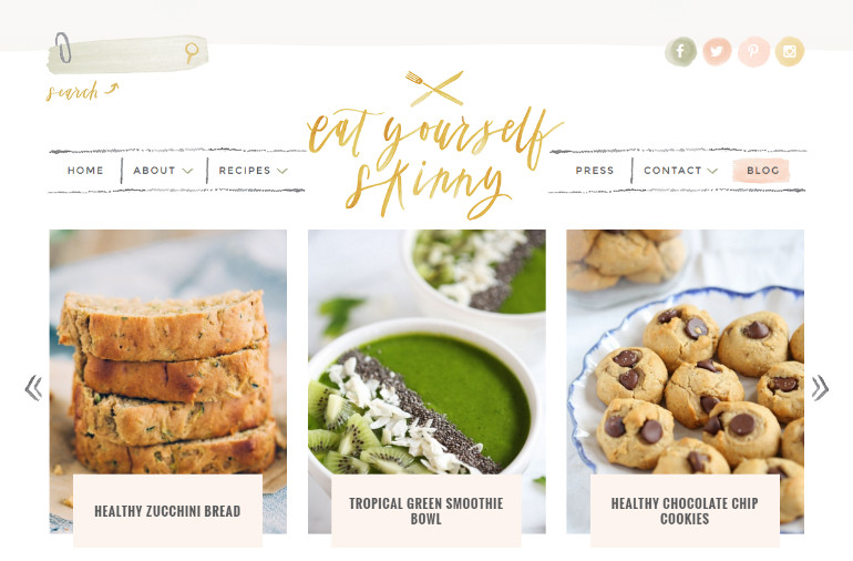
Watercolor seems to be making a big splash in design this year, and fonts are no exception to this rule. The look of a watercolor font goes perfectly with the soft, muted look of a watercolor background. This font works best in a logo or a CTA as it is necessarily larger to remain readable. A watercolor appearance works great for portfolios, artists' sites and any type of creative endeavor. It has a modern edge, so if your audience is made up of millennials, then this typeface is one you should consider to grab their interest.
Trend # 4: Custom Typefaces
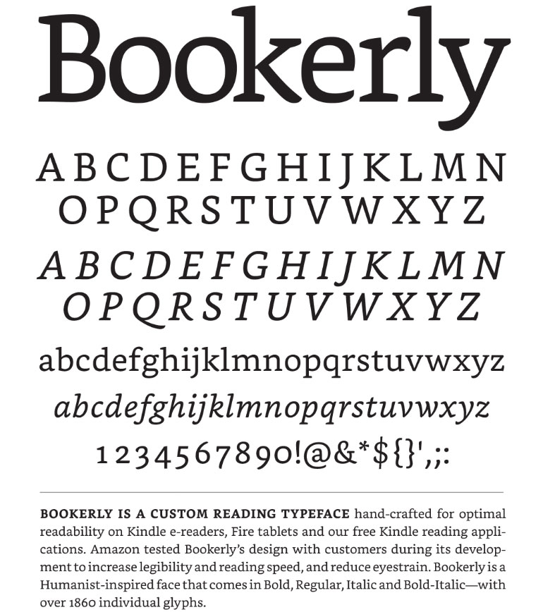
With more than 187 million people using smartphones to surf the Internet, some companies have realized the importance of customizing typefaces and choosing ones that look good across multiple devices. One example is Amazon, which came up with the Bookerly typeface for Kindle readers. Apple and Google also have created their own custom typefaces.
Trend # 5: Combining Typefaces
Sometimes, a single font simply isn't enough to get the point across. One of the trends for 2016 is combining more than one font to create a unique logo or overall design concept. One thing you'll want to do is be sure you are using fonts that complement one another. For example, it works to combine serif and sans serif, but probably not sans serif with a script. You can, of course, combine more than two different fonts. However, be cautious about placing too many different fonts on your page, as it can grow distracting to the site visitor.
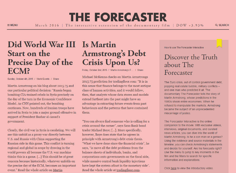
Trend # 6: Hero Images With Strong Typefaces
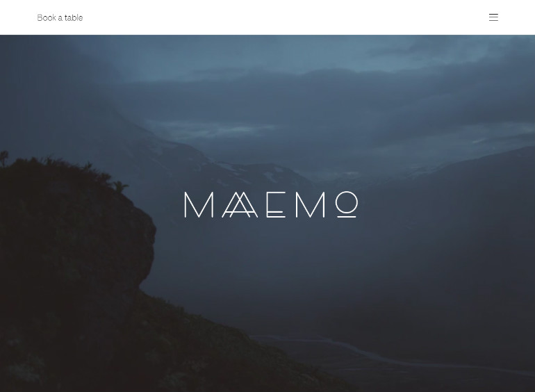
According to Awwwards.com, which judges website designs and keeps an eye on current trends, one trend is in the hero design. Because most people today have faster bandwidth, designers can now use large images above the fold. However, with a large background image that fills the screen, it becomes vital to use a typeface that is large and bold or it will get lost in the patterns of the image.
This trend is also appearing in overall designs, with a large, bold graphic-based typeface logo at or above the fold, particularly on a homepage.
2016 is shaping up to be a year with some very clear-cut new trends. While the elements listed above are common and you'll likely see them as you browse the Internet, designers are always coming up with new ideas. That is why it is so important to know what looks good and where the eye is naturally drawn on a page.
By learning to do this, you will develop a good sense of design and gain the ability to break the rules when needed and follow them when necessary to come up with a unique design that works best for you and your clients. Whether you go with these or choose to think outside the box is up to you and your design preferences.
About the author
Copyright © . All Rights Reserved
