Open Photoshop and create a new document. Dimensions, I used 330x150 pixels, but you can yours whatever dimensions you like. Background: Transparent. On the background Layer, that should be empty and transparent, take the Gradient tool, mix two colors, (your gradient style should be linear) and draw a line with it. This is what I have so far:

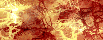
Create a new Layer. Now for this next step you should have grunge brushes. But if you don't it's not a problem, it's very easy to find them, just go to Google.com and in the search field write grunge brush. Millions results will show in just a second, download some. OK, when you finish downloading your brushes, take one, choose white color and on the new layer we made in this step start clicking. I am saying clicking and not brushing cause if you start painting with these brushes you wont end with the result you are looking for. So 2-3 clicks with white color and the same number with black color on the same layer. After that put this layer in Overlay Mode. Create a new layer and do the same, but with another grunge brush. Do this on 1 or 2 more layers. I had 4 layers like this. And also experiment with the Blend Modes. This is what i have for now:
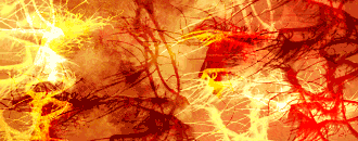
This next step requires you to have some textures, but if you don't, again you can take some from google images. They should resemble some grunge textures. After you find them, put them above all layers, and experiment with the blend mode. This is what I have with the textures on:
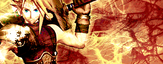
As you can see not much of a difference, but it has another shade of the colors. Moving on. Every grungy signature needs a character inside. So again, go to google, find some cool looking dud, final fantasy provides very cool characters.... When you're done searching your character open it in Photoshop, extract the background and put it between the grunge layers. Make a copy of that layer, and accurse play with the blend modes. Here is mine result to here:
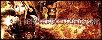
Get the type tool and insert some text, anything you want, make it with some effects, so just it's not a plain text. And the rest of the tutorial is Adding adjustment layers of color balance, pattern, and hue/saturation, and again for the final time experiment with their blend modes. In the end here is mine result: