

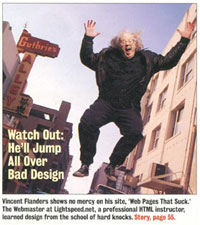
PC Magazine and Yahoo! helped make Vincent Flanders a star when he purchased his URL “WebPagesThatSuck.com” in 1996, and he is still shining, with no chances of being extinguished or eclipsed in his own particular niche in the web design universe. Let’s find out what keeps his fire stoked after all these years.

WDL: I imagine many of our readers are familiar with your
site WebPagesThatSuck.com, but there may be some who aren't. Could you give
us some background?
Flanders: Sure.
I was working for a company called Lightspeed Software back in 1995 and one
day the boss walks in and says, “You know we're going to become an ISP because
it will help us understand what software we need to write for the Internet.
You're the webmaster. Create web pages.”
One of my “duties” was to teach HTML coding to the local businesses and I wanted
to keep everyone from being bored to death by the topic so at different times
in the class I would show them examples of bad sites. I'd say something like, “Here's
a site that really sucks so don't do this.” People would laugh because back
in 1995-96, “suck” was still an edgy word.
My boss wanted me to put up a site “about web design” and I didn't want to
do it because talking about web design is extremely complicated and I didn't
want to do all that work. So I went to the boss and said, “What if I put up
a site about bad design because it's easier for people to understand bad design.”
I had to come up with a name for the site and since I'm a marketing weasel,
I wanted something edgy and catchy. So in July 1996 I purchased “WebPagesThatSuck.com”,
launched it, and Yahoo! quickly made it a pick of the week. Once that happened,
it spread across the web. PC Magazine made it one of their Top 100 sites and
even more people learned about the site. Right now, “The
Daily Sucker” is the most popular feature because it shows current examples
of sucky looking web pages.
 Vincent Flanders' photo on the cover of the WebWeek newspaper |
WDL: I see you've written two books called, logically enough, “Web
Pages That Suck” and “Son of Web Pages That Suck.” How did these books come
about?
Here's an important tip for your readers. If you want to become an Internet celebrity, you have to plaster your picture and name all over your site - a good example is “Seth Godin's Blog” where he has a nice, arty picture that doesn't reveal his whole face. My current picture is a lot more subdued than others I've used in the past. For a long time my site was just “Web Pages That Suck.” Now, it's “Vincent Flanders' Web Pages That Suck.” If you want to be famous, you can't be anonymous. Yes, I realize that there are important people who don't put their name on their site, but it's easier if you do-assuming of course that you have great content on your site.
WDL: Is WPTS your primary activity right now?
Flanders: Yes and no. I'm sort of chained to it because it's successful. I still have a large audience and people still hire me to come out and give amusing and educational speeches on web design. On the other hand, I'm moving into the non-profit industry - I just completed a certificate program at the University of Washington - and I'm trying to get into the industry. I'm also launching a new site called “Non Profit Tips”, which, among other things, will be discussing web design issues for nonprofits along with other topics specific to the non-profit industry.
WDL: What do you feel is your most significant contribution to the web design industry?
Flanders: From e-mails and conversations, what people tell me is I helped keep them from making a fool of themselves by showing them what not to do. I view the whole WPTS experience as I'm the guy who comes up to you at a party while you're talking to a beautiful woman and I whisper in your ear “Your fly is open.” I want people not to be embarrassed by their sites and I want them to be successful. I'm not on some vindictive trip and I really don't point out sucky design out of malice. Here's a typical e-mail that I received today “By the way, thanks for your site and books! They sure opened my eyes when starting up my own professional online presence.”
I also wrote two books that were fun to read. I've received hundreds of e-mails saying “Your book was the first book on computers I enjoyed reading.” My final legacy is my fight against what I call “Mystery Meat Navigation” - the most evil and insidious form of navigation on the web.
WDL: You say that you are a supporter of templates though you admit that templates in general do have lacks, that, in fact, it's hard to find good ones. Could you describe the “ultimate” template for us?
Flanders: I love templates. Why do you think blogs are so successful? They come with templates that keep designers from making stupid design decisions. At the minimum, a template should be able to run through the W3C HTML Validator with no errors. What I actually said was it's hard to find tableless CSS templates that are compliant.
|
“
1. It's too
easy to buy things on your site. „
|
What I want is the “Ultimate Template” - a CSS-based, tableless template that looks good in all browsers and is easy to modify. CSS-god Eric Meyer wrote me that it was possible to do, but would require a lot of work making sure the template stayed current. That's my current bitch with all these CSS books and Web Standards books out there. I own a bunch of them and as far as I can tell, none of them has what I'm looking for. The books want to teach CSS, but there are lots of people who don't want to learn CSS, but just use CSS. None of these books has the “Ultimate Template.” There are a lot of new books coming out in 2005 that talk about Web Standards and tableless design. I'd tell your readers that if these books don't have an “Ultimate Template” design, don't buy them.
WDL: Putting up barriers between people and the product you wish to sell to them is your greatest concern in website construction, isn't it? After all, you stated that websites are meant to sell, not to entertain. Can you think of any good examples - that is to say, any concrete websites - that break your usability rules to their advantage?
Flanders: Well, let me clarify a bit. Not every web site is “meant to sell” something. I don't discuss personal pages, movie, art, band, and experimental sites because they're “allowed” to suck. There is only three reasons anyone visits a web site: entertainment, get information, or buy products and services. When I talk about barriers I'm referring to the four complaints you will never receive from your customers:
1. It's too easy to buy things on your site.
2. It's too easy to find information on your site.
3. Your web pages load too quickly.
4. Your site is too easy to navigate.
As to your question about which web sites “break your usability rules to their advantage”, the first site that comes to mind is Amazon.com. The home page is excessively busy and it's impossible to look at everything they're throwing at you-and they're throwing the kitchen sink. It completely chokes the W3C HTML Validator, and they list a bunch of stores on my personal Amazon page that I have no interest in like “Kitchen and Housewares” and “Shop in Beauty”-and they should know because I've never bought anything from these pages.
WDL: CIO.com took an interview with both you and Jakob Nielsen. Could you give us a few details about the differences that separate you and Nielsen?
Flanders: (Laughs) Well, as time goes on we seem to be more and more in agreement-especially since I think I turned his head around about music sites and band sites. I think these sites have the right to use stupid design techniques like Mystery Meat Navigation because their audience expects them to use them. I agree with Jakob that they would be better sites and make more money if they were designed “properly”, but. On the other hand, I'm a little more fatalistic and I realize it's hard to resist temptation. If you want to design a site that has twelve animated GIFs, that's fine. You'll just end up on WebPagesThatSuck.
WDL: If you were given an opportunity to choose and revamp one website that really sucks yet that remains worthy of redesign, which one would it be? What would you do?
Flanders: That's an incredibly interesting question. Hmm. I've never thought about it. I'm going to have to pass on that one.
WDL: Who do you think deserves a monument for his contributions to web design?
Flanders: Another incredibly interesting question. My choice is going to freak everybody out. I'd have to choose David Siegel for his single pixel GIF hack that let everybody design web pages that look like printed text. TemplateMonster.com couldn't exist without single pixel GIFs-you're using 165 of them on your “Web Design Library” page. It's the one design element that really opened up the web. On the other hand, it's led to some incredible abuses, but I think it has profoundly affected the web.
WDL: Which measures do you suggest to make the Internet more usable and easy-to-use for the disabled community? In particular, do you think that E-Commerce sites should make a separate version of their sites for people with disabilities or use some tricks to adapt their websites in other ways?
Flanders: I'm not qualified to answer that question. That's a Joe Clark question.
WDL: Can you name three premier resources, which should be the best friends for people who want to learn web design?
Flanders : I like HTML Dog a lot. I had never seen your site before and I like what I've seen so far.
WDL: In your book, Son of Web Pages that Suck, you included a “Two-Minute Offense” sidebar session where a webpage snapshot is shown and users are asked to examine it for two minutes and name all the problems they find there. Let's do a “Two-Minute Offense” sidebar session for Web Design Library's site. What did you find?
Flanders: (Chuckle) Ah, my least favorite question. “Say, Vincent, now that we're both standing here in front of all my friends and customers, tell everyone what's wrong with me.”
First, I like the external design of the page. Very, very clean and that's very important. You also adhere to one of my most important “rules” - It takes no more than two seconds to figure out what this site is all about. Sounds obvious, but you'd be surprised at the number of sites where it can take 30 seconds to figure out what the site is about. The only confusing part of your home page is the “Search materials” section. It's not immediately obvious to me how this section works. I have to think and as Steve Krug said, “Don't Make Me Think.”
My main external design complaint is the small, fixed text when you look at your site in Internet Explorer. I can't increase the size of the text. Part of the problem is Internet Explorer. Firefox and other browsers let you adjust the text size. Closely related to that problem is the lack of contrast on the links in the left navigation bar in Internet Explorer. They're hard for me to read.
| We appreciate Vincent's remarks on our site and are going to correct our imperfections ASAP. We had doubts when asking this question, but now we are certain it was good idea to hear his answer since Vincent recognized that we have, after all, achieved the main goal of design and made our website easy to use and navigate. George Hogan, |
Most of my complaints are about internal design issues:
1. The page isn't valid HTML code and it has 293 validation errors - in fact, you don't even use a DOCTYPE.
2. I ran your site through “Web Page Analyzer” and this page shows the results: link. Most of the information on improvement is at the bottom of the screen. You have over 30 tables in your site - which may be a new world's record - and I suspect that's where many of the internal problems can be found.
WDL: What can bring the most frustration to website visitors and how should webmasters avoid this?
Flanders: I think if you reversed what I said earlier you'd find that the biggest frustrations are:
1. It's too hard to buy things on your site.
2. It's too hard to find information on your site.
3. Your web pages load too slowly.
4. Your site is too difficult to navigate. How to avoid these mistakes would take a book to explain. Just remove obstacles. There's a great interview with Jared Spool where he says:
I learned quickly that business executives didn't care about usability testing or information design. Explaining the importance of these areas didn't get us any more work. Instead, when we're in front of executives, we quickly learned to talk about only five things:
· How do we increase revenue?
· How do we reduce expenses?
· How do we bring in more customers?
· How do we get more business out of each existing customer?
· How do we increase shareholder value?
Notice that the words ‘design', ‘usability', or ‘navigation' never appear in these questions. We found, early on, that the less we talked about usability or design, the bigger our projects got. Today, I'm writing a proposal for a $470,000 project where the word ‘usability' isn't mentioned once in the proposal.
When we work with teams, we teach them to follow the money and look for the pain. Somewhere in your organization, someone is feeling pain because they aren't getting the answers they want to one of the questions above. I love “Follow the money and look for the pain.” If I ever got a tattoo, that's what I'd put.
WDL: Thanks for taking the time to be interviewed.
Flanders: It was my pleasure.