

The following tutorial is courtesy of "Mac Design Magazine"
In the early days of the Web, it was very popular to use images-buttons-as the basic navigation links on our page. As the Web has matured, many people have moved to favoring text links. There's a strong argument for doing so: flexibility. It's far easier to edit text than to create or regenerate images. But plain text links don't look very exciting. Thankfully, CSS enables us to easily add zest to our text links.
However, as soon as you begin using text links as your navigation bar, you're faced with the issue of how to differentiate them from the links on the body of your pages. That's the subject of this month's tutorial. You can take what you learn here to create as many different looks as you'd like for the links on your pages. And next month I'll talk about some jazzing-up methods.
Note: Since this is GoLive, chances are, you'll want to create your navigation menu in a Component. Thus, these directions include the Component here. Please refer to the tutorial, Create a fun section divider, Steps 1, then 7-10 if you're not clear on Components yet. An alternative to using a Component is to place your menu directly in a page, then turning that page into a Template or Stationery. Just leave this Step and the last two Component Steps out.
Step 1 Start your menu Component (Optional)
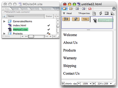
Create new blank page and add at least some of the text that will be your menu's links. You can write out the text for all of your links now, or just start and add more as you develop the site. Be sure to link it to your external Style Sheet to it. Don't do any linking yet though.
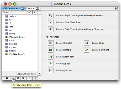
Step 2 Create a class in your external style sheet document
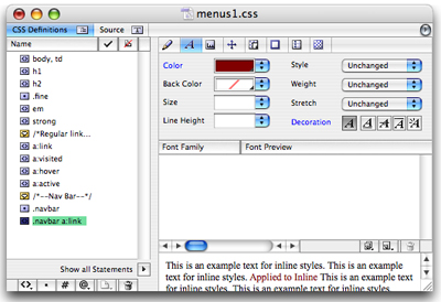
Open your external CSS document if it's not already open. In this Style Sheet, start a new class by clicking the Create New Class Style button - the dot at the bottom of the style list. The default class name is pre-selected so immediately type a short descriptive name for that class. In this example since I'm defining my Nav bar styles, I call mine navbar. (The name is actually .navbar; the period is automatic.)
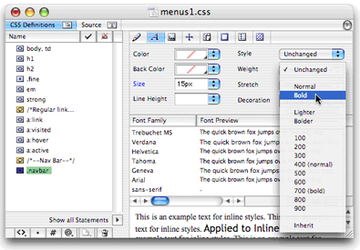
Step 3 Set the parent class's attributes
This class (.navbar) acts as the parent - the main definer - for this set of links. With this class
selected, use the Font tab to select a font family (if you want the font to differ from that on the
rest of your page) and to set the text size. If you want the font to be bold, choose that here too.
You can also use the other tabs to further define the class. Do not set a color in this parent class.
(It is not seen.) Setting the No Text Decoration button here is ok to do but will need to be repeated
in the next stylyes anyway.
Note: You don't have to get too hung up over the formatting attributes right now.
You can always change them later on.
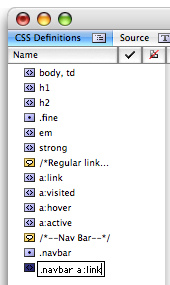
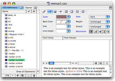
Step 4 Create your first pseudo class
Start another new class (again by clicking the Create New Class Style button) to specifically define
your nav links in their unclicked state. Name it as follows: the same class name (.navbar), then a
space and the words a:link. The result in this example is .navbar a:link.
You'll notice that the a:link part is just like the selector tag you normally use to define a link.
The difference is that this one will apply itself only to those links to which you will assign the
class that you created in Step 2. You may also notice that even though you've created a class, the
icon for the style is (<>) that of a selector tag. Not a problem.
Step 5 Define this pseudo class
With .navbar a:link selected, set up any attributes that you want to have for unclicked links. Here
is where you define the color of your navigation links. If you want to turn off link underlining be
sure to click No Text Decoration (the A button beside Decoration).
In this example, the font family, size, and weight was determined by the class so this just defines
the color and decoration.
Step 6 Create and define the other pseudo classes
Repeating Steps 4 and 5, create and set attributes for the following pseudo classes in this order:
| .navbar a:visited .navbar a:hover .navbar a:active |
- Visited is what people see after they've clicked your link. If you want there to be no link underline
you must click No Text Decoration here.
- Hover is what they see as they rest their mouse over your link. (On Netscape 4, which is old, people
won't see the hover formatting, but there's no harm done either.)
- Active is seen only while they're pressing the mouse down to click your link. You might want to skip
creating the .navbar a:active pseudo class.
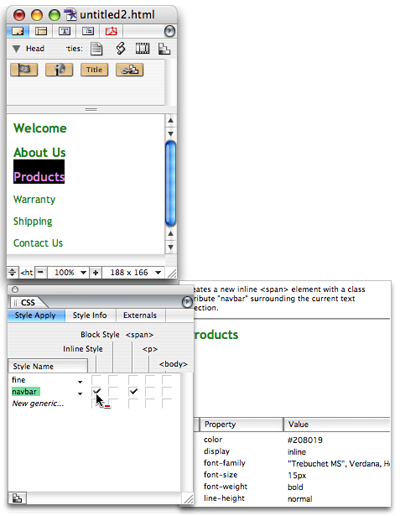
Step 7 Apply the Class
One by one, select the text of each link and in the CSS palette, click the box under Inline Style for
the line navbar (or your own class name). You'll notice a column called span appears automatically
is automatically checked.
Note: You can actually do this any time after Step 2, but you must do it before Step
8. Note that you won't see any formatting take affect yet as there are still no links. I should also
explain that you can apply the class to the entire block or to a whole table cell. However, span tags
applied specifically to the link text provides the most flexibility.
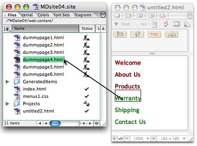
Step 8 Link the text
One at a time, select the text that is to be linked and link it to its destination page. As soon as
you create the links, you'll see the formatting appear.
You can actually do this much later in the game. You can return to the Component and complete the links
days later. After all, you must create the pages before you can link to them. One trick is to link
to a dummy page for now, then relink to the correct page later on. Here, I'm doing that, linking to
dummypages.
Note: The <span> tag must be around the tag for this to work. If you create
the link first, then apply the class using the CSS palette afterward, the tags are written inside out.
Your html should be like this:
| <p> <span class="navbar"> <a href="dummypage3.html">Products</a> </span> </p> </p> |
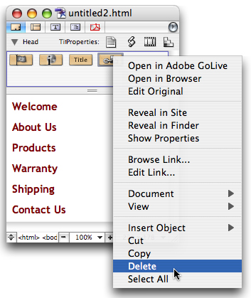
Step 9 Unlink the Style Sheet from the Component (Optional)
Reveal the head section of the page, click on the Style Sheet icon and press Delete or use the contextual menu to remove the link to the external Style Sheet. (Having the Style Sheet linked was just so you could assign the tags in the CSS palette. Your links will look generic now, but they'll have the formatting once you place the Component on a page that uses this Style Sheet.) Save the menu page as a Component. (See the "Create a fun section divider" tutorial to learn how to do so.)
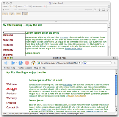
Step 10 Add the Component to your page (Optional)
Open the Library palette, switch to the Components tab, locate the Component under your site's name,
and drag the Component into place on your page(s). Then preview in the various browsers and see your
handiwork. (No comments about this example; it's meant to demonstrate, not to be a designer's dream.)
Closing Comment
Whether you've created your menu in a Component or directly in a page or into Template or Stationery
you can edit it just the same-by editing the external Style Sheet. If you have a page that contains
the Component open, or your Template, or Stationery page open, you'll see the result of your edits.
If you'd like to create another set of links that differ from the body links and these nav bar links,
just repeat all of these Steps, creating another set or pseudo classes.
Deborah Shadovitz thinks of links as vicarious travel and figures Style Sheets are almost as cool as
her backpack. She extends thanks to Mads Rasmussen rasmussens.dk,
for introducing the GoLive community to this method.
Courtesy of Layers magazine.