4 Examples of Eye-Catching CTA Buttons
Any business trying to make it in today's world will have to pay close attention to their online presence. A website is the 21st-century equivalent of a business card, so you'll want to make yours stand out.
When your company is relying on online sales – be it of products or services – you need to pay close attention to your CTA buttons. With the average conversion rate in 2018 and 2019 being approximately 3%, an eye-catching Call-To-Action can make the difference between acquiring a new customer or losing out to your competition. You can invest a fortune into marketing strategies, and still see no increase in your bottom line because the very design of your website isn't helping you make conversions.
Fortunately, there is a lot of advice on the web regarding how to create effective CTAs. But, if what you're looking for are instances of companies that have done a great job, here is a list of four examples of eye-catching CTA buttons.
Spot-on design: Cubefunder
There are a few rules you should follow when it comes to designing a CTA button for your website:
- It should stand out. This means that the rest of the page shouldn't be too busy with content. It should also be surrounded by a decent amount of white space.
- It should be of an appropriate size –so that it's clear there's an action to be taken by clicking on it.
- It should contrast with the background. Blending in is not what you want here.
- It should be placed in the right area. Central placement works best, but keep in mind that the top right corner can also be a good spot.
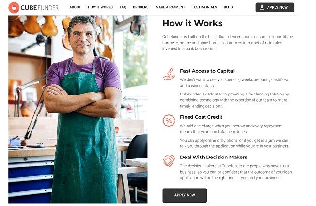
What Cubefunder does particularly well is that they have a clean website design that consists of the most important messages they want to send their clients. Moreover, each section of their homepage features the same CTA button, where the key features are described and potential clients are called to apply. This ensures that customers can scroll down and inform themselves about the company's services, without having to go through any additional (unnecessary) effort to enlist those services.

Science-backed use of colors: The Adventure Junkies
One of the most common mistakes people make when designing their own website is going crazy with the colors. Even when they're smart enough to keep things simple, they don't always make the best choices based on research and color meaning.
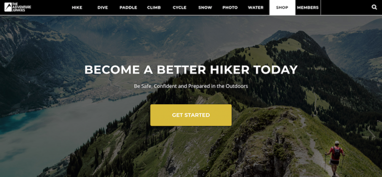
When adding a CTA button to your homepage, you want to choose its color based on symbolism and its ability to inspire action. The Adventure Junkies, a site specializing in exciting travel experiences, did exactly that. They chose to use orange for their CTAs and hit the nail on the head.

The fact about the color orange is that it's commonly associated with positive feelings and actions. It stands for cheerfulness, friendliness, adventure, and enthusiasm. It is also likely to inspire spontaneity and positivity. From a designer's perspective, it also goes well with most other commonly used colors for web design, and won't cause eye strain, as would be the case with red.
Other great color choices for CTA buttons include:
- Blue – popular with financial and insurance institutions
- Green – great for ADD TO CART actions
- Red – suggesting urgency
- Purple – particularly liked by women
- Black – gives a sense of luxury
Creating a sense of urgency: Mindvalley
There's no secret about the fact that to sell a service or product, you need to convince your customers that they really need it. And not just need, but that they have to get their hands on it this very instant. Some of the most successful businesses rely on these tactics, creating a sense of urgency with shoppers.
The reason why this strategy works so well for CTA buttons is that it plays to everyone's inherent fear of missing out (FOMO for short). FOMO creates a necessity in us to be in the know about the newest developments, to have tried a certain product, attended an event, or read the latest news.
Easy ways to create urgency with your CTAs include:
- adding words like NOW, FREE, or BEFORE IT'S GONE
- including a countdown for taking certain actions
- adding statistics about the number of users who have already purchased your products
- using cliffhangers that require people to take action to get the information they're looking for
However, when it comes to creating urgency, do keep in mind that there's a fine line between effective design and going too far. If your message is too overwhelming, you risk having potential users seeing you as unreliable or spammy. So it's best to approach this strategy with a critical eye.
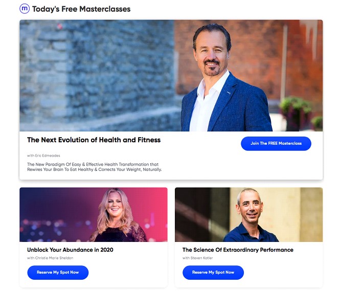
For an example of a company that managed to use just the right amount of urgency, look at Mindvalley, an online learning platform. Their homepage features no more than three highlighted courses, each with a few-word description and a CTA button that says "Reserve My Spot Now." Here, the message is clear. The user is encouraged to take action as soon as possible, but without utilizing language that's too aggressive.

Interactive CTA buttons: Best Choice Life Insurance
For people who can do more, or simply want to stand out from their competition, interactive content is definitely the way to go. An unexpected example of doing just that comes from Best Choice Life Insurance, a company that helps users find the best life insurance rates.
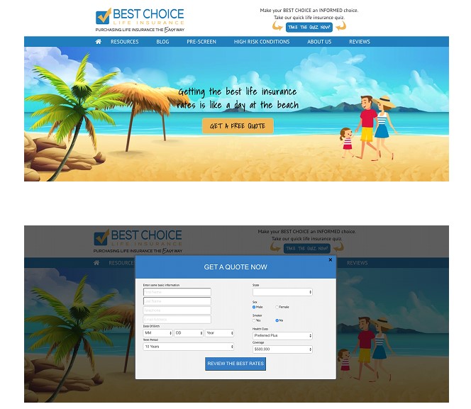
This company's homepage features a CTA button that allows customers to get immediate answers by entering relevant data. Once users have written their name, date of birth, term period, state, sex, health class, and coverage, they're taken to an overview of available policies where they can make an informed choice. What's more, the webpage invites anyone with questions to set up a phone call during which all of these will be answered.

The great thing about interactive CTA buttons is that, with a little bit of effort, you can make them into absolutely anything you need. They're successfully used by nonprofits, dating sites, and clean energy businesses. Their one potential downfall, however, is that they can be quite pricey and will require you to hire an experienced web developer.
Getting your CTA buttons to work
Once you've looked at these examples of eye-catching CTA buttons and found the strategies that will work best for your homepage, you'll need to take additional steps so that your efforts have the desired effect.
The single best way to do this is to test, as well as to keep a close eye on analytics. Remember, wording, design, and placement will all have a significant impact on conversion rates. So don't be afraid to experiment, or to change the things that aren't showing results. In the end, your website will need to serve your target audience, and the only way to do that is for you to have a clear idea of what's working and what's not.
Copyright © . All Rights Reserved