5 Reasons Why You Should Use a Responsive Design for Your WordPress Website
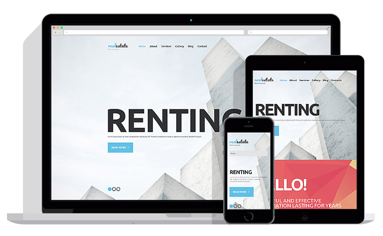
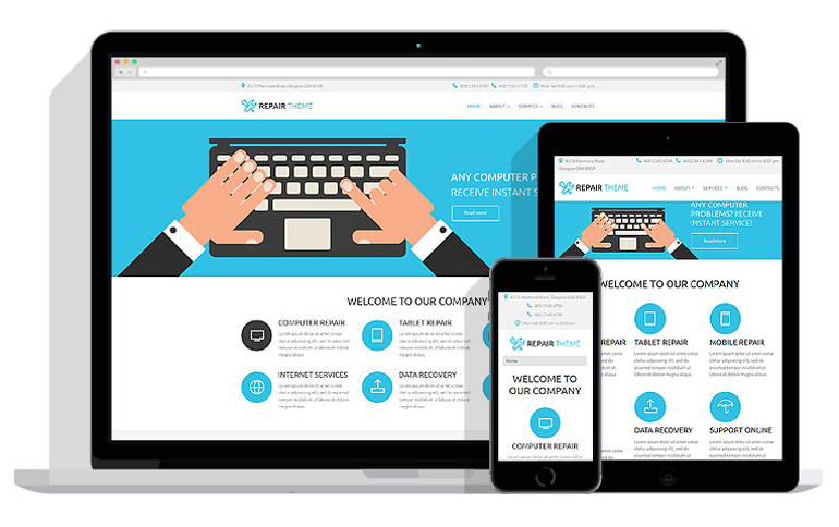
As the number one website template on the Internet, WordPress continues to be the basis for many different types of websites. With the wide variety of add-ons, the possibilities for WordPress website design are virtually endless. With this in mind, new webmasters should take it upon themselves to create the most highly optimized and streamlined website that they possibly can. Having a responsive website is especially important for many reasons. Here are 5 of the top reasons that you should start off with a responsive website design if you are using WordPress as your basic template or web hosting platform.
1 - Google is now beginning to punish any website that is not fully responsive, even those sites with the most expensive WordPress website design features.
As of April 2015, Google began punishing websites that do not have responsive capabilities. For now these websites are losing ranking within the mobile search rankings. Soon after, websites that are not responsive will not be listed at all by Google, severely limiting the ability of those websites to be seen at all on the Internet. It is highly likely that the other major search engines will follow suit, as Google is the overwhelming monopoly in the marketplace, controlling some 80% of all searches.
Having a website on Google also increases the ability of a website to optimize itself across directories and message boards. Many niche search engines are actually subsidiaries of the main Google search engine. Being on the main listing can improve the ranking of a website on a niche listing exponentially.
2 - A responsive website opens up the commercial possibilities of a business to an entirely new audience. The first generation of people who grew up completely on computers are now coming-of-age and beginning to do e-commerce. Many of these people actually prefer to do commerce in the digital space in a cashless society. To them, mobile phones and tablets represent a convenient way to purchase products. If a website is not responsive, then this entire generation of people will overlook the products that company has to offer.
The entire Fortune 100 is spending at least a quarter of its marketing budget on mobile marketing as of 2013. If this is not enough to convince your business that having a responsive website for all of the major mobile platforms is the way to go, then nothing will do the trick. However, most marketing experts are in agreement: any website that does not cater to this new Millennial generation of consumers can expect to lose a great deal of its market share over the next five years.
3 - Responsive designs are much more conducive to small screens.
Another reason for a responsive website design is to keep in compliance with the format of mobile phones and tablets. Unlike laptop and desktop viewing screens, mobile phones and tablets are much smaller. Text is more difficult to see in some cases, and the multimedia that is on a website must be compressed into a certain format in order to play without lag. If a business simply tries to "shrink down" its desktop website, the results are far too random to ensure any kind of engagement with the audience. The headlines may not show up on the first viewing screen. There may be issues with scrolling if the page is more than a few columns across. The website may also show up differently on different operating systems.
A responsive web design will ensure that all of your customers see exactly what you want them to see no matter what operating system they use. You will be able to secure a marketing plan for your website instead of trying to direct people to your desktop website when they get home.
4 - You need a different layout when you are trying to appeal to customers within the mobile space. Your customers will act differently when they are accessing your site on the mobile space. The same person does not look for the same thing when he is on a desktop at his house versus when he is out and about with his phone. Having a responsive design is your answer to this.
Studies have shown that people who are on their mobile devices are much closer to the end of the sales funnel than people who are browsing on their site at home. This means that your entire format may need to change, streamlining out many of the middle pages and getting straight to the point. You may also want to put your loss leaders on your landing page when you are trying to appeal to people within the mobile space - many people are prone to making an impulse purchase online in the same way as they are when waiting in line at the grocery store.
5 - Your site will increase its longevity with a responsive layout.
If your website is not fully responsive, then you will definitely have a larger expense farther down the road when the entire scene of technology changes. Whether you believe that the desktop is going the way of the dinosaur or not, the fact is that the trend towards responsive websites is not turning around anytime soon. All marketing experts are in agreement: pay less now to change now, or pay more later to change later.
Investing in a responsive website for your WordPress layout is one of the best investments that you can make in your business today. Aside from the immediate effects of increasing your visibility and connection with an audience with plenty of expendable income, you will also save yourself a great deal of money in the future. You will be able to solidify your market space before the mobile market becomes oversaturated in the same way that the desktop world is now saturated. Responsive websites are relatively cheap, and they will only get more expensive as the need for them goes up in the future, so now is the time to get into the game!
Copyright © . All Rights Reserved


