5 UX Mistakes that Are Killing Your Conversions
When you're trying to improve the user experience at your website, you follow all kinds of tips. You provide various features that are supposed to make browsing easier. You include calls to action and social media buttons. You include visually distinct elements, so your visitors won’t get bored.
Somewhere along the way, you realize that you went too far. You made several web design mistakes that affected the conversions in a negative way. Maybe you skipped some of the essential rules for successful UX design, while focusing too much on the others.
What happened?
If you go through this list of mistakes that are common for badly designed websites, you might be able to identify and fix the issues.
What Are the Most Serious UX Mistakes?
1. Unintuitive Navigation
When you focus too much on the design, it’s easy to forget one of the most important factors that keep visitors there: intuitive navigation. What does that mean, anyway?
When someone lands on your website, they should easily find the details they want. The landing page will get them mildly interested in your offer. But then what? Where can they find more information? Where are your contact details? Is there a blog section, where they can get their questions answered?
If it’s not easy for a new visitor to navigate through your site, you made a serious mistake that’s common for bad UI websites: unintuitive navigation.
Here’s how you can fix it:
- Establish the main elements of your navigation plan:
- Main navigation bar
- Sidebars
- Call to action
- Landing pages
- Internal links
- Use Google Analytics to see how your visitors move from one page to another. When you notice that a particular page has a high bounce-off rate, it means you’re missing an internal link or a call to action.
2. Slow Page Loading Speed
If the website is slow and sluggish, how do you expect people to share contact and payment details there? Slow, bad UI websites give them the chills.
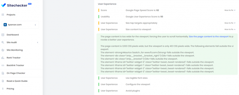
Does a page at your site take more than three seconds to load? You can try website checker tool, which tests the speed among other technical elements that make a difference with the conversions. If you notice that the site is slower than it should be, these are the things to do:
- Fix issues like lack of adequate memory, slow routing, and slow database queries. The goal is to boost the response time of the server.
- Avoid redirects, since they add more loading time to a page.
- Compress JavaScript, HTML, and CSS files that are over 150 bytes.
- Use the JPEG format for photographs and the PNG format for graphics.
3. Cluttered Layout
Too many options in the menu, too many graphics and videos, too much text… all these elements will suffocate the website UI.
When a user sees a cluttered page, they will be confused.
Neil Patel’s blog is crazy useful for anyone who wants to build a better website. For many viewers, however, the pages are quite cluttered, long, and confusing. There are too many visuals, pop-ups, calls to action, and ads for a SEO tool. You just don’t know where to look.

This doesn’t stop the blog from being successful, mainly because of the author’s reputation. However, for a first-time visitor, the layout is too cluttered.
- Keep the visitor’s eye to the most important part of the page. If it’s a blog post, don’t feature too many menus and calls to action on the side.
- Don’t use too many colors. Two font types and three main colors are the standard rule for a user-friendly design.
4. Bombarding Users with CTAs
Calls to action are important. No one is trying to deny that.
However, their usage and placement must be meaningful. Purposeless CTAs all over the place won’t do you any good. On the contrary; they will make your website look too “salesy,” so the visitors will be less likely to convert.
- Use up to two call-to-action buttons on a page. You can use one at the top and another one at the bottom.
- Make the button simple and visible. It’s best to stick with the standard rectangular shape. To make it stand out, use a pop of color surrounded by white space.
- Don’t make the button too big and overwhelming. For the viewer, it shouldn’t be the main element of the page. They are looking for purpose. When they get the information they need, they will notice the standard button. You don’t need to exaggerate it.
5. Not Designing for Mobile
In November 2019, the share market of mobile users increased from 37.38% to 48.33% in the USA. The use of desktop dropped from 54.86% to 46.5%. You know what that means: people are more likely to access your website via mobile. If the site doesn’t perform well, their user experience won’t be impressive. They will leave the page without considering a conversion.
- Do not use Flash under any circumstances!
- Make information easy to find. Use well-organized menus.
- Make the site responsive. The action buttons and menu options should be big enough for the user to tap.
- Use a larger font size, so the content will be readable on a small device.
Are you making any of the above-listed 5 mistakes? If you fix it, you might improve the conversion rates.
Copyright © . All Rights Reserved