8 Tips To Help You Optimize Your Ecommerce Website for Mobile Devices
Today, a huge number of people access the Internet using their mobile phones. This means that half of the web traffic is generated from people’s mobile sites. This is a great reason why your eCommerce website should be optimized for mobile devices if you want to be successful at what you’re doing. Google is important, and so it’s the fact that it will favor mobile-friendly websites.
If you don’t optimize your website for mobile, you will lose your visitors, and your sales will drop. It is important that you learn how not to allow your website to fail in the era of mobile phones because a report by TechCrunch from 2014, revealed that mobile traffic is taking over desktop traffic and the following year, Google officially confirmed it.

If you still haven’t started your website journey, and you are new to this, you first need to choose the best website builder that will help you achieve your goals. If you decide to go with WordPress, then, you will need to pick a theme. Look for ones that are easy to navigate and would keep your customers interested.
Website Speed Optimization for Mobile Devices
Users are very impatient when the website they are attempting to reach is loading slowly. This means that you need to work on your speed if you do not want to have frustrated users. There are mobile-friendly test tools that can help you out. Try to eliminate any potential hold-ups by choosing fast themes and cutting down on unnecessary plug-ins.
How can you assure faster loading? According to Digital Agency Network, you should do the following things:
- Keep redirects down
- Use compressed images
- Simplify your web design
- Keep the use of custom fonts to a minimum
- Activate Google AMP
- Cut your signup steps short
- Turn browser caching on
- Minify your code
- Do your mobile SEO well
Also, it is very important to have relevant content that is easily readable. You do not want just a bunch of text that nobody would read.
Create an App from Your Website
Another thing for you to consider is creating an application for your website. Why would you do this? Well, some people prefer using apps instead of websites. As reported by eMarketer, mobile users on average spend more than two hours using apps each day.
So, if you are capable of developing a mobile application, then, you should do it yourself. On the other hand, you can hire a freelancer to create the app instead of you. And, there are many how-to websites to teach you how to create an app from your WordPress website by yourself.
Get Rid of Unnecessary Words
According to SEL, mobile searchers are specific in their demand for answers. The content you provide on your website should contain just the relevant information that your users will find useful.
Use short and eye-catching headlines. Your client will get your attention only if they are able to clearly see the benefits and options you are offering them.
Top Navigation Menu

Owning an eCommerce site means that you will have to pay attention to details, one of them is the menu. So, you need to use a top navigation menu because this way, your clients will be able to easily navigate your website and take action.
Display of Trending Products
Imagine yourself as a customer. What would you like to see when you open a website that offers products? Probably the answer would be nice images, great layout, trends, etc.
Well, for eCommerce it is of extreme importance to present your products with high-quality images that your clients will be able to easily find, and of course, buy - if they want to. You can also display large images of products that are trending on your website, so the customers can just tap on them easily, using a finger.
Search and Browse Option
One of the most important things in eCommerce is to know your target audience as well as what they want. How can you achieve the latter? Customers who visit your website want to find an option ‘search’ in order to type in the product they want to purchase or to see similar available options.
Likewise, offering your clients the ‘browse’ option allows them browsing of similar products they may like, so they would not have to go all the way back to the menu. It sounds simple, but it is a must. So, do not forget to include these two options.
Marketing via Video
This is a fun part. Online shoppers find it hard to know how would an item of clothing fit them without trying it out. As a result, many people who would like to purchase something without leaving their home just give up.
To prevent this, you should create GIFs or product videos in order to present your customers with a better understanding of how your products would fit them.
Keep in mind that product demo videos need a good context. You should have a storytelling approach. And, it is very important to always include a Call to Action at the end of every GIF or video you create for your website.
Simple Checkout
If your website offers products to be purchased, you need to consider this. Neil Patel says that if customers proceed through some extra steps and find out they need to register for an account before they check out, they will just abandon their purchase, and that happens 23% of the time. To avoid this, you can offer your clients guest checkouts. In this way, they will not have to enter their personal information if they change their mind.
Also, it is very important to provide your clients with access to digital wallets such as PayPal, Amazon Pay, Payoneer, Apple Pay, etc.
If your site facilitates online payments, enhancing the checkout process becomes crucial for customer satisfaction. An emerging solution is integrating apple pay qr codes directly into your eCommerce platform. This technology simplifies payments for users and improves the overall mobile shopping experience, aligning perfectly with goals of optimizing for mobile use.
Did you know that you can always register for updates to learn more about eCommerce business for sale?
All in all, if you are the owner of a website, you need to make sure and optimize your website for mobile. It is for your own good and of course for your business to become even more successful. Just follow the tips mentioned in this article, and you will get to the top.
Another tip to create your site is to use a template already adapted for mobile devices.
Achieving high performance and getting the highest marks in the GTMetrix and Page Speed ??Insights tests in the new online store is quite realistic if you use the Roxxe - Responsive Multipurpose Shopify Theme.
This theme is optimized for mobile devices and shows the best speed characteristics. In addition, the Roxxe - Responsive Multipurpose Shopify Theme is of multiple purposes. Inside, there are several dozen templates for launching a store of any subject. With Roxxe, you can successfully launch a clothing store or a small bookstore. Planning a big vegan grocery store? Swimwear shop? Nail salon? Roxxe will help you with this!
Try Roxxe - Responsive Multipurpose Shopify Theme and get not only beautiful but also a fast and convenient online store.

The growth of mobile activity began a long time ago: a few years ago, most users began to choose mobile Internet. To date, this indicator is constantly growing.
In this regard, search robots are actively checking sites for adaptability for mobile devices. If it is inconvenient to use the site from a smartphone or tablet, it will be difficult to reach the top of search results due to poor behavioral factors.
Search robots always actively check sites for adaptability for mobile devices. If it is inconvenient to use the site from a smartphone or tablet, it will be difficult to reach the top of search results due to poor behavioral factors. With Sirius, you may not worry about it. This minimal Shopify theme store for dropshipping is fully optimized for mobile devices, features high page loading speed. It has a simple interface and it is easy to make edits here. You can use all the possibilities of this topic to create your ideal resource, make sure to do it yourself.
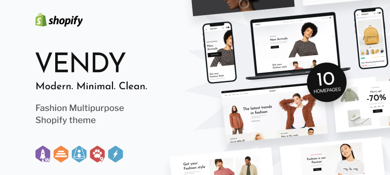
Another responsive theme on Shopify is Vendy. With it, you can build an online store of any complexity. Such an eCommerce website will perform flawlessly on screens of all modern devices. Plus, it will be also fast and adaptive to varied browsers.
Moreover, Vendy Multipurpose Shopify Theme for Fashion shows off strong SEO capabilities and reliable pre-built forms for marketing needs, like banners, pop-ups, testimonials, newsletters subscription, and other web forms.
And, if you are still not amazed enough, Vendy is loaded with a record-breaking number of page templates. For now, there are:
- 10 homepage and 2 “About Us” mock-ups;
- 2 collections and 5 products templates;
- blog and lookbook page layouts.
Copyright © . All Rights Reserved