Consistent Navigation & User Engagement
Sometimes there's a disconnect between what looks great on a page and what actually works for the end-user. Actually, to be honest this happens an awful lot in design, even when there are people dedicated to taking care of UX. Basically if you find it difficult to navigate through your own app or web design, then users are going to find it a total and utter nightmare.
To help you think around any navigation or UX problems you're dealing with right now we're going to take a look at some of the biggest sites/apps on the web today, to see how they manage to create consistency in their navigation.
Single Page
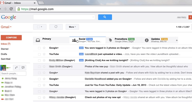
Gmail is a perfect example of how you can take something like webmail, that's been around forever, and then completely overhaul it to add more functionality. Google nailed it with the Gmail interface because everything you need to use it, is present on a single page, so there's no time wasted going backwards and forwards in browser windows. This "single page" approach to navigation works incredibly well, even managing to integrate the Google Hangout chat app into the design too.

Related Content
Engaging visitors when they first start using your app or site isn't the biggest hurdle you're going to face - what's going to be really tough is getting them to hang around for more than a few minutes afterwards. That's why the "related content" model of user engagement is a smart way to approach site design, offering users something to read or do even if they couldn't find exactly what they were looking for in the first place. Most of the big news sites will now have a panel of 4 - 10 related news stories listed either at the bottom of the page, or included in a menu elsewhere on the page.
Overflow Menus
A clean user interface is something which most app and web developers strive for. Clean is functional and functional is popular. The problem with minimalist designs is that...well...there's not very much to see or do except for what you see in front of you. An overflow or off-page menu allows you to keep all the usual menu functions users need tucked away in the background should you ever need them. Spotify and Google make excellent use of this type of navigation system.
Recently Viewed
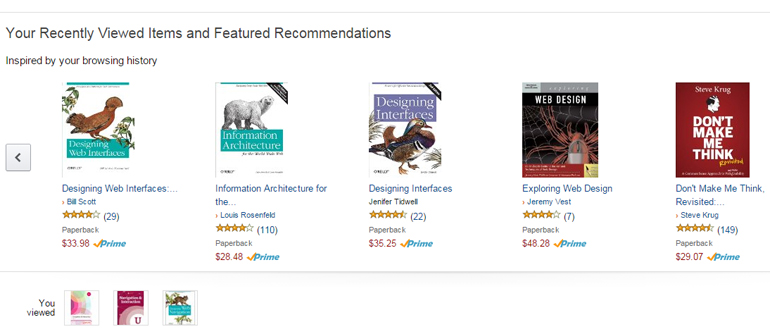
The reigning champion of "recently viewed" has to be Amazon. They took the simple idea of reminding you about the items you'd looked at recently, and then improved on that by adding in recommendations based on your shopping preferences. This is something that most other e-commerce stores now do, as do some of the biggest social networks and streaming music sites, like Spotify for example. They all display the last items you were looking at or listening to, and then provide recommendations based on that.

Infinite Scroll
When visitors are browsing through vast amounts of content, and particularly images, there's nothing worse from a UX point of view than having to jump between pages to find what you're looking for. An 'infinite scroll' feature allows the user to simply keep scrolling towards the bottom of the screen, but new content will be loaded each time they actually reach that point on the screen.
Image-based sites and search tools such as Pinterest and Google Images make great use of infinite scrolling, as does Facebook, but to a lesser extent.
Fixed Navigation
For all the creativity and ingenuity you find in web design sometimes end-users prefer to have things nice and straightforward, and a fixed navigation menu is a great way to make that happen. Creating this type of navigation system involves nothing more than creating a menu aligned to the top, bottom or sides of your viewing pane and leaving it there, no matter what. The content then scrolls around the menu system, in much the same way it would have with a site designed with frames way back in the early days of web dev.

What type of navigation systems do you use to ensure consistency for your visitors? Let us know by posting a comment below.
About the author
Copyright © . All Rights Reserved
