Exploring Trends in Real Estate Website Design in 2016: Real Estate Websites vs Real Estate WordPress Themes
When was the last time you redesigned your real estate website? Years ago? Well, it's high time to do it now! Guess what, there's a correlation between the look of your website and its popularity. And you shouldn't overlook that.
No secret that web design is a sphere of rapid change. New web trends appear every year. Some of them are to go away, some - are here to stay. Of course, you don't have to use all the novelties in your website design. Yet, there are trends that have become popular not for nothing. So, today I'm going to unveil the mystery and tell you about the trends you should use.
To figure out what I'm getting at, let's take a look at a few live examples of real estate websites.
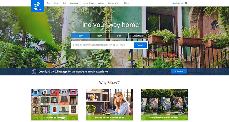
Zillow is the first candidate on our list. It's a real property portal for selling and renting real estate. Design-wise, it's a hit and not a miss for sure. It looks clean and professional, without any excessive details. A prominent hero area with a search panel allows looking by address, city or zip code. Vivid banners and ghost buttons attract visitors' attention. Besides, the large hero area contains an obvious image, related to real estate business. So, it's a no-brainer example.
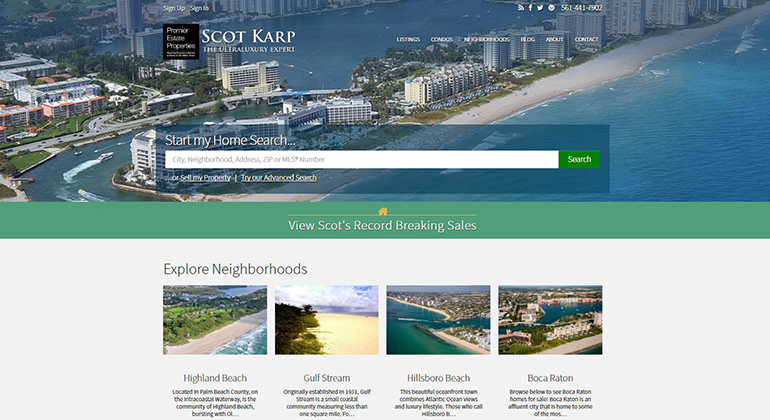
Scot Karp is an example of a private real estate broker website. It has quite a minimalist, yet stylish design. The transparent menu on top has drop-down menus for clients' convenience. This website also has a full-width header with a search panel. A grid-based layout has product banners with featured property listings. Long scroll provides even more deals and offers closer to the bottom of the homepage.
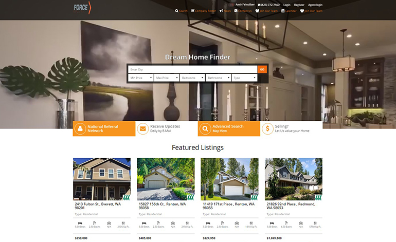
Force Realty is a real estate agency website that doesn't look like a design hit. Even though the primary goal was to combine the latest trends, the idea didn't turn out quite right. A search panel doesn't look like it's in place. It overlays the background picture in the header and covers the man's face. And that doesn't look good. Or real estate related. Well, there's a hint on some housing in the blurred background. But there's no direct message in the hero area. Also, the colors don't harmonize with each other. On a positive side, the homepage has rows of animated product banners. These banners are also product cards that have well-structured information on property.
To sum up, the above real estate website examples have:
image-based designs
�¢??Image-based�¢?? means that a website uses full-screen images and large hero headers. This effect combines minimalism and visual appeal.
dropdown menus
A usual menu has several drop down areas that group similar website elements together. This helps to save the space on the page and search for content faster.
ghost buttons
These are the buttons meant to attract attention to specific website elements. Usually, they are larger than the rest and placed in visible areas. Often, ghost buttons play the role of calls to action.
flat design
Flat design uses minimal style elements like simplistic typography, flat colors etc. It focuses on a practical approach to website design. So, it's impossible to see any extra elements or embellishments. Everything�¢??s clean and simple.
animated product banners
Animation has become an inseparable part of web design. It makes websites look more interactive and interesting for the viewers. Also, it draws the attention to particular elements like banners, buttons, images.
The above trends have been dominating in web design for a while now. If used with wisdom, they can make a website look attractive and draw more clients in. But what if you'd like to be in charge of your website's design yourself? Imagine there's a way to alter the look of an online resource and not to use the help of a coder. Now, isn't that special?
That's what website engines like WordPress are for. Bet, most people here have used or are using WordPress as their site's CMS at the moment. What else is good about WordPress? Well, there are lots of real estate WordPress themes to use as a basis for your design. Let's take a closer look at a few WordPress themes for real estate to figure out what they can do for your project.
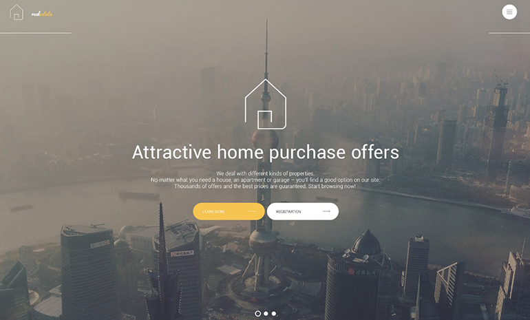
This real estate WordPress theme by TemplateMonster looks awesome. You're looking at transparency and clarity. Thanks to Parallax scrolling effect, the theme looks three-dimensional. The default background is perfect for urban real estate agency. But, of course, you can switch it to the one you like better. Also, flat icons stand out against the background and attract attention. Product banners supported with yellow ghost buttons can help you present your deals. Besides, there's an interactive live demo you can check out and test yourself.
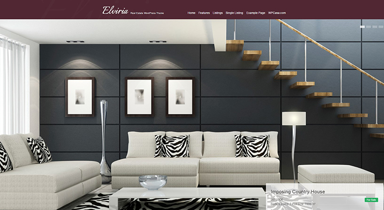
Elvira here is not the mistress of the dark. It's a lightweight and professional looking child WordPress theme for real estate agencies. Developed for WP Casa theme frameworks, it has a minimalist design and top-notch graphics. It has cool features that will be at hand for your business. For instance, advanced property filters, custom listing details, image lightbox etc.
Using WordPress themes for real estate websites has a few serious benefits. The first and foremost is - they have regular updates. This means a lot for those who don't specialize in web design. It's handy to install automatic updates and not to bother about where to get them etc.
The good news is web designers think ahead of time. So be sure, you'll get the latest trends and frameworks in the download package. To sum it up, WordPress is a convenient content management system that even a child can use. So, why don't you try?
About the author
Copyright © . All Rights Reserved
