How to choose the right colors for your brand
When it comes to brand colors, it seems so easy to make the right choice. Well, it’s not really the case. You may spend hours staring at color samples without having a clear understanding of what you want and what you need for your project.
A strong visual brand identity is a driving force of potential success. Company colors can help you introduce yourself, stand out from the crowd, and become recognizable. You can always hire a designer or marketing specialist to craft a color concept. But you can also check out the best design bundle deals that will help you do this job on your own.

By paying attention to certain factors, you can discover the perfect palette for your brand. Of course, it will take time and effort to brainstorm all the ideas. The information below will help you make the right choice.
1. Understand the meaning of each color
When you are creating something, you are often led by your emotions. And this is a normal thing. However, you should be careful with it when you are making serious business decisions.
As a brand representative, you will need to establish a strong emotional bonding with your customers. While you can’t introduce your company’s story in a single logo or slogan, you can use abstract language instead.
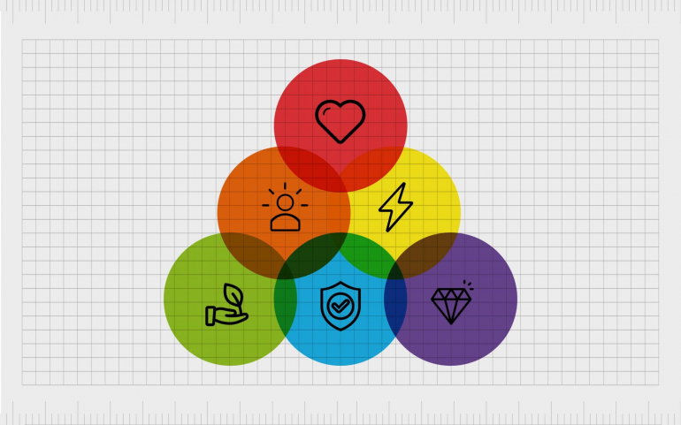
When you see a particular color, you give a specific emotional response. You can’t control it as it is automatically produced by your brain. For example, red is usually associated with passion and sexual attraction. It’s worth noting that a different opacity or tone can add a new meaning to one color.

While choosing branding colors, you should think properly about the reactions you want to get from the audience. Some colors evoke universal emotional responses. The major connotations to consider when you’re creating your color palette are as follows:
· Yellow: kind, friendly, satisfied, and delighted;
· Orange: excited, inexpensive, family-oriented, and seasonal;
· Red: passionate, expressive, sexually attracted, and adventurous;
· Pink: girlish, fashionable, young, and romantic;
· Brown: reliable, sophisticated, and sturdy;
· Black: authoritative, strong, reserved, and mysterious;
· Green: ambitious, financial, fresh, and stable;
· Blue: calm, trustworthy, and smart;
· Purple: luxurious, creative, and independent.
2. Follow the trends
The popularity of each color is quite changeable. Thus, it’s crucial to pick one that happens to be relevant to your audience.
If marketing colors selected for your project don’t match the cutting-edge colors used in fashion, you should reconsider your decision. You should check out Web Design Trends in 2021. Then, you may need to make some corrections to your corporate color palette. You don’t necessarily have to change everything. It can be enough to adjust the tone or hue to the current trends.
After all, fashion is changing very fast, and your brand color is going to stay for years. This is why it’s important to find the golden mean.
3. Lear the industry standards
You can’t make design decisions based purely on the common color meanings. You should think logically while creating a logo colours scheme. For example, IT companies often use black and blue colors in their visual representations. Just take a look at Apple and Microsoft.

Cosmetic and pharmaceutical companies love different tones of red and blue. La Roche Posay and Pfizer serve as a good piece of evidence to this theory.

Not all brands follow this classic design pattern. And you don’t have to do this as well. Feel free to go outside the box. Pick unusual and even extravagant colors in order to grab more attention from your target audience.
4. Identify your brand essence
In your creative search, it’s important to identify what colors mirror your brand. During your creative search, you should establish your thinking in the following way:
· What your brand is all about?
· What are its goals?
· How will it speak to your target audience?
By answering these questions, you will make things easier for yourself. The way you want to be seen by customers can help you come up with your brand color palette. While your product might be technologic, your brand idea might be associated with praising a good virtue. In this case, you may go with innovative blue. You can even make both blue and white be part of your branding concept.
5. Look at the competitor’s brand colors
Branding color palettes should be easily recognizable. Depending on the market sector you are about to cover, you should conduct thorough research and analysis to gain a clear understanding of the existing market offer. By taking a look at your closest competitors, you can do your best to look different.
To avoid looking the same, you should go for changes. What good colors haven’t been brought to the market yet? What will look unusual to average customers? For example, if most cosmetic brands prefer light colors, you should try some darker tones. Don’t be afraid to repel your current and potential fans.
6. Create a brand color palette
To select color, you have to deal with many “shades of blue”. With the right approach to details, you will end up with a decent brand palette.
Color hues: Variations of the primary colors include red, yellow, and blue. Depending on how you mix them, you can create different new colors.

Color shade: By adding black to a color, you create a shade. The amount of shade is determined by the amount of black added.
Color tint: By adding white, you can create a light version of shade. The amount of tint is determined by the amount of white added.
Color saturation or tone: You can change the visual concept by added black and white colors. This will make your visual design look more striking and exciting.
Color codes: If you use one of the major color codes, you will ensure your brand colors can be properly replicated. You don’t have to learn these codes by heart but you need to know what your brand colors are in each format. This happens to be the key element of brand instructions.
· CMYK stands for Cyan, Magenta, Yellow, and Key (black), and PMS stands for Pantone Matching System. Both of them are used for printed and digital formats;
· RGB stands for Red, Green, Blue, and HEX stands for Hexadecimal Numeral System. Both of them can be mainly found on websites and emails.
Brand palette: Most brands use more than one color. For example, a green logo can be completed by yellow and orange colors on the website. All these colors should work together well by being set in the same tone and intensity. This is known as a color and branding palette.
Although it sounds like a good idea to diversify your color approach, you should be careful with your choices. The more colors you add into your palette, the harder it will be for your customers to remember your brand. Google and Microsoft use multiple colors in their color palette. But most companies like IBM, FedEx, and Coca-Cola try to be laconic by using one or two colors in their brand assets. After all, an average consumer likes when things are kept simple.
Why is finding the right color important?
According to a common belief, the first impression is the last one. The same thing goes for colors in branding. Colors automatically grab the attention and turn things into something special. This is why every brand developers do their best to make their design visually attractive.
A combination of proper colors evokes human emotions and contributes to the customer’s first impression. This is why the correct color palette can be a powerful instrument to help customers engage with the brand. For example, the white letter on the dark blue background allows people to immediately relate to Facebook. Or when you think about Facebook, white and blue colors automatically appear in your mind.
Your brain functions in a way that it processes visual content more efficiently than the written content. Thus, images related to any brand are mainly made from vibrant or soothing colors, which find a direct reflection in people’s mind. Choosing the right color palette might take a lot of time and effort. You should be ready for a long and tiresome creative process. But once it is done properly, it may bring plenty of benefits in the long-term perspective.
Bottom Line
Identifying color for your brand is one of the most exciting things about your business adventure. By using your research data and your personal sense of style, you should try to create a worthy visual concept. Once you do everything right, you will see positive reactions from customers. They will start remembering your brand simply by a particular color or a combination of colors.
Generally, there are no strict rules for choosing the right brand colors. There’s always a possibility that you’ll get better results by going outside the lines. So, you shouldn’t be afraid of going against the rules of color theory throughout the creative process.
Copyright © . All Rights Reserved