How to Use Kinetic Typography to Make Your Website Interactive?
Kinetic typography refers to a form of animation. Here, we make the words go live.
I say words, but it can be anything – from a single letter to an entire paragraph. Depends on what you want to achieve through that motion. With that in mind, your moving type must be thoughtful and intentional. You can’t just make your words go jump and boom for the sheer heck of it.
Well, you can – but this superficial use won’t have the same impact.
Because when you use motion language in web design, whether by creating a logo design animation or through kinetic typography, you are making the design open up to the users.
In other words, you are helping the users forget that they are just tapping on a screen, and instead present your website as something alive that can respond. It can smile, tell you what to do next, dance when you click on the right button, and blow up in stars when you succeed.
When users can interact with your design, they may decide to spend more time on it, feel delighted by it, comprehend it more fully, and ultimately feel an affinity to it.
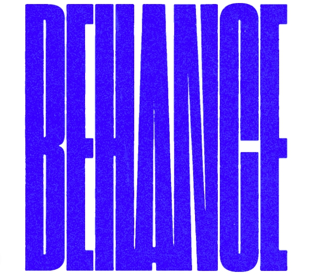
https://dribbble.com/shots/14187210-Behance
5 ways interactive elements improve the website experience
Elevate the aesthetics
Aesthetics are everything when it comes to your site to make its first impression. If your site looks drab and poorly put-together, that impression will be carried over to your brand, too, making your bottom line suffer.
On the other hand, if a site looks beautiful and offers features that not many have seen before on most sites – kinetic type, for example – that’s a huge win.
Since kinetic type also makes the aesthetics more alive, the impact increases. You now have a beautiful website that people can touch, talk to, respond to, and get feedback from.
This is something that a good old static website just cannot do.
Allow you to stand out
To make your indelible mark on the digital world, you got to have things that others do not have.
For whatever incomprehensible reasons, no major brands are benefiting from what kinetic type can do. Forget big brands, startups are also blind to the wonders of this beautiful marvel.
This is where you can strike out.
Include subtle, engaging, and on-brand kinetic type effects on your website to claim the experience as uniquely yours. Show people what you can do.
People will look at your innovation, see how impeccably you have handled it, and how it helps your business convey its message, and they begin to trust you. They’ll look at you as someone who knows what they are doing. When that trust is established, a monetary transaction soon follows.
Keep the user engaged
The entire premise of the internet and social media is built on engagement. Your content has to give people something that can keep them engaged with the content, creator, and platform.
Utilizing kinetic typography features on your website achieves the engagement ratings that you can only dream of.
Instead of forcing them to read through static copy, you are giving them live-action words that are morphing, changing, adapting, and performing to make the user journey more comprehensible and fun.
Improve visual hierarchy
Visual hierarchy refers to the organizational order in which things are presented to the user. The text with the largest font is the most important, then the one smaller than that, and so on. Similarly, fonts in bright colors grab our attention quicker than fonts in grey or light blue, for example.
Using these visual cues, we help people guide their attention o various parts of the page in an organized order.
Moving type can be an immense help here. Instead of static cues, we can use fluid typography and make our letters and words morph into icons and shapes that help guide the user’s attention.
Educate the users
When you launch a new website, it can be hard for people to get a hang of it. But interactive features can help.
According to a content marketing study, 93% of marketers believe that interactive content is ‘highly effective at educating prospective customers’.
Now, this interactive content could be anything – a blog post, video, an infographic, anything – but when you introduce movement in various areas of your website through moving type – navigation, menu, search bar, you name it – you increase the education and comprehension of a new layout tenfold.
Here’s how kinetic type can make your website interactive
1. Make your page load wait time more fun
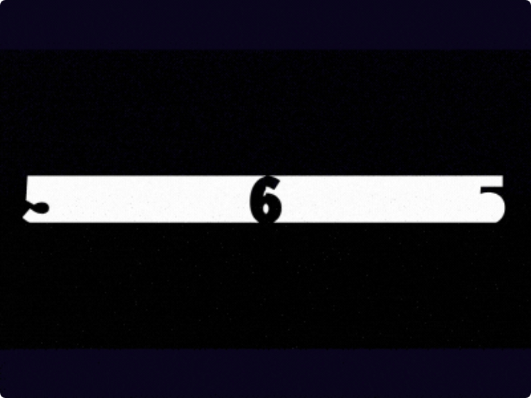
https://dribbble.com/shots/6189182-Counter-01
None of us are fans of web pages that take forever to load. In fact, according to Google, slow loading pages are one of the top reasons why some sites have a higher bounce rate than others.
But font activity can help here.
Think of a page where the changes in text size inform you on how much wait time is left.
As the type moves from a smaller size to a larger one, it can alert users about how much longer they may have to wait. While people may not respond positively to page load times, when you tell them how soon the wait may end, they may be likely to stick around for longer.
You can make the wait time even more fun by making the copy more interesting, the animation more appealing, and the effects more natural.
2. Drive user attention and hint at the next step
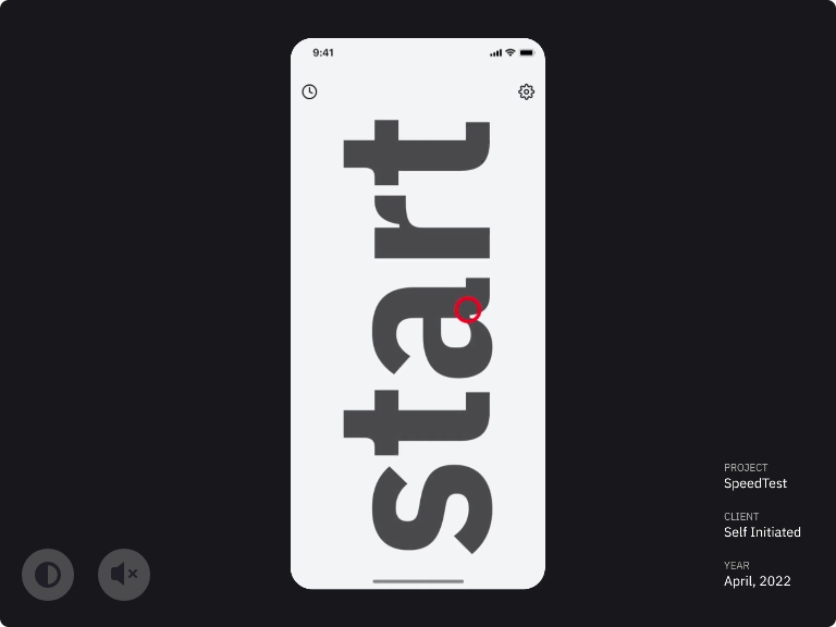
https://dribbble.com/shots/18058873-Internet-Speed-Test-App
For those who may not be too familiar with your website, finding the next step in the user journey can be a bit confusing.
Moving type can help you draw users’ attention to the right area of the website at the right time. For example, moving type on a restaurant’s digital menu can help you guide your attention to serving sizes as you finalize your dishes. Or, when you are booking a trip, kinetic typography on the built-in calendar can help you make sure you’ve chosen the right dates.
When you make the user journey easy to follow and more predictable, it’s a sign you have created an intuitive interface that most people will easily understand.
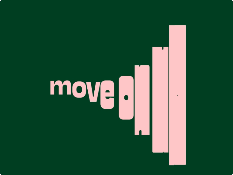
https://dribbble.com/shots/17559699-Move-On-Up
3. Tell people what to focus on

https://dribbble.com/shots/9287077-hop
Another key area where movable type can improve a website is when you have to tell people what to focus on.
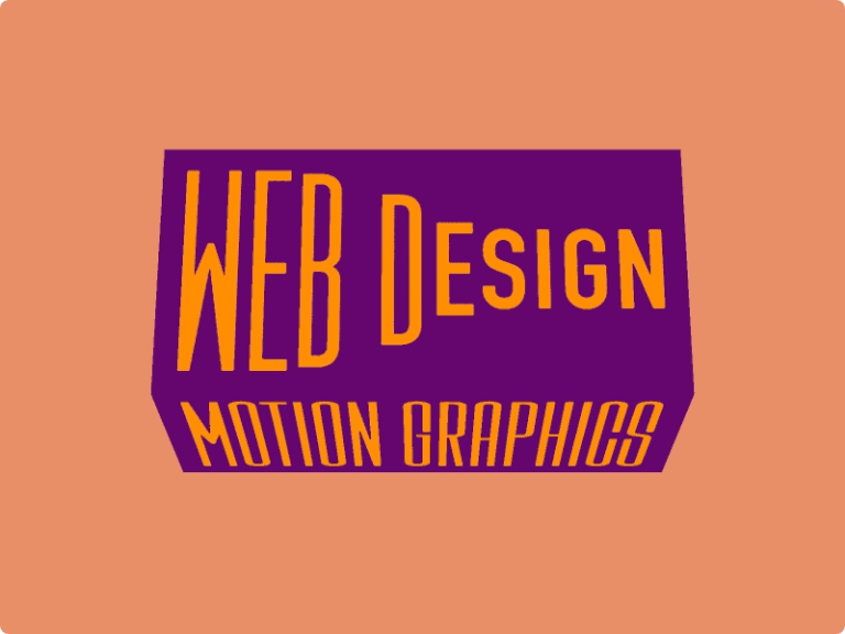
Think of a My Services page. While a traditional, static page can do its job, through kinetic type you can tell people which service is your primary product, which is second, and so on. This way, the kinetic type is helping you establish and promote your niche.
In addition to movement, you can also make the type convert into different shapes relevant to your services to make your message more visual. For example, if you are a writer, a quill icon can reference your skills as an editor while a bulb symbol can signify creative consultancy.
As different letters in your copy morph into these new icons, it not only looks incredibly playful and engaging but shows off a bit of your personality, too – and in marketing, that’s (mostly) always a plus.
https://dribbble.com/shots/13945869-My-Services
4. Prepare users for a state-change or transition

https://dribbble.com/shots/11258557-Creative-Coding-5
E-commerce or a web browsing experience is inundated with transitions. You’re always going from point A to B to C and so on. Hard-cut transitions make for an irksome user experience. Nobody likes to feel jolted from one place to the next. Fluid, liquid-like typography helps keep everything smooth.
It prepares people for a change that’s about to come. Tells them to get ready for it. Helps them to get into the mindset to prepare for the next stage of shopping, downloading, or simply browsing.
A smooth transition is also effective at retaining user attention. Instead of a static page displaying a waiting signal, some nice copy with symbolic motion will be much received by everyone and help the brand vibe.
5. Emphasize keywords, phrases, or areas of the website
https://dribbble.com/shots/11138509-The-Truth-is-Worth-It
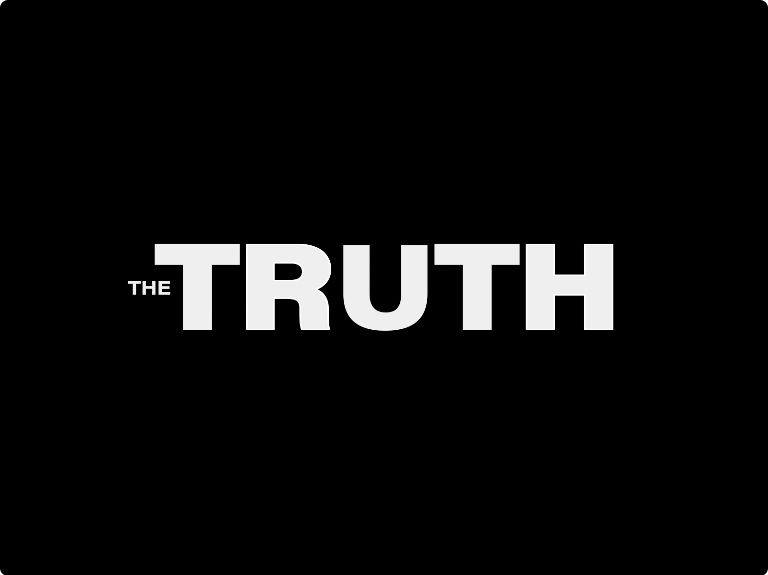
So much of the website is composed of text. Web copy, descriptions, and CTAs are a few examples. When you decide to use kinetic type, you can allow these textual elements to become animated. Highlighting your core message becomes easier.
Think about a CTA that morphs into a shopping cart icon as you finalize your online order. Or an error message that shows disappointment by turning itself into a sad frown. Or, a podcast episode list where each title becomes larger as you hover over its name.
As part of motion design, kinetic type helps you accentuate what you want to say. Double the power of your words. So, use it with intention and thought.
6. Provide visual feedback when a task is completed successfully
https://dribbble.com/shots/16174668-KEEP-IT-UP
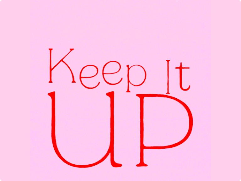
When a user engages with your UI, it helps when they know they’re doing it right. Error messages, confirmations, and other forms of visual feedback help users understand what they need to do. Reinforcing user action helps them stay engaged and increases the likelihood that they’ll follow through on what they have to do.
Animated typography is an effective form of visual feedback. It is quick, keeps the excitement of the experience intact, and encourages the user to take further action.
It especially plays a key role when you use it for your error messages. You want people to try again, don’t feel frustrated, and tell them exactly what went wrong. So, for example, when a user enters their password incorrectly two times, and the third time will lock them out of the app, you can include an animated error message alerting them of the fact so they can be more careful now.
As you can see, you don’t have to flood your website with the moving type. The whole thing will look, frankly, bizarre, and too overwhelming. As I keep saying, be subtler and more thoughtful when you work with any kind of animation. Do it when it improves the experience, and even then, keep the effect light and smooth.
7. Help set the brand tone
https://dribbble.com/shots/17070314-SIMPLE
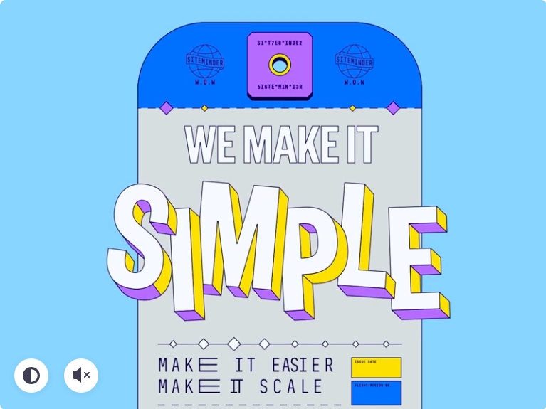
While animated text can help all and any industries, it is more efficient in some than others. Take banking or insurance, for example. You can animate your typography there, but you’ll have to be very understated. Because if you go over the top even a little bit more, it can make your brand character take a hit.
But think of fashion, lifestyle, retail, real estate, kids gear/clothes/toys, and so many others, and a healthy dose of kinetic type to make the UI more interesting seems to make a lot more sense.
While, alone, it cannot establish your entire branding but can sure work as a great asset alongside other tools.
The Takeaway
There are three:
- Be purposeful. Don’t just do it because it looks pretty. Do it because it serves a purpose, and then make it beautiful.
- Be frugal with your moving type. It can be a lot to take. So, only add it in UI areas where you have the space and where it will achieve the most results.
- Be clear. Use font styles that won’t lose legibility when you add animation. Also, stay away from animation styles that will mess up perfectly legible type styles.
Copyright © . All Rights Reserved