Integrating Responsive Web Design Principles Into Email Marketing
Did you know that, according to studies, nowadays, more than half of people use their smartphones to check emails? Now think of the last time you created an email campaign — were you using a smartphone or a computer to do that? Chances are it’s the latter.
That’s why more and more often we talk about responsiveness. It’s widely used in web design and the trend is rolling over to email marketing as well. In this article we will discuss how you can apply responsive web design principles to your email campaigns.
Understanding responsive web design
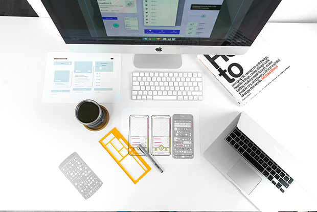
In short, responsive web design is all about creating web content that adapts seamlessly to whatever screen it’s being viewed on. The core of it is the smart usage of flexible layouts, images that are scalable, and media queries, all of which ensure that your content looks good whether it’s viewed on a desktop, mobile, or tablet.
These principles can (and should) be applied to email design as well, especially if you’re an ecommerce business, because you want your products to look their best in those marketing campaigns. While some of the best platforms for ecommerce email marketing may already have that sorted out for you, it’s still useful to have a deeper understanding of responsive design principles.
Why you should opt for responsive email design
- Increased mobile usage: Over half of all emails are opened on mobile devices. If your email isn’t mobile-friendly, you risk disengaging a significant portion of your audience.
- Better user experience: Responsive email design makes your content easier to read and interact with, giving a better overall user experience.
- Higher engagement rates: Emails that are easy to navigate on any device typically get higher click-through and conversion rates.
Best practices for creating responsive emails
We have a lot to learn from the best practices of responsive web design. So what should you take into consideration when creating your next email campaign?
1. Use a mobile-first approach
When you start designing your email, think of the smallest screen first and then scale up. With such an approach you’ll be sure that the email looks good on mobile devices first, which is where a significant portion of your audience will likely read it. From there, you can add enhancements for larger screens.
2. Simplify your layout
A golden rule for responsive design is a single-column layout. Not only does it simplify the design process, but it is also easier to read. But if you must use multiple columns — you have to make sure they stack vertically on smaller devices.
3. Optimize images
Images definitely add a lot to the visual appeal of any email, but they also can cause trouble if not optimized. You should use scalable images that resize appropriately to fit any screen, and make sure images are optimized for fast loading times, as well as have alt text for accessibility and cases where images don’t load.
4. Choose the right ESP
Nowadays email marketing is mostly done through Email Service Providers (ESPs) that allow you to manage your lists and create great campaigns. A reputable and user-friendly ESP will offer you ready-to-use responsive layouts, such as product recommendation, abandoned cart, thank you email templates and more.
Additional tips
While responsive design is a major component, there are more things you can do to ensure your emails are as effective as possible:
- Clear call to action (CTA): Make sure your CTAs are prominent and easy to tap on mobile devices. Use large, tappable buttons rather than text links.
- Short and sweet content: Keep your content concise and to the point. Mobile users, in particular, appreciate brevity.
- Engaging subject lines: Write creative and compelling subject lines that grab attention. Your email’s responsiveness won’t matter if it doesn’t get opened in the first place.
Copyright © . All Rights Reserved