The Ingredients of a Clean Website
We all have come across sites that look horribly clumsy. I mean there are some sites that have so many elements on them that it is almost impossible for a normal visitor like you or I to concentrate on a single item at one time.
But don't blame the designer all the time because maybe the designer had tried his best to persuade the client to opt for a cleaner interface but the client insisted otherwise. We all start a website design project with a clean interface. It usually starts with some important elements placed prominently on the interface to capture the attention of the audience but the unending list of changes eventually degrades the design.
However, it is not always the client whose interference leads to a clumsy interface rather there are some web designers who always fail to keep the interface clean. Some web designers believe that they need to show their creative impulses to the world and therefore, they insist on adding more gaudy elements to the interface just for the sake of showing off their skills.
So, if you are planning to design a simple website with clean interface and have no idea where to start from, you need to read this article. Here we are going to discuss how we can make an interface clean without making the design look downright bland or boring.
Simple Color Scheme
Just because we are planning a simple interface for our next web design project, it does not mean that we should be restricting our creative impulses. A clean color scheme does not mean that you can't use more than two or three colors rather it means, you need to have a clear idea why you are using a particular color. Just because you love a color does not mean you can use on a website. The color combination should justify the purpose of the website. For example, if you are designing a financial website, you should be using green color whereas if you are designing a website that will target teenage girls, you will have to use pink as the primary color of the design.
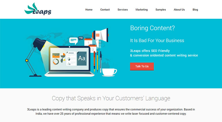
3Leaps is using a simple color scheme for its website. It has used sky color as the primary color of the design and for the Call to Action text, it has used dark red.

Declutter the Navigation
The navigation of the website should be as simple as possible. You should not be experimenting too much with the navigation of the website. Since people have become accustomed with the standard navigation, we would be better if we stick to the industry standards. Use simple Sans Serif fonts and you can always use a dropdown menu on the top navigation section so that people can have quick access to different parts of the website.
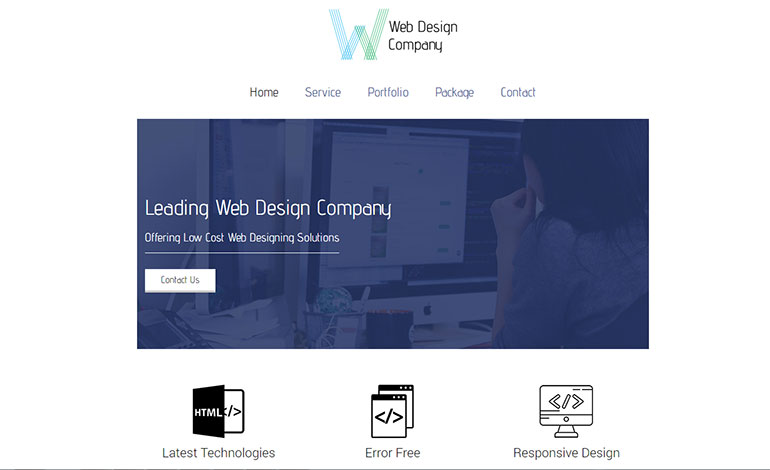
WDC has used a simple navigational structure for its website. It has used a different font type for the Navigation and all the navigational elements are center aligned.
Large Images
You can spruce up the look and feel of the website by including one large image that should be gracing the Above the Fold section of the website. Use of large image has become a dominant trend as this helps captures the attention of people and also to keep things nice and clean.
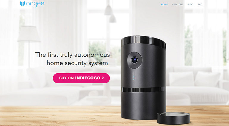
Dragonfly has used a large image to grace the above the fold section of the website. It looks stunning and the image does help convey the message across.


Fonts
Stick standard font. However, if the project requires you to use some interesting font types, you can always fall back to Google Fonts; they have a nice collection of fonts. However, you will have to restrict the number of font types to three at maximum because the use of too many different fonts might adversely affect the look and feel of the interface.
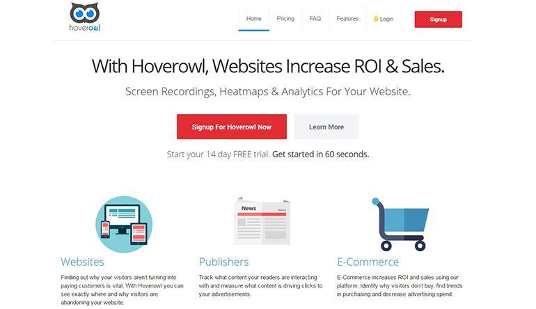
Hoverowl uses multiple fonts to jazz up the look and feel of the interface and as expected, it has kept the number of fonts used to three.
White Space
A clutter-less interface is impossible to achieve without focusing on the whitespace. Whitespace is what makes the interface look simple, neat and clean. Don't keep on adding different designing elements just for the sake of filling out the gaps. The more, the better - this policy does not apply in this sphere. Just stick to some basic designing elements and you will just be fine.
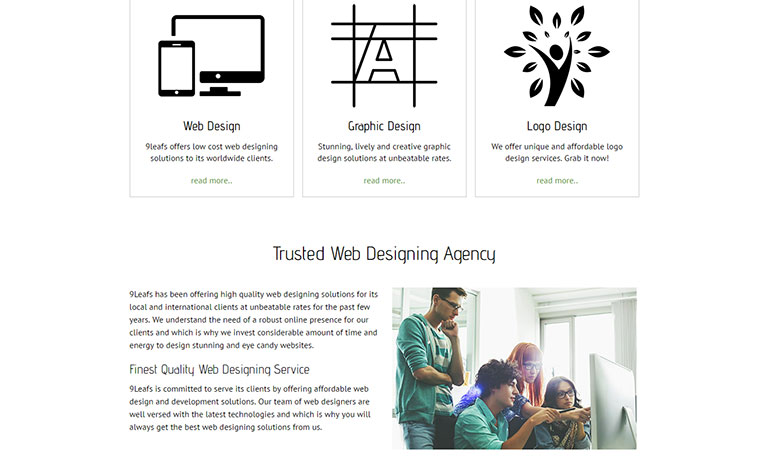
9Leafs has ample whitespace on its interface and this is what helps it capture the attention of the audience and it also helps it convert a good number of visitors into customers.
Maintain Hierarchy
You need to maintain a typographical hierarchy throughout the design process. For example, the header tags need to have larger font size. You can use a different color combination or font type for the header tags just to give the design a nice and refreshing look. Make sure that there is enough contrast between the header tags and the background otherwise all your efforts will go wasted. Another important thing that you should never ignore is the fact that you will have to maintain the same typography style throughout the website.
WireFraming
You need to spend considerable amount of time on wireframing as this will help you save the hassle of making umpteen numbers of changes due to poor communication. What happens usually is you convey something to the client verbally and he agreed at that point but as time passed on, he forgot all about it and started asking you making changes in the interface. This is why it always makes sense to spend some time wire framing the interface so that it can be mailed to the client for approval.
So, these are some factors that you need to take into consideration if you want to design and develop a clean and simple website.
About the author
Copyright © . All Rights Reserved
