The Scoop on Long Shadow Design
There's always one constant in the world of web design: There are always trends that are popping up left and right on a regular basis. A couple of years or so ago, it was parallax scrolling that was all the rage. Then, as something of a rebellion against all of the overkill exposure of skeuomorphism primarily coming from Apple, flat design began to take charge. Both design trends have by no means petered out (just like email marketing isn't going anywhere), but they've certainly peaked in spite of their ongoing popularity.
That brings us to the relative new kid on the block, so to speak, in the design world: long shadow design. It made a brief splash last year, but it hasn't yet reached the popularity of both parallax scrolling and flat design at their peaks. Still, long shadow design is a mini trend that's more than well worth exploring, if only because it's so nifty and just interesting to gawk at.
Here's what's up with long shadow design.
The Origins of Long Shadow Design
Each cool, new trend has to make its start somewhere, and long shadow design is certainly no exception to this rule. If parallax scrolling had its start with Nike's now-different "Better World" website and ad campaign, then long shadow design had its start thanks to an observation made by a designer by the name of Jeff Escalante, who wrote a post on his website about this unique design that he was noticing in various spots on the web last year.
Jeff just happened to be surfing across various websites, and he began noticing a peculiar and eye-catching design: Essentially, shadows coming off of icons that extend at an angle of 45 degrees and are two-and-a-half times the size of the object from which they're extending.
So what did Jeff do when he realized that this was more than a fluke and an act of randomness? Why, being the good blogger he was, he decided to report this to the world, and voila! We just witnessed the coining of the term "long shadow design."
Standout Features of Long Shadow Design
For any design to be a hit and memorable, it has to have ultra-unique features that are duplicated nowhere else. Long shadow design satisfies this criterion with great ease.
As mentioned above, the shadow extending from the object is usually at a 45-degree angle from the object, and it's also more often than not two-dimensional and flat. It also extends for a minimum of two-and-a-half times the diagonal of the initial object. What results from this design setup is a shadow that's very noticeable in how disproportionately longer it is compared to a normal shadow.
This had led to observations that it's not really accurate to therefore call it a legitimate shadow. Instead, you can think of it as graduating from an ordinary shadow into a highly specialized design element that instantly grabs the viewer's attention and doesn't let it go for a long time.
Finally, the shadow in this design approach is normally represented as extending out to the bottom right (the southeast, if you will, on a compass). Since the point of extending the shadow out to the bottom right is to mimic real shadows in the world, the failure to extend the shadow in this direction would actually hamper much of the stylistic effect of long shadow design.
Oh, and one more thing, too: Many of the representations of this design aesthetic feature gradients as well. Take note, though, that these gradients are really subtle because the design approach is mired in minimalism instead of in-your-face loudness!
Some Prominent Examples of Long Shadow Design
Any time you're featuring a design of any kind, it naturally helps to showcase specific examples so that everyone can understand exactly what the design's all about. Hey, people are just visual creatures!
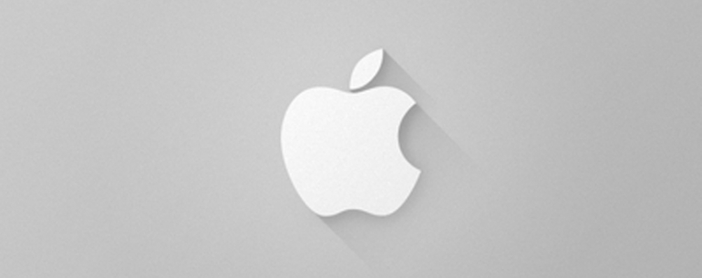
Let's start with a long-shadow take on a corporate logo that everyone knows all too well: Apple. In this version, the Apple logo is clearly changed around to reflect the long shadow; according to its creator, it was achieved simply by way of gradients and easy vector shapes.
Another good and accessible example of this design style is the changed-up Skype logo, which you can see right here. Again, take note of how the super-familiar Skype logo is modified with the long drop shadow that angles out to the bottom right at 45 degrees. In addition, see how minimalist the design is, yet, at the same time, it's still really attractive to the human eye.
Finally, we have the long shadow design applied to a famous Marvel Comics character's logo. Note how The Punisher's logo looks cooler with the long shadow extending out to the bottom right. Thanks to long shadow design, Frank Castle (real name of The Punisher) can now play judge, jury and, of course, executioner to all the lowlife villains in the Marvel Comics universe in style!
Probably Not That Impactful, but Still Awesome
Long shadow design first showed up sometime in 2013, and while some people with an eye for subtlety and aesthetics did pay attention, it since hasn't made a huge splash. So while it won't have the sizable effect that parallax scrolling and flat design had, long shadow design will forever be remembered as a mini trend that almost was.
Note the characteristics that make for good design, though. People took notice of long shadow design because it was highly unique yet still minimalist. In short, it was all about a stylistic approach that took something familiar and turned it upside down.
What is your take on long shadow design? Did it get its 15 minutes in the spotlight, or did it not get the recognition you think it deserved? Get what's on your mind off your chest in the comments section below!
PS: Here you'll find a video tutorial on how to create long text shadows with InDesign type on a path.
About the author
Copyright © . All Rights Reserved


