Typography & Creating Your Brand
Unless you're a design professional you'd probably find yourself very surprised at just how much time, effort and money goes into choosing the perfect font for a particular brand. You'll never find big companies like Coca Cola, IBM, Microsoft or Google opting for a default font, for example. In fact most of these companies have reinvented typography to enhance their own brand awareness.
So how do you go about choosing the perfect font for your brand or business? Well the first choice you need to make is between fonts which are viewed as being more traditional in nature, or something far more modern instead.
Serif Fonts

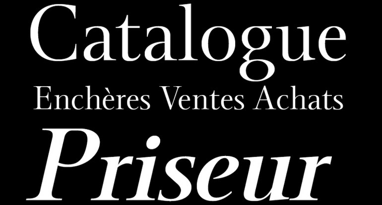
These are seen as being the more conservative font for a business to use. If you're wondering exactly what a serif font is then you just need to look at its edges - if there's any curve or embellishment to it then it's a serif font. If you're trying to convey a sense of professionalism or luxury than a serif font is the way to go. Times New Roman is a perfect example of a serif font
Sans Serif

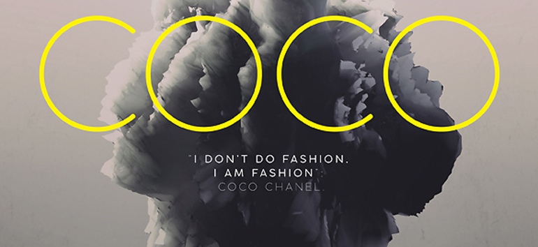
This is a far more modern range of fonts, with clean edges and nothing to distract the eye. Sans serif fonts are purely functional, making them ideal for conveying simple messages quickly. Century Gothic is a typical sans serif font.
The Rule of 2
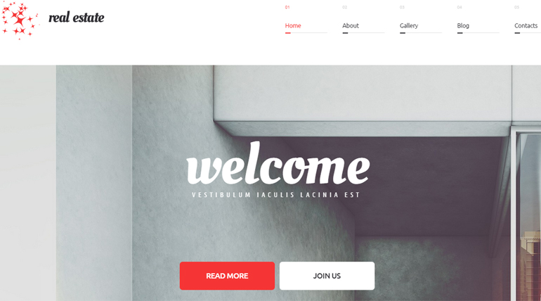
Some designers say that you should use no more than three different fonts in any single document, but we'd limit that further to just two. In reality you'll have one font for your large content blocks, and then another for headings and sub-headings.
Your navigation system will probably use a variant of these core fonts, so everything has a consistent look and feel to it. If you feel a little restricted in being able to use just two fonts in your design plan then feel free to extend it to three fonts instead; any more than that though and your page will look like an indecisive child put it together.
Typographic Consistency
In the same way that you should limit the number of fonts used in any online or offline design plan, you should also ensure that you use the same fonts for the same purpose every single time. Mixing up your fonts might seem like a neat way to add some contrast to your web design efforts, but it's going to look bad from a UX point of view. Remember that humans are creatures of habit, so they hate to find that a pattern they've become used to (your font choice) has suddenly become disrupted by random fonts used all over the screen.
Avoid Defaults
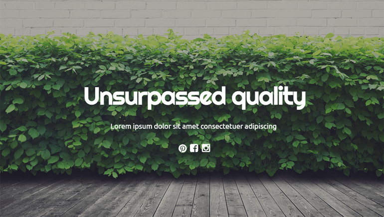
Please, please, please never, ever use a default font in whatever you're designing. We hope that was enough emphasis on that point, right? Seriously though using a default font for your logo, body content font or your heading/sub-heading font tells your client or visitors one simple thing: "I'm lazy and just didn't want to try anything new". If you really care about design then being innovative is part of the constant challenge. As a favorite mentor once told me "You're better off trying new things and apologizing for them, than never trying anything new at all".
Typography can be as interesting as you make it. It can also be as boring as you make it too, so why not experiment and use fonts you'd never dream of using otherwise? You're going to find yourself amazed at just how much of an impact that silly little font made to your page design.
What are your feelings on web typography? Do you think two fonts are too many, or not enough?
About the author
Copyright © . All Rights Reserved


