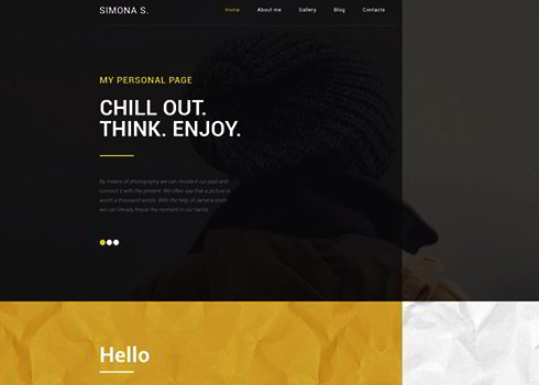
Simona S WordPress Theme
This responsive and retina-ready WordPress theme with MotoPress editor is an awesome choice for creating a modern personal page.
Loading...

This responsive and retina-ready WordPress theme with MotoPress editor is an awesome choice for creating a modern personal page.
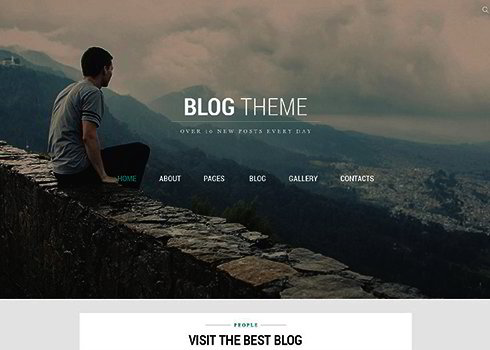
This responsive personal page template is professionally developed to work with Joomla CMS. This Joomla design is full of great features and ingenious design solutions, take a look a t the live demo!

Facebook reveal tab templates are pages that you may set to display in case a visitor is not a fan of your page. After a person hits the Like button, the reveal tab disappears and the "fan-only" content appears.

This fan page template is a fine and memorable portfolio that will be a suitable creative godsend for artistic plans of a creative photographer.

Here the navigation is presented with an animated background image sufficient enough to create that attention grabbing first impression. Clicking on the portfolio reveals some of their excellent work.

Fandango Media Group utilizes a very basic CSS fixed background trick to add heaps of character to how the content flows on the page. It's not much, but it certainly gives navigating the page an edge over most other vertically scrolling sites or pages.

This welcome area uses a retro look to help draw in users. The typography is varied, but comes together well as part of a great piece of imagery to headline the site. The copy has a nice personal touch as the webmaster states 'I'm here to help you get there'. Color is uses sparingly, but red is used to emphasize key words.

A totally immersive welcome area experience. The jungle backdrop creates an enormous sense of depth, as does the huge 3D typography and foreground photographs. This welcome area perfectly captures the feeling intended by his live shows - that you as viewer are part of the action.

Luca Vercellio uses a very minimal homepage design, where the welcome message comprises most of the page. The welcome area is relatively subtle, with a soft light effect, and white on light blue color palette. The typography varies quite a lot, but is all light and clear, fitting with the modern, clean website design.

New cool xml fLash site template provided by Templatemonster.com

Quite attractive dark style website design. Really nice source for getting inspired.
Julian Remo Perretta is an English singer-songwriter. And here is his personal web page.

Personal site showcasing all-encompassing web design portfolio.
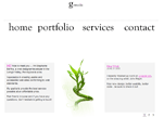
The main page has only one image, and still the site's web design looks very professional and appealing. Its genius is in its simplicity
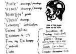
White background, nice fonts, and presentations of works which are at least exciting. Series of images, drawings, paintings, changing each other and showing the inner process of creation.

This amusing flash site is the mixture of child's drawings, applique work and flash games. You couldn't keep from smiling.
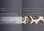
The website bears certain similarity to tracing or engineering design - the clearness of lines, gray shades plus good portfolio works.

The personal website of new talented designer. Top-flight usability and nice touchy pencil drawings.

A four-year-old boy's personal site. As it should be it's bright, many and highly colored, and cartoony.
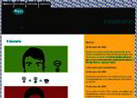
Here is an interesting Flash design. All original graphics in this super layout make the website a great place to visit. Navigation is easy and very attractive.
Copyright © . All Rights Reserved