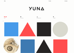
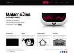
Iamyuna
Here the navigation may appear minimal and negligible but once you keep your mouse on the option it shows you the complete list of all available choices. The mouse over effect is simply amazing.
Loading...
Here the navigation may appear minimal and negligible but once you keep your mouse on the option it shows you the complete list of all available choices. The mouse over effect is simply amazing.
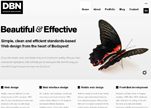
This welcome area uses photography to enhance the message within the copy. 'Beautiful & Elegant' describes their designs, but is also depicted by the beautiful, elegant butterfly to the right of the welcome text. When you hover over the butterfly image a magnified circle pops up, providing an interactive element to the welcome area, which helps maintain people's interest.
PSD templates only contain the design source files created in Adobe Photoshop. But it's design is awesome!
It's a fun layout from top to bottom, but the one noteworthy thing about their footer is how they use one simple graphic to tie the entire page together. They could have left the chemistry beaker full of magic potion and the pile of books out and the site would have still been fine. But by placing that image there it ties us back in to the header at the top of the page, giving the site a whole and complete feeling.
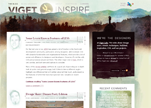
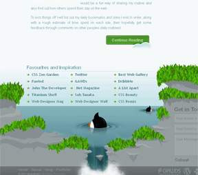
Viget utilizes their footer to give viewers an easier way to browse through archived posts or browse by specific categories. Another thing that I really enjoy about this site, and it is actually something I've done for clients in the past, is using a skyline at the bottom of the page.
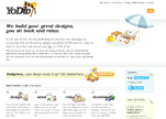
YoDiv is a fun site, not only because of the entertaining icons and artwork, but because the footer provides a wealth of free resources for developers and designers. I've seen this strategy of making the bottom of your page ground level, giving everything above it the appearance that it was in the sky, and by making the color below it an earthy, dirt-brown color, suggesting the footer is buried underground.
Carol Rivello has a perfect example of social media icons in use in her footer. Her color selection flows together seamlessly and there aren't any sharp contrasts that strain the eyes and make it hard to look at.
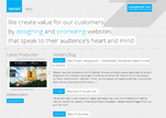
A clean and minimal welcome area with a limited color palette. The key words 'designing' and 'promoting' which describe company's key services are highlighted in blue in order to make them more prominent. The welcome message uses a light font, with a solid colored background to help contrast it against the main pixelated website background.
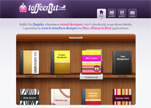
Toffeenut Design has a fun footer. Toffeenut includes an email contact form in their footer, a contact link in their main navigation cluster at the top of the page. There's also an abundance of social media icons and ways to get in touch with them, their latest Twitter feed, and all that other good copyright jargon and sitemap linkage that comes standard in a footer.
Branded07 uses a few different techniques with their footer. They use an image that signifies you're at the bottom, they've got links and logos galore, and a contact form.
Iutopia.com has a theme in their vertical depth, meaning that as you scroll down the site is following some sort of theme. For example, the top of the page has a sky scene, then as you scroll down you reach land, followed by underground.
Hailstone is a website of UK based illustrator who create awesome creativ design and artworks
They show how a creative point of view make things look better. And their result is amazing!
Look at this an attractive online art and fashion magazine! It will inspire you :)
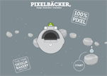
Take a look at this inspiring piece of web design. Pixel Baecker has a cool illustrations and an interesting background.
Take a piece of web design inspiration from WDRemix! The nice usability of this site will blow your mind
Creating a minimal style website layout requires concentration. A good Minimalist design of Pixel Bot gives beautiful results.
Check this cool dark xml flash template from TemplateMonster.com. It costs only $67 :)
Take a look at this Drupal Template from one of the biggest template provider TemplateMonster.com
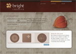
Bright Creative is a one-person studio in Vancouver BC. Check this amazing design and get a piece of webdesign inspiration.
Copyright © . All Rights Reserved