Web Designing: Background, Evolution and Latest Trends
Web designing is not an old phenomenon, it started with the advent of technology with the birth of first website and has its roots in graphic design. The global hypertext project that transformed into World Wide Web later was used to have text only pages with simple line-mode browsers. After that, Mosaic Browsers were designed those were Unix-based and text rich. Now we have two primary web designs as static and dynamic. There are different innovative designs too which are getting famous nowadays.
Web design styles change so quickly and Websites tend to follow latest trends. Web designers should be aware of the current and upcoming trends to stay ahead of the competition and to fulfill buyer's needs. Innovative design developments are the inspirations of both the designers and users in design and usability. The main purpose of the latest designs is to improve the technology that helps design to move forward. Latest designs are usually the preferences of designers and users in design and usability. Following are just a few of the web design trends that distinguished in recent years. Though popular trend sis not always the best choice but users try to follow these to look prominent among others.
Rapidly Changing Web Trends
Web design has many enhancements as compared to where it started. We see many new trends like Hero Images, Minimal, Flat, Video sliders, Background video, CSS animation, Frontend frameworks etc. Most of the trends remain on changing to be more advanced and swift with the advent of new technology and few may be switched with polished alternatives. Others, such as background video, will be used with moderation.
Latest Web-Designs
Recent web design trends follow the best practices for both UX and mobile platforms. UX and mobile have been in view over the past few years, but now they're front and center and the main driving focus of website design with an uncluttered UI. There are continuous improvements in current trends.
Flat Designs
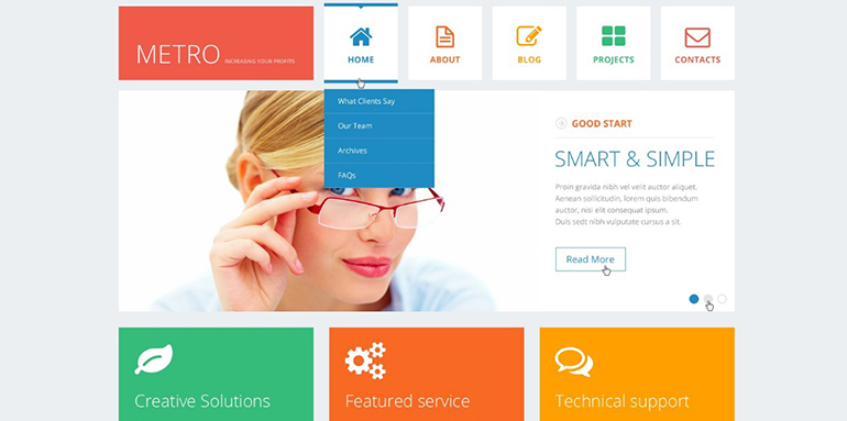
Flat Designs are derived from minimalist web designs which was first used by Microsoft. As the material, design is different from flat design. Flat designs are responsive and minimal are a design basis for presenting UI and graphical elements by stripping the visuals down to the basics avoiding visuals that try to mimic the real world with designs such as rounded corners, textures, etc. It minimizes all of the distracting stuff from the desired content and provides relevant information according to user need. It has solid colors, sharp edges, and thin lines. Flat designs are easy to read on mobile devices and loads fast. No matter how many new trends will be introduced in the market but flats are not going to fade easily because of its compatibility with Material Design.
Typography
Typography can be improved by enhancing resolution and inducing responsive designs. It can be more vibrant and prominent. It can make a statement with the use of serifs and hand-writing with specific uses respectively. With the help of Serifs layout designs are fine and don't need more revised versions except for the content itself. While the Handwriting if done with care it looks more attractive and stands out the website design. Just like serifs but keep it readable on devices like cellular phones is a real challenge because of their small screens. Hand-writing is more used in logos, headers, post titles, menus, business cards, and etc.
Material Design
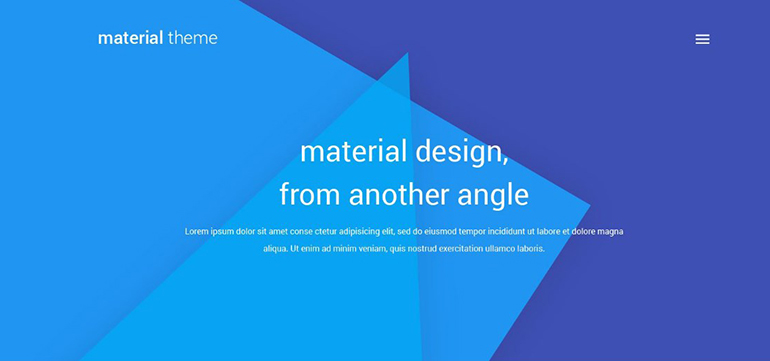
Like the flat design, it also contains fine graphical origins. It's a set of Google design standards that separates elements using the layers concept found in image editing software. It can stack and remove elements as needed. It has built-in animations that would need to be created manually. It is design language with specific rules .The results look the same from one platform to another. As these principles are established by Google so they certainly are popular. Following strict rules may obstruct creativity so it's a challenge to improve creativity within set rules.
Mobile Layouts Through Minimalists Designs
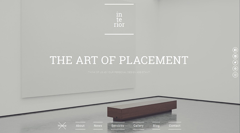
Minimalism rules for mobile devices. While viewing it on cellular phones there might be few elements which will not show up. Other elements are adjusted according to the screen size and type. This allows the message to fit the screen. Least important elements should be shed off to convey the core message of the content by fitting it to the screen. Fortunately, Material Design brings back visual elements so sites don't have to look plain on mobile. Also, you can render an image at a different size or resolution depending on the size of the screen. This will speed up the page loading and the images will still look great on mobile devices.
More Imagery, Less Text
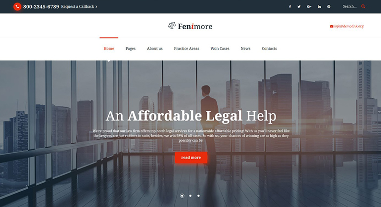
Consumers tend to look more at images and video as compared to the text that makes a balance both for SEO and UX. As search engines select texts to index. Through this approach, we see more images on the homepage while text on the subpages to attract user and to explain the idea through pictures in the first glance. The important text is put under the pictures to capture the user attention as compared to search engines. With the advent of technology, browsers have become faster at translating images in order to increase the quality of images to make it clear and bigger with enhanced resolutions and artwork.
Dynamic Storytelling
It is an interesting trend that has taken users attention since few years as it depicts the story through graphics supported by text in the form of a timeline. It can be presented through a video or presentation that can be automated. This is done through graphic skills with a storyboarding that know the exact purpose of the website which is to be conveyed to the users that highlight the positive features with the help of graphics.
Instant Feed Back and Review from Users Directly
Most of the websites have introduced an instant feedback system by embodying the commenting section. Though all the websites have their own feedback systems but it is observed that users prefer some social networking sites to express their experience as compared to websites itself. To capture social comments, the trend continues to move toward more websites using social commenting systems rather than the built-in commenting system. This ensures visitors can comment using their social accounts and/or any social media mentions are picked up and displayed right on your site. Many websites have now linked their websites with social networks to get user experience feedback like forbes.com, casinos.co
Content-Centered Approach
Readers get annoyed by adds so in all these years designers have made it possible to avoid adds. Homepages have moved from being a banner for the content and ads, to being an eye-catching landing page with great visuals. They contain more visuals than text and the ads have moved to the content itself. This requires a great layout to make room for them, which leads us to stay focused on content we want to get information about. As now by the help of drag and drop builder plugins users can make homepages and layouts with widget areas to place modules.
Latest Designers Tools
There are some interesting tools to help designers to prototype websites and design layouts that have landed on the scene those released in 2016 are Adobe Project Comet and Sketch. Adobe Project Comet is one of the latest trends. It is for designing UX completely with the tools for wire framing, visual design, interaction design, prototyping, and more. It can be previewed on any device as its works with Photoshop and illustrator, and can be expanded through community-built plugins. The sketch is basically an app for Mac that is being used in place of Photoshop with a good work environment and specifically designed for web and mobile designers. With features like layer styles, text effects, tools to create vector elements.
Never Follow Blindly
New trends should not be followed blindly especially by the businesses who have a name and history. New trends should be tested first to know the needs of your users, then apply on the running website. Any New style cannot be applied to all kind of businesses as different industries have different requirements according to their user needs. Trends should be taken as additional tools for the website design toolbox and these should be used and employed accordingly.
Copyright © . All Rights Reserved


