Responsive Web Design 101: Get to Know More About Responsive Web Design
Just a few years ago, businesses deemed it very important to have a Web site to help market their products and services. Nowadays, they are looking to get their Web sites on mobile. The problem, however, lies in that regular HTML Web sites do not appear right on mobile devices. For quite some time, Webmasters have used two major techniques in making mobile Web sites work. One is to create different pages for each mobile device screen and the other is to use responsive Web design. Each has its own benefits and it is largely up to the business or the Webmaster to use the method that it feels would serve its visitors better. But for now, we are going to focus on responsive Web design.
What Is Responsive Web Design?
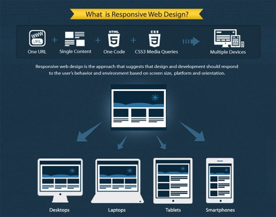
Responsive Web design is the name given to a variety of techniques aimed at making Web site perfectly viewable on any screen. This includes making it easy for people to read the content on the site and for them to easily navigate through different pages of the site.

This Web design technique follows several concepts that are better explained by illustrating how they work:
1. Flexible elements
One of the biggest problems of mobile Web design is that you simply cannot anticipate what screen size to use. The increasing popularity of smartphones (with different screen sizes, specs, default browser, operating system, among others) made website development more challenging. Plus the fact that more and more new smartphones and other mobile devices are introduced every day.
On top of that, for every screen size, you would have to design for two views: portrait and landscape.
Without using flexible elements, your mobile Web site would be best described as clunky and crappy.
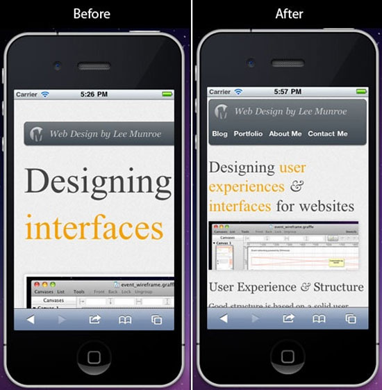
Responsive Web design allows you to use the right sized images, use the correct layout and even change the navigation options, depending on how big the mobile device screen is.

Images. Responsive Web design allows you to use big images on your desktop Web site while also ensuring that you do not have to scroll up and down, and left to right to see the full image when viewing the same page on a smaller screen.
Text. Content and text on a responsive site would be easy to read no matter if you are reading it on an iPhone, an Android phone or on your desktop computer. This means that you do not have to pinch and zoom the text before being able to read it.
Layout. A responsive site would serve different layouts for different screen sizes. For example, if the screen is big enough, you will see a three-column layout. But on a small phone screen, you might be seeing a site with one or two columns.
There are other elements that you can work with, such as the page background and tables. But these are the basics that every site has, so we'd stick with these three first.
2. Showing only the necessary content
One of the many challenges of working with a smaller screen is that you simply cannot put in too much content or else it would look cluttered and cumbersome.
Responsive Web design allows your visitors to hide or show content as they need it.
A very good example would be Web mail. On your desktop, you would probably find a lot of information already available on screen such as the sender's name, the e-mail subject, the date, the folder where the mail is located and a snippet of text that shows the first few lines of the message body.
On a smaller screen, however, that would look cluttered and it will not be very useful for people who are on the go and looking for information on their inbox.
Nevertheless, all that information is important. What do you do?

You can hide some content and show them only when the user asks for them. For example, you can just list down the sender name and the e-mail subject. If the user taps on the e-mail subject, it could show the snippet and other things you want it to show.
You could also have it so that only unread messages are displayed.
3. Built for touchscreens
Responsive Web design also takes into consideration that most mobile visitors are now using touchscreen devices. So you must make sure that your design is intuitive. Your buttons and links should be easily tapped. Make allowances for big thumbs and keep your links far apart so that people would not have problems tapping them.
The Benefits of Responsive Web Design
More than making sure that you give your Web site visitor the best experience no matter what device they are using to view your site, there are a lot of benefits from using responsive design.
1. Responsive web design is something you already know.
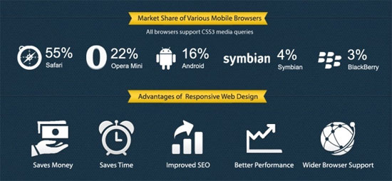
When it comes to doing responsive design for your site, you really do not have to learn a new set of coding or a programming language. You would STILL be working with HTML and CSS - tools you're already familiar with as a Web developer.
What's more, if you absolutely hate tweaking HTML and CSS, you can use a content management system such as WordPress and be able to do responsive design easily and quickly.
2. Responsive web design makes your site future-proof.
As more and more people are browsing the Web on their mobile devices, the future is pointing to having a Web site design that would enable you to display your site perfectly on these devices. In fact, if you only have a desktop version of your Web site now, then you might be missing out on some customers because people nowadays are using their smartphones more than their desktop PCs!
3. Responsive web design helps you save on costs.
Using responsive design, you only need one set of pages for every possible screen that you have. This means that you do not have to create separate pages for iPhones, tablets, Android devices and other screens. As you can imagine, you would be coding less pages keeping development costs down.

Furthermore, you will find that having only one set of pages for your site would also help you manage it more efficiently.
Responsive Web design has a lot of benefits that could allow you to save. And the good news is that you do not have to learn a new programming skill or language to do it. Do not hesitate to jump into responsive design now!
About the author
Copyright © . All Rights Reserved
