10 Free Color Tools
Design is all about colors. Seemingly, it's very easy to choose colors that go well together. However, after a while you get stuck and it becomes so difficult to find a color that matches the other colors you have so carefully picked. In such cases color tools are of great help.
There are color tools to pick matching colors, to find colors with good contrast, to pick colors from image, etc. This article includes free tools in all groups and I hope the tools I've picked will be as useful to you as they are useful to me.
1. Color Explorer
Color Explorer is one of the most useful free color tools. In fact, this is a suite of many tools, not one. It has a color picker that also suggests close variations to the color you've selected, color libraries with long lists of colors, a color matching tool, a tool for analysis and conversion (from one color system to others), a color extractor (from images), a css/html color importer (just upload a css/html file with colors and all the colors in it are displayed onscreen together with their RGB and hex codes).
2. Adobe Kuler
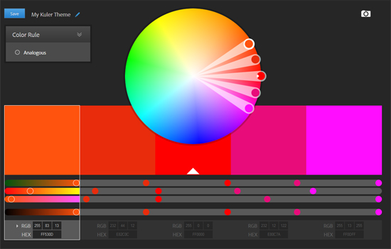
Adobe Kuler is another great color tool. It comes with a very powerful color wheel you can use to create color palettes. Another cool feature of Kuler is the functionality to import colors from an image. Probably the most interesting functionality is the themes gallery where you can access hundreds of ready-made color themes. Of course, you can also create your very own color themes and save them for future use.
3. Slayeroffice Color Palette Generator
The next tool - slayeroffice - is one of my personal favorites. It doesn't have all the perks of other tools but it is a very simple and very straightforward color palette generator. You just put a base color, a top and bottom blend colors and you get some suggestions of colors that fall in between.
4. ColorBlender
ColorBlender is another free tool you can use to create a color palette. It's especially good when you use the palette in Photoshop or Illustrator because the tool offers the option to export your palette in Photoshop/Illustrator format. Additionally, you can have your palette mailed to you. There is also a library of ready-made blends you can browse and use.
5. 0 to 255
0 to 255 is one more color picker, but this time its main purpose is to help you find matching lighter or darker shades of a color. This works great when you need a shade that is similar to the one you use, yet different enough. Most often you will need such similar, yet different shades for gradients, hovers, borders, etc.
6. Colorspire
If for some reason you don't like the other color palette generators, you might want to try colorspire. It's not fundamentally different from the rest, but it has some useful options, such as brighten, darken, saturate, and desaturate that can drastically speed up the process of finding the exact color palette you want.
7. Color Schemer
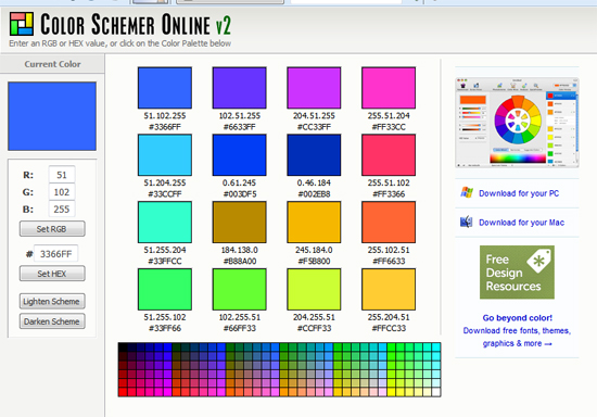
This tool isn't as sophisticated as the others but still it's quite OK when you need a quick color scheme. Its main advantages are that it offers a palette of 16 matching colors (while most of the other tools offer just 5), offers to lighten or darken the generated palette, and that it can be used offline on a Mac or PC.
8. Color hunter
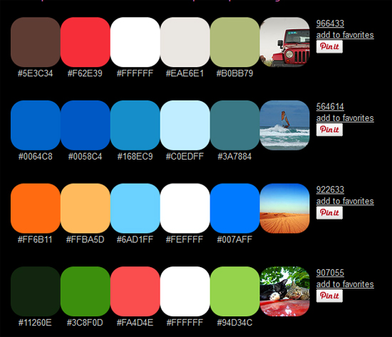
color hunter is a gallery of ready-made color combinations, most of which are extracted from images. You can get color combinations, if you enter a tag, a hex color, or an image URL. You can also upload an image and the palette will be extracted from the colors in it.
9. ColorCombos
ColorCombos is again a tool with color schemes, but this time they are ready-made ones. You can browse the library with these combinations, but you can also create your own. There is also a color grabbing tool which you can use to extract the colors of a site.
10. WebAIM
This tool is very different from the other free color tools on the list. It's not a palette generator, but it complements them nicely because it's a color contrast checker. It might not always be obvious, but frequently colors that match each other perfectly have such a poor contrast ratio that you simply can't use this combination.
Contrast is especially important for colors you use for text because it seriously affects readability. Therefore, when you pick some cute color combinations you plan to use for headings, body text, and background, it's really a good idea to run them through the contrast checker. This way you will know if your readers are going to have a hard time reading your text, or if the colors you've picked have enough contrast to make good body text and headings.
There are many free color tools out there and it's not possible to include them all. Actually, it's quite possible I've missed some great ones you've been using for years. In any case, I think that the tools on the list are useful and I myself can't imagine my designs without their help. You don't have to use them all - try them, see which ones you like most and stick to them.
About the author
Copyright © . All Rights Reserved


