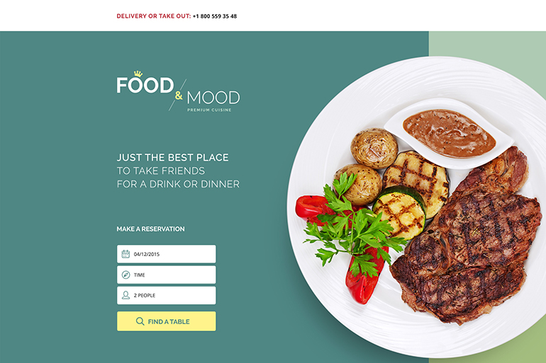
4 Ways to Simplify Landing Page Design
In today's business world, there's a high demand for web designers who can create high converting landing pages. In other words, if you're skilled at designing landing pages that influence customers and push them through the conversion funnel, then you shouldn't have any trouble finding a job.
While there are many different aspects to landing page design, one of the most important is simplification. Here are a few tips worth keeping in mind.
Take a Top-Down Approach
There are a variety of landing page strategies. Some prefer to start with the basic information at the top and then gradually push the user down the page to reveal the call-to-action (CTA) and conversion form. And while this does work in some situations, it's almost always better to put the most valuable information - aka the CTA and conversion form - at the top. This way, it receives maximum exposure.
This is a concept that real estate agents frequently use to increase the value of their landing pages.
"When crafting a listing, you have to assume that people have short attention spans," explains Green Residential, a leader in real estate marketing. "It's possible that most people will never make it to the bottom of a listing. With that being said, place your best features and the most important information at the top. This diminishes the chances that someone will overlook something."
This doesn't mean you can't put information at the bottom of a page. However, only non-essential information should be placed there. Furthermore, if you're truly designing a simple landing page, non-essential information shouldn't even be included.
A Picture is Worth ...
As the saying goes, a picture is worth a thousand words. The best thing you can do is rely on visuals to move users through the conversion funnel. While it's impossible to develop a page without the use of some text, don't let dense paragraphs and bulky verbiage overpower the rest of the page. Whenever possible, let visuals do the talking.
"Never assume that a visitor is going to easily understand the benefits of your product," says entrepreneur Eric Sloan. "If you can back up your copy with a picture it makes it much easier to convey your benefits to visual people."
Streamline the Conversion Form
When a landing page gets a lot of views, but very few conversions, one of the first things you have to consider is the conversion form itself. Is the form as simple as possible?
The first place to start is with the number of fields. Fewer fields almost always equals more conversions. According to research involving 40,000 different forms, three to five fields is the "sweet spot" Any more than that, and you risk overwhelming users. Any fewer, and the form may get overlooked.
Focus on a Single CTA
The heart of any landing page is the CTA. While the CTA is likely determined by the client, you must be prepared to guide them through the selection process.
Here are a few tips and best practices for effective CTA integration:
- Emphasize the CTA. The biggest mistake people make when integrating the CTA into a landing page is not giving it enough attention. "Set the offer copy and corresponding call to action apart from the rest of the page to make it special,"says SEO expert Erez Barak. "Use white space, a box around it, lines above and below and/or some sort of contrast to point out where the visitor needs to focus to obtain the item."
- Ensure the CTA is weighty. Weak CTAs don't work when you're asking a user to provide information. In order to ensure your conversion forms work, the CTA needs to hold some weight. Something of perceived value must be offered in return.
- Keep it concise. A good CTA is only a few words long. If it takes more than seven or eight words to explain, it's probably best to go back to the drawing board. As a good rule of thumb, an effective CTA will comfortably fit into a standard size conversion button/icon.
While the CTA isn't something a designer typically focuses on, it's imperative that you have a keen understanding of how to properly integrate and utilize CTAs in the grand scheme of landing page design.
Keep Things Simple
Simplicity is the name of the game. Whereas traditional web design of the late 1990s and early 2000s was all about using as many different design elements as possible and combining them in clever, flash-heavy ways, today's web design values a minimalist approach. This strategy of minimalism is especially important when designing something as targeted as a landing page.
When a user clicks on a landing page, you only have a few seconds to engage and convert them. If you don't utilize these valuable moments, you risk missing out. While this directly impacts the client, it could - in the long run - hurt your perception as a quality conversion-based designer.
Keep things simple and avoid this negative reputation.
About the author
Copyright © . All Rights Reserved


