Do You Desire to Know What a Responsive Website Page is?
The world has gone crazy about mobile devices usage in only the last few years! People have chosen a new way of socializing. Over 72% of people keep their smartphones at arm's length and makes up the largest part of their time. We are using our “hand-pets” even while in the shower, dating, baby-feeding or shopping. It’s become common to view website services from smartphones. Millions of pages are viewed from mobile devices every day.
Unfortunately many of the websites on the internet are not designed to be seen by anything but a desktop. It is essential to have a certain approach to this information layout, so it can be easy to view information on any website, working effortlessly for any existing device.
Responsive web design is a web development approach to modern websites creation under which a designer makes the resource convenient for browsing from any device, regardless of the dimensions of the screen, whether it is a desktop, mobile phone or tablet, as well as any device existing presently or any other gadgets which may appear in the future.
Here are some remarkable and universal features of responsive web design:
- Flexibility. An appealing flexibility of a contemporary web-page structure is used to adapt the screen resolution for all devices.
- A fluid grid. A flexible grid-based layout positions the content of your website in a direct proportional percentage of the device’s display size being properly used.
- Fluid images. Besides a fluid grid structure, web designers use fluid images or fluid copy blocks to adjust media or images by scaling in case of width reduction of such a page type. Entire content streams will smoothly contract; structural elements will decrease relatively to each other as a website itself detects the device which you are using to browse and enables it to display a page correctly.
For instance, if you have a three-column-type structure custom website design, on a narrower screen it will become a two- or even a one- column content page. Features mentioned above can be used to control orientation - Portrait and Landscape -, aspect ratio, max-width and -height, device-height, the width and height, etc.
Philadelphia web developers will warn you: Google drops you for non mobile-friendly website design.
An unpleasant truth is that Google lowers the search results for non mobile-friendly websites pages. April 2016 literally changed the world! Google boosted an algorithm of search results so it would become impossible to navigate a website from a mobile device without zooming and pinching. If your website is not adjusted for a smartphone browsing then it’s rating positions will be lowered forcibly.
There is a question which arose a long time ago: to be or not to be..oops!… to have or not to have a responsive website? Web designers say: a responsive site is a must-have feature for everyone. If you don’t believe our Philadelphia web developers, just monitor your website statistics: are there any abrupt and sudden drops in your traffic?
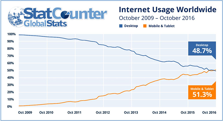
Web development in progress. Smartphones browse first, don’t they?Gadgets significance in people’s lives changed web development history. Up-to-date statistics says that smartphones are now more frequently used for browsing websites than desktops. October 2016 became a crucial point as this was the month wherein mobile devices traffic exceeded traffic from desktop worldwide.

As far back as eight years ago almost 100% of all internet traffic was coming from desktop computers. The situation has been changing by leaps and bounds. Traffic has been growing every month and continues to do so progressively. It had become a critical point for the entire industry. The world’s biggest enterprises, local business companies and e-commerce owners – any service is now in the need to be adjusted for worldwide network changes.
Now before starting to create a website, we are usually starting with working the content for a smartphone platform out and to adapt its layout of elements for a desktop computer later.
Business advantages of a responsive website.Larger numbers of people started to use not only desktopslaptops but also other devices, such as smartphones, tablets, game consoles and TV sets for viewing websites. Besides a number of those who use a desktop, permanently decreases.
With responsive design your website will adjust itself for any screen type and eliminates the situation in which a user would leave the site because of lopsided images or awkward and unreadably small texts displayed.
Google searches made from mobile devices primarily shows sites of companies which are convenient for viewing from smartphones and lowers the position of those websites which are not firm in this.
What kind of company or service need a mobile website?Now that we’re aware of responsive website design advantages, it’s a great time to enlist top market niches which obviously, and reasonably demand to have a mobile APP for being in a close touch with the world and their customers. Well, let’s see who is shaping the top list?
- First and foremost, it’s any business or company in which the customer may be in the need of operational information right away while being out of reach from a desktoplaptop.
- Restaurants. According to the latest study, restaurant sites are visited from mobile phones by more than 80% of users which is outperforming other industries.
- Almost all services dedicated to individual users primarily need a mobile version of a website. For instance, according to Robert Kiyosaki, “local small businesses make up 63% of the US economy and the vast majority of them know nothing about internet marketing”
- In e-commerce, goods have being purchased mostly from smartphones. To run a successful e-commerce website now it is a must-have to focus on smartphones and tablets users. By following this you significantly increase your chances to reach a majority of your potential customers. So, it's your responsibility to create an appealing web design for your visitors. Mobile shoppers are demanding and picky, and you should be aware of the highly competitive nature of the e-commerce industry. Do your best to prevent your customers from purchasing from your competitors. Avoid all significant losses in your business by avoiding any insignificant troubles on your website.
- Black Fridays are now on track to set new records. Recently, Black Friday shopping was made up of more than 60% mobile devices. Online shopping continues to grow. Pricing range changes. According to 2016 Adobe reports, which had been tracking e-commerce transactions throughout sales holidays, Black Friday set a new firm record by exceeding $3 billion and became the first day in U.S. retail history to gain over a billion dollars from mobile sales.
- In contrast, B2B services are more often being viewed from desktops but even so a percent of visits from smartphones has already grown to between 30 and 40%
- Obviously, the absolute leaders are social networks as their percentage of users viewing from mobile devices is approaching 100%. Let’s observe the chart of data changes over a few years.
It’s not a secret that it is possible to track how shoppers behave with their smartphones when they make purchases. In June 2017 Google published interesting research showing how buyers use their smartphone when they buy. The key idea of this research is the following: before customers used to choose what they were willing to buy prior to shopping but today they search for what they need directly from the shop floor!
The behavior model changes as buyers are searching in network for the right information in the course of the purchase decision making process to assure that they are shopping for a product or a service at a better price and a higher quality.
It is necessary to ask your clients for feedback and ask questions of them about how they learned about you on the internet, what they were focused on and why they have chosen you (for instance in the way any tourist agency or beauty salon does).
It is important that an increasing number of progressive people prefer to buy not from the desktop but from a smartphone. According to this research 44% of all online purchases are done from mobile devices!
If you intend to shape an army of loyal customers you should definitely follow this remarkable idea: "It's less important for a shopper to be present in-store than for the store to be present wherever and whenever a shopper needs it."
What does this idea focus us on? Retailers who use so-called “micro-moments strategies” significantly prosper in comparison to those who neglect the two main rules: “be there” and “be useful” for your shoppers who are mainly led by certain basic micro-moments such as “I-want-to-know”, “I-want-to-go”, “I-want-to-do” and “I-want-to-buy”.
What does this mean? When a User turns to a mobile device driven by any reason: to search, to watch, to check in or to check out, to learn or to teach, to discover or to buy, they show and express micro-moments when they are already certain about preferences and desires. It’s quite a challenge so a Retailer who must respond immediately: meet high expectations on a moments notice by reacting to what and when the User is looking for by offering the best solution at an affordable cost.
“We want things right, and we want things right away” ©
Testing your connectivity or whether my website is responsive or not?If your website is able to open from a mobile device or a tablet it doesn’t entitle your website to be responsive. The purpose of a custom responsive website design is to be able to adjust itself with respect to a device which is used to view the content. Here is an example of how it happens

There is no longer a question of if we need a responsive web-design: it is a must-have for any professional business and it’s out of the question any longer.
In our Direct Line Development studio in Philadelphia nearly 100% of the designed websites are responsive. We are masters of our craft who can design for you a website (including offshore customs) which boots fast, works perfectly, has reasonable pricing and the best look on any device. Also, we can be a resource for your outsourcing – just ask our developers!
About the author
Copyright © . All Rights Reserved
