How to Design a User-Friendly Navigation App
Navigation apps help to determine the best routes and provide navigation tips to reach the desired destination. They have driven out paper maps, which is no wonder since they are convenient, time-effective, and provide a lot of options to choose from.
The popularity of smartphones and mobile apps has contributed to the advancement of navigation apps. The navigation market is expected to reach an annual growth rate of 10.46%, resulting in a market volume of around 2 billion dollars by 2027. As such apps provide important info, and users should be able to rely on them in their travels, developers have to use intuitive and user-friendly design approaches.
1. Use Responsive and Adaptive Design Principles
The navigation app should work seamlessly on different devices, screen sizes, and resolutions. In order to achieve this, a development team has to use responsive and adaptive design UX/UI principles such as:
- Breakpoints — specific points on the screen reaching which the layout and the content adapt to different screen sizes. Common breakpoints on the smartphone include 360 x 640, 375 x 667, and 360 x 720.
- Media queries are used together with breakpoints to determine how the CSS elements should be presented on the screen based on the device characteristics.
- Fluid grids instead of fixed ones. Fluid grids allow you to adjust their content proportionally to the screen size using percentages.
- Flexible or responsive images can scale and adapt to different screen sizes. Using the “max-width: 100%” CSS rule will ensure that the images don’t overflow their containers.
Navigation apps allow us not only to navigate outside, on the streets but also inside complex buildings like shopping centres. That’s why designing a shopping centre navigation app can be a smart decision for your development strategy.
Example: How Mapbox Uses Responsive and Adaptive Design Principles
Mapbox is a map studio service that can be integrated into other web and mobile applications. Meta, Snapchat, and Shopify use Mapbox Studio for their maps. Its main feature is the ability to customize the map view in accordance with the design code of the service. Thus, customizable mapping solutions can fit all products and their requirements.
The app uses different breakpoints and media queries to adjust the layout, content, and functionality of its maps in accordance with the device type, screen size, orientation, and resolution. Fluid grids and flexible images allow the maps to resize and reposition fitting into the available space on the screen. By using such features, Mapbox maintains usability and accessibility for all users.

Source: https://www.mapbox.com/
2. Use Clear and Consistent Icons, Labels, and Colors
Using clear and consistent icons and labels helps to achieve an intuitive experience throughout the app. They allow developers to convey the purpose and functionality of the application. But it all starts with the color.
- Pick the appropriate color scheme that you will use within the app. Choose a primary colour and a few secondary colours and tones. You can also assign some colours to designate actions like “Start,” “Go,” “Stop,” etc., or show traffic conditions.
- Choose simple icons that are widely recognized. You can use a compass or a globe for the map, a magnifying glass for search, etc. Stay consistent — ensure that one icon is used for the same function.
- Labels supply icons with text designation. Be descriptive and concise when using them, ensure that they are easy to read, and have the appropriate fonts and sufficient contrast against the background.
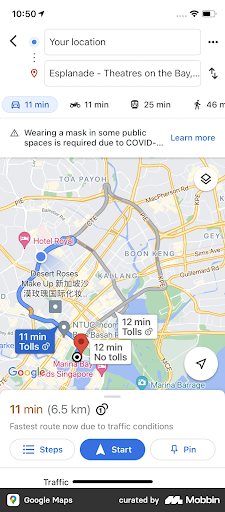
Example: How Google Maps Uses Clear and Consistent Icons, Labels, and Colours
Google Maps is one of the most popular and used navigation apps and has 1.8 billion monthly average users. Aside from the Maps functionality, it also provides accommodation options, events and entertainment, taxi, and traffic notifications. It uses quite clear and consistent icons, labels, and colours that are recognizable worldwide.
Icons such as a car, bus, or bike allow users to choose the mode of transportation, while location pins mark the new and saved places. “Explore,” “Commute,” and “Saved” labels complement and sometimes explain the icons. Colours are of importance as well, since they designate traffic conditions, places of interest, types of the road, etc.

3. Use Simple and Intuitive Navigation Patterns
Navigation patterns are design elements that help users navigate within the product and access different screens and features more easily. Almost all apps use a set of recognizable patterns that can simplify and improve UX. Examples of such patterns include:
- The hamburger menu is mostly used on mobile apps to hide the menu content.
- Tabs can be found at the top or the bottom of the screen and represent the most used features like “Settings,” “Directions,” “Traffic,” etc.
- A navigation drawer is often hidden behind the hamburger menu. It can contain “Saved places,” “Recent routes,” “Settings,” and so on.
- Buttons or Call-to-Action buttons initiate actions within the app. Examples of such buttons can be “Start navigation,” “Stop,” “Mute,” etc.
- Gestures like swipe commands allow for quicker switching between views and maps. You can swipe from side to side, from the bottom to the top, and vice versa, and pinch zoom to initiate the command.
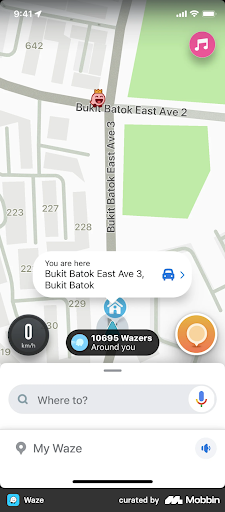
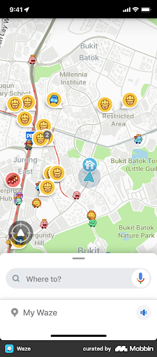
Example: How Waze Uses Simple and Intuitive Navigation Patterns
Waze is a Google subsidiary that provides real-time traffic information and location alerts using crowd-sourced data. Thanks to this feature, it has amazing traffic prediction accuracy. Waze also has quite an intuitive design: it features main tabs in the left-hand corner, providing users quick access to the settings or reports.
Its navigation drawers like “Search” and “Settings” allow to achieve different functions within the app, and “Go,” “Report,” and “Mute” buttons initiate actions. The app also utilizes voice commands as well as gesture commands such as swiping, tapping, and pinch-zooming to interact with the app. Fun icons show the road construction sites, traffic jams, and restricted areas.
To Sum Up
Navigation apps should be intuitive and user-friendly enough to save users time and costs. That’s why it’s vital to implement responsive UX/UI principles — adaptive design, clear and consistent icons and labels, and simple navigation patterns. These measures will enhance user satisfaction, improve accessibility, and give the app a competitive advantage in the market.
Copyright © . All Rights Reserved