UX Design that Persuades - Finding the Triggers
A human mind is a fascinating place for exploration. Scientists have been going there for years. And out of all of the "going there," there have been some basic understanding of what mental activity motivates human behavior. Overall, we all tend to act in what we believe will be best for ourselves, even when objectively it may not be. Marketing and sales professionals have been using this body of research to persuade consumers for years, with their advertisements.
Enter Internet marketing, especially through the way companies appeal to consumers through visual and textual content and how that content is presented through design. That presentation falls under a larger umbrella called UX (User Experience), and UX has become a huge part off persuading visitors and users to convert and become actual customers.
So, how do designers use the principles of psychology in their design? Here are some common and some not-so-common psychological triggers that designers can use to persuade.
Reciprocity
Humans like to reciprocate. When someone does them a favor, they tend to want a return that favors in kind. Thus, if a neighbor agrees to the water plant and feeds the cat while someone is on vacation, that someone is happy to do the same when that neighbor leaves town.
In sales, we see this in the grocery store all the time. Free food samples are given out for a reason. When someone receives that "free something" their brain is triggered to reciprocate, and that reciprocity may mean that they purchase the item they just sampled.
In terms of design techniques, the implications are obvious. Quite prominently featured on most business and e-commerce websites are such things as free shipping, free trials, buy-one-get-one-free, free downloads - anything that implies the consumer is getting a favor of some kind. When a user takes advantage of that "favor"? s/he feels an obligation, maybe not immediately, but perhaps in the future, to purchase from that business.
Need to Be of Service/Help
There is a human need, within the majority of people, to be of help to others in need. At a time when official church membership is declining, individuals do want to believe they are contributing something to others or to humanity in general. This is how charities are funded, of course. The need is especially true of millennials, who want to conduct business with companies they feel are socially and environmentally responsible. If a company is making contributions to society or the planet, then its website design should feature this in prominent places.
Here is the home page of Toms Shoes, a footwear retailer that donates a pair of shoes for every pair purchased:
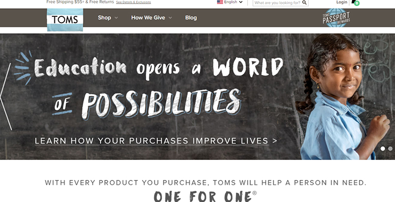
And, the company has moved into a number of other initiatives - eyewear, prenatal care, and clean water - all for disadvantaged people in under-developed areas of the world. Consumers feel good when they purchase from Toms - they are contributing. Obviously, it works. The company is said to be worth about $650 million today.
Social Proof
This is often called the "sheep syndrome". When people are unsure about something, they look at what others are doing and then use that to guide them. When humans see lots of people doing something, especially respected people, they perceive it as correct.
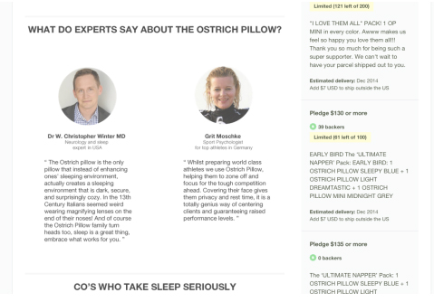
- Design elements that demonstrate social proof typically include on-site testimonials, especially from experts and celebrities. What could be more influencing than to have corporate CEO's endorse a pillow?
- Validation from Other Companies is especially important for B2B businesses. Design elements should include the logos of companies that have purchased their product and services. Basecamp, a project management software company, displays this on its home page:
- Publish the numbers of people who have purchased products or used services, have shared content on social media.
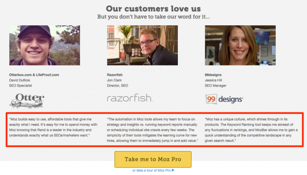
- Individual customer testimonials can be effective too if they are published with names and perhaps their positions with a company, or their professions. Here are everyday people testifying for Moz, an online content marketing source firm:

Scarcity
This has been a marketing tool for advertisers for over a century. Tell consumers that the supply is limited, and they will feel a sense of urgency to act now. Humans have a tendency to want what they cannot have, and items become more valuable when they are seen as scarce. The diamond industry has used this tactic forever. Diamonds are deliberately held off the market by the industry, in order to keep their prices high.
In web design, if users experience scarcity, they are far more motivated to buy right now. This is the tactic of many travel websites when they state that there are "only 2 seats left at this price", a favorite of Travelocity and others when consumers use the site to purchase airline tickets.

- Applying Scarcity in web design can involve several tactics:
- Limited time offers still can be effective and motivate quick purchases.
- Pushing purchases by limited discounts on abandoned shopping carts - a design element that targets these customers may be what is needed to move a customer off indecision.
- Offering limited time free shipping - a favorite of e-commerce sites during the holiday season.
Framing
Framing offers options to consumers. People like to have choices - it makes them feel as if they are in control. And, people also like things that are not extreme. There have been many research studies on options and consumer choices. One of the most famous studies was conducted in 1992, with options for microwave ovens. One group was given a choice of two ovens at two quite variant prices; the other group was offered three choices, the same two of the first study and then a really high-end oven at the highest price. When offered the two ovens, the majority of participants selected the lower-priced oven. When the higher priced oven became the middle one of the three ovens presented to the second group, the choice moved from 43% to 73%.
This has come to be known as the "Goldilocks Effect." And web design can effectively funnel consumers to the choice that can actually be the most profitable for a company. Dollar Shave Club presents its three options quite cleverly:
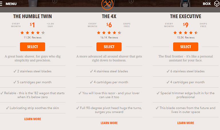
If a customer chooses the cheapest option, it may only cost $1, but there is a $2.00 S&H fee; both other options ship for free, and both have just about the same rating based upon customer reviews. The customer is drawn to the middle one, and this is the one that might just give the largest profit margin to the company. And, because the customer has been given a choice, the likelihood of actually making a purchase is greater.
Seductive Moments
A lot of researchers have studied and discovered that there are points in the sales process when customers can be offered additional products or upgrades and are more likely to "take the bait"/ This has implications for designers so that these additional appeals can be placed at the right points in the process. Sometimes these are called "seducible moments". Here is the basic psychological pattern:
- The customer has found what s/he is looking for is ready to enter the checkout process on the site.
- Once that "Go to Checkout" or "Submit" button is clicked, the customer is presented with related items, protection plans, or other "upsells."
- The customer's attention is now on the product/service that s/he initially came for and his/her focus can now be directed to something else. This is the "seducible moment."
Here is an example from a writing service website, Bestessay.Education. The customer has determined the product desired, has completed the order form and pressed the "Continue" button. Here is what pops up next:
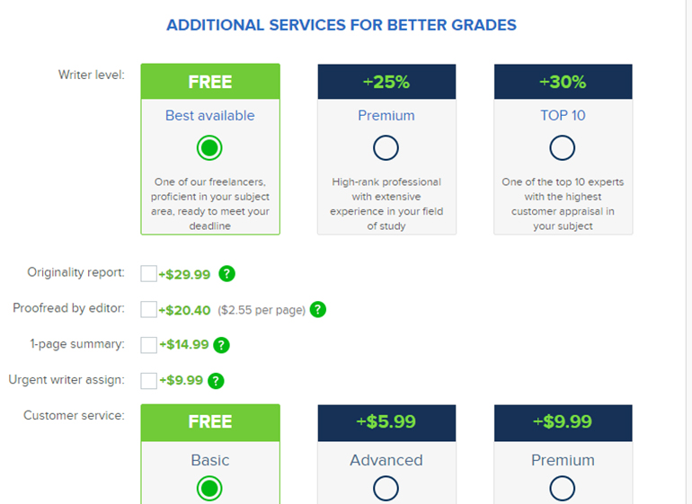
The customer is now given choices to upgrade and additional features to order, along with the original writing product. The customer is willing to consider these now because the original mission has been accomplished, and attention can be drawn to other things.
In design, then, upsell moments:
- Should occur within the checkout process
- Should always be complimentary products that relate directly to the item that has been purchased. Throwing in unrelated products or services confuses the customer.
Colors/Contrasts
There is a body of research that connects colors to emotions, both within the individual and for brand "personalities". In web design, then, the color should be used to promote the emotions that should be associated with the brand. Black and deep blue/purple, for example, connote sophistication. Thus, sites like Rolex will use these colors and shades:
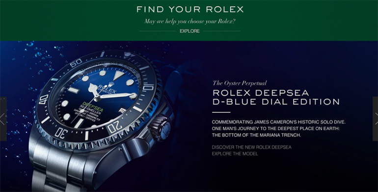
Children's toy site obviously will use bright primary colors. The brain also focuses on and remembers something that contrasts with its surrounding environment. This has been studied since the 1930's, and the results are consistent.
In online selling, elements that contrast with their surrounding environments will catch attention. For this reason, call-to-action text and buttons should contrast in both colors and from everything around them and be set off. Here's an offer on the Prevention Magazine website:

First, the colors are more pastel, because the magazine is for women. Second, take note that the CTA button is in a different script and a totally contrasting color.
Now, for a Few Lesser-Known Persuaders that Should Drive UX Design
Realism
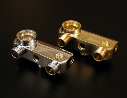
Consumers are more likely to make a purchase of an item they see online (and even pay more for it) if it looks very real - as if they could almost touch it. This has major implications for UX design. Photos must high resolution, and 360 views should be provided when appropriate.
Breaking Things Down into Smaller Steps
This makes things seem easier to people, and they are more likely to follow through. This is especially important when designing checkouts. The full checkout may be three separate processes, so put each one on a separate page rather than cram it all into one.
Prices - Reduce the Number Digits
Psychologically, people tend to believe a price with fewer digits is a better price. Check out the two numbers:
$2500.00
$2500
Yes, people actually are more persuaded by the price with fewer digits.
Conclusion
Business goals all relate to conversions - ultimately purchase conversions. And when it comes to e-commerce, there is a lot of competition out there. Incorporating the 10 persuasive triggers in your UX design can give a business an edge.
About the author
Copyright © . All Rights Reserved
